Case 005Commerce platform and product design
MeuCommerce
A commerce platform for sellers who close orders through WhatsApp. Selsa Select, its first store and design partner, connects a browsable catalog, saved products and a cart to a structured conversation with the seller.
- Contribution
- Founder, product strategy, UX/UI and development
- Project status
- Implemented platform
01
My contribution
The starting point was a real seller managing products, prices and sales through a notebook and WhatsApp. The product needed to give that operation a searchable catalog and a coherent buying journey while preserving the conversation where orders are agreed.
I developed the product strategy, UX/UI and implementation. MeuCommerce is the platform; Selsa Select is the store shown in this case. Its merchandise and product artwork belong to the respective brands and suppliers.
02
Connect the seller’s work to the storefront
The platform separates the seller’s administration from the customer-facing store. Product information and commercial conditions feed a public catalog that can be shared by link.
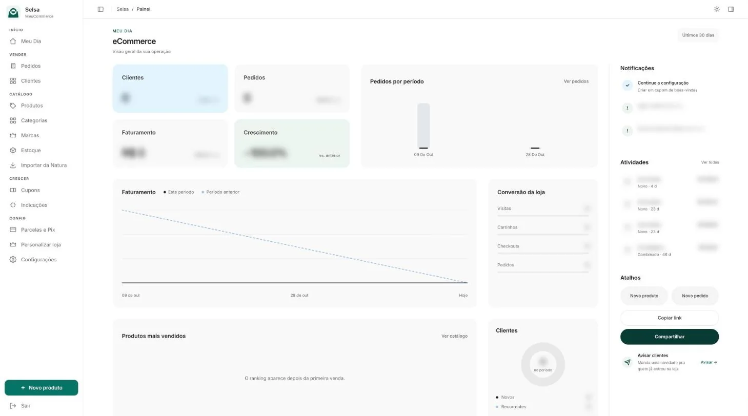
The panel opens on the seller’s day: customers, orders, revenue and growth, the store’s conversion, notifications for low stock, the latest orders and shortcuts to add a product or share the store.
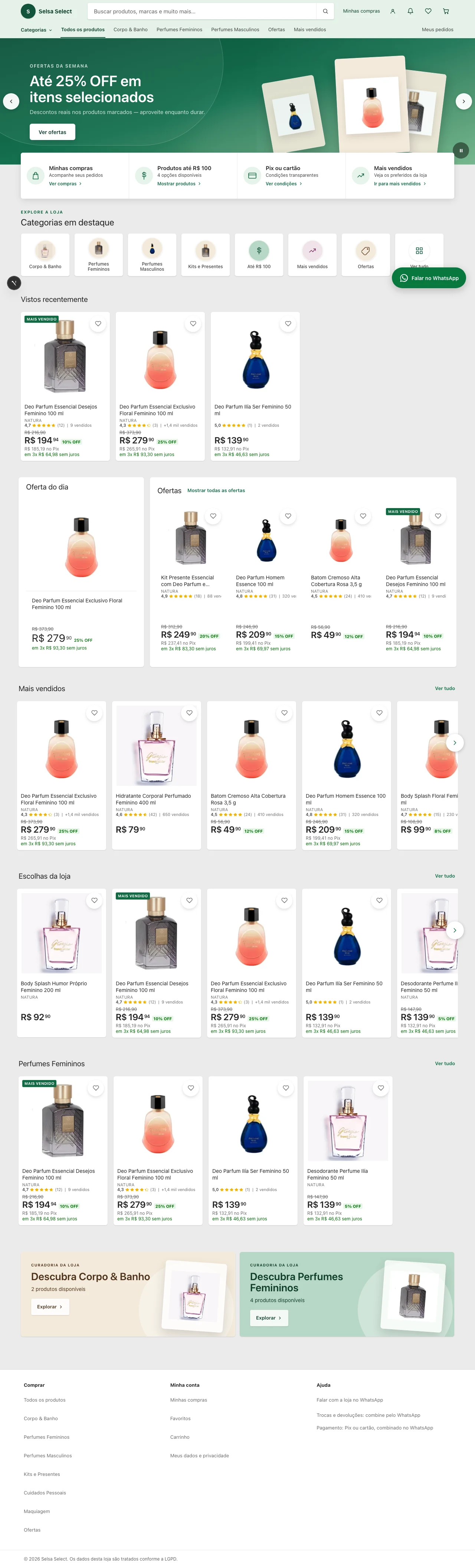
Selsa Select brings several merchandise categories into one storefront. Search, product cards, favourites and recently viewed items give customers ways to find an item, compare it and return later. Each route keeps the store context as the person moves toward a purchase.
03
Change the look, keep the store
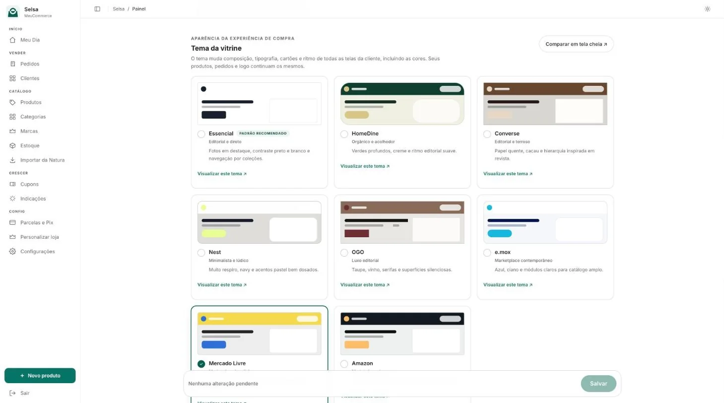
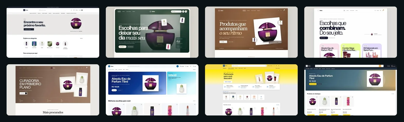
A store is not tied to one appearance. In the panel the seller chooses between eight storefront themes, and each one changes the composition, typography, cards, colours and rhythm of every customer screen. The products, orders and logo stay the same.
A comparison page opens each direction in full, from a quiet minimal catalog to a dense marketplace, so the seller decides by looking at their own store and can switch again later.
04
Keep the conditions with the product
A product card has to carry more than an image and a name. Current price, previous price, discounts, Pix and instalments need a readable hierarchy that also works when some of those conditions are absent.
The mobile refinement groups the available conditions beside the product image and removes empty space reserved for missing fields. The recently viewed section uses a continuous surface with separated rows, while leaving room for the favourite control and floating WhatsApp action.
05
Turn the cart into a useful conversation
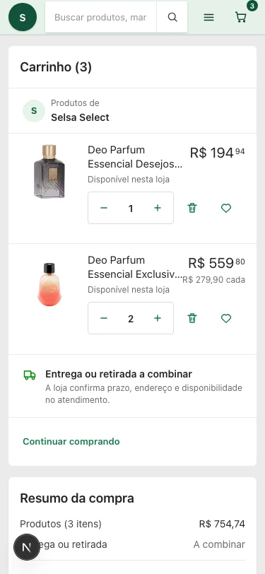
The cart lets the customer change quantities, remove items and apply a coupon before reviewing the summary. The server recalculates the quote so the displayed conditions and the generated order message share the same source.
Checkout prepares a structured WhatsApp message with the selected items and order summary. The seller can continue the conversation with the order already organised. Payment is arranged outside the platform, so the interface keeps that handoff explicit.

06
Support the moments around checkout
Saved products, orders and account controls extend the experience beyond a single cart. Empty states lead back to the store; loading, coupon errors and expired sessions need their own response instead of an apparent success.
The implementation work includes responsive refinements and recorded checks of the storefront and cart on desktop and mobile. The case shows the resulting product surfaces and their interaction decisions; it makes no claim of a measured sales or conversion increase.