Case 009Mobile app design
DoBetrBoy
An app for partners that follows cycle phases, cravings and small ideas for offering comfort. A phase ring on Home, a checklist of cravings and a library of supportive words each answer one practical question.
- Contribution
- Product flows and interface design
- Project status
- Interface design · Figma archive
01
My contribution
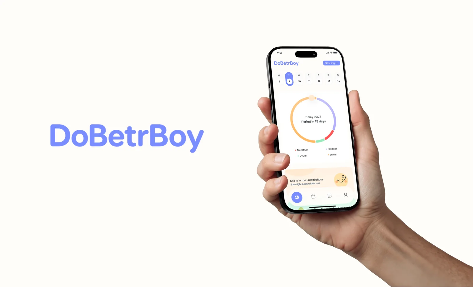
DoBetrBoy is an app for partners. It follows where she is in her cycle, keeps track of what she is craving and collects small ways to offer comfort. I designed its screens around a plain question: what might help today?
Every date, phase and note on screen is sample data.
02
The day at a glance
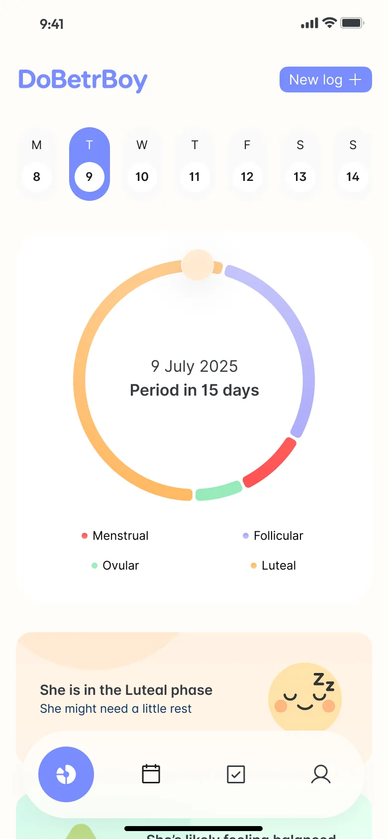
Home leads with a ring divided into the four phases, a marker on today and two lines in the centre: the date and the days until the next period. A week strip sits above it and a legend below, so the chart explains itself.
Under the ring, a card turns the phase into a short note: “She is in the Luteal phase”, followed by “She might need a little rest”. The wording stays tentative, a suggestion and not a statement of how she feels.
03
Small, practical gestures
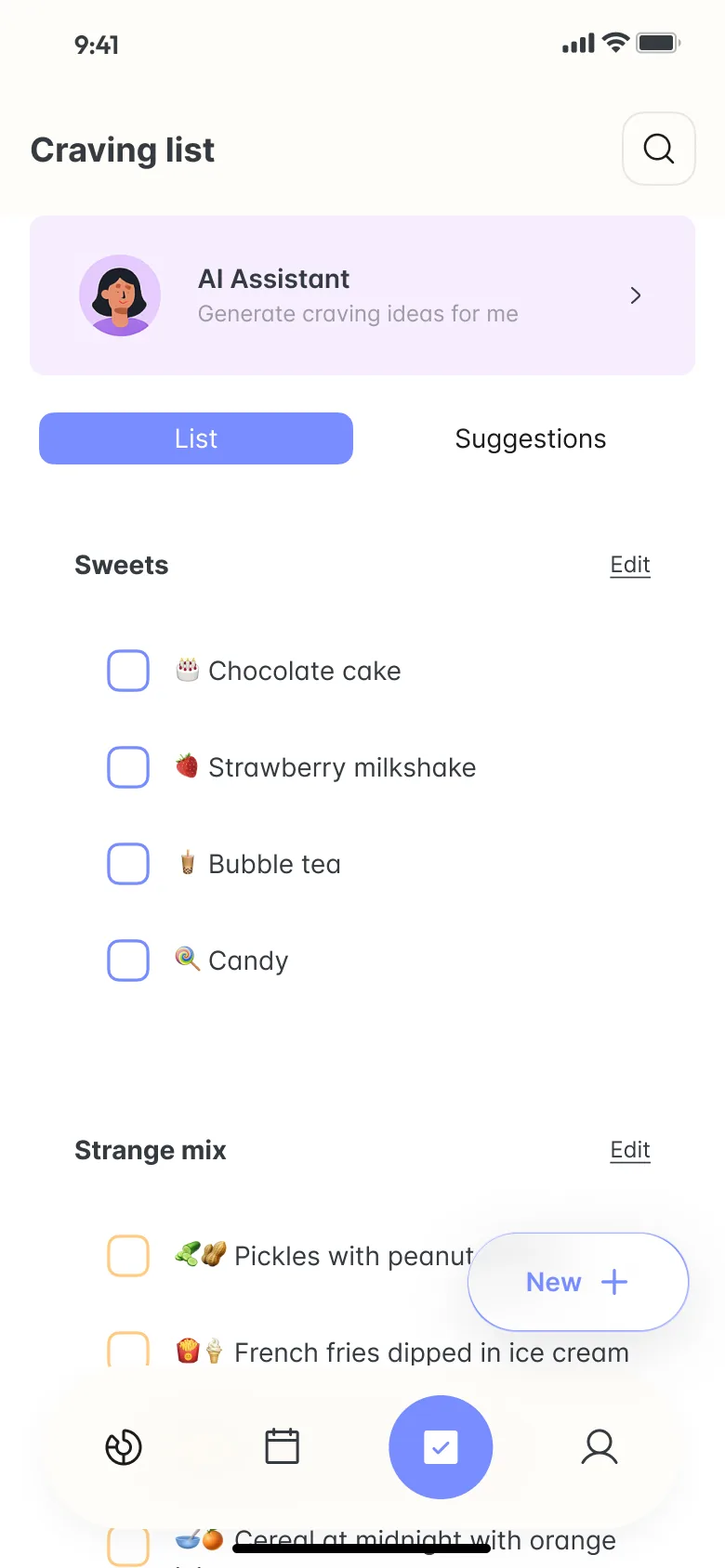
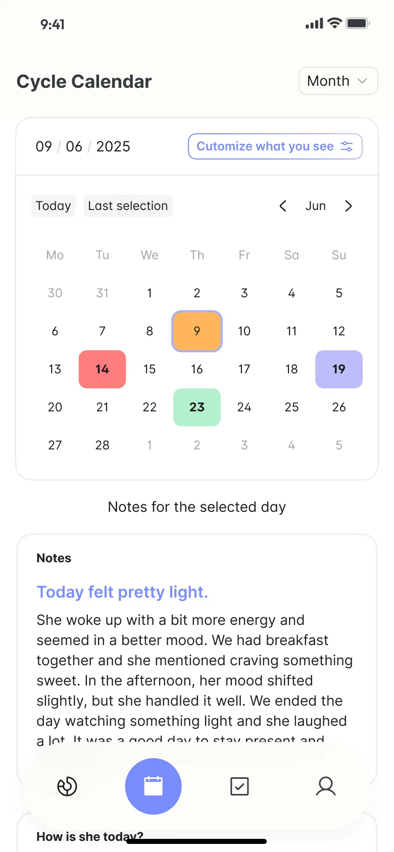
The rest of the app turns that information into something to do. The Craving list groups items into sections such as Sweets and Strange mix, each with a checkbox, and an AI Assistant card offers to generate more ideas. The Cycle Calendar carries the ring's colours onto the month and keeps notes for the selected day below it.
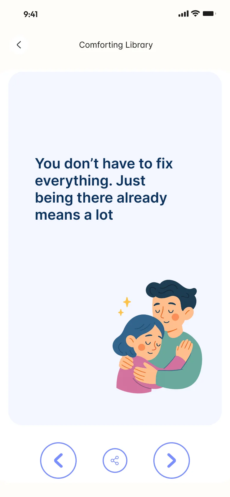
The Comforting Library is the quietest screen: one sentence and one illustration at a time, with controls to go back, move forward or share.