Case 056Brand identity and communication
Qualifyer
An identity for an AI service and sales platform, built around a stable symbol and lettering with room for painting, paper, typography and motion.
- Contribution
- Brand direction, identity system and applications
- Project status
- Brand system and production kit
01
My contribution
Qualifyer brings AI agents, customers and conversations into a shared operation. My branding work gives that product a visual language that can move between an institutional signature, an expressive campaign and an everyday communication piece.
The work extends into a brand book, editable applications and motion assets. The central design decision is to define what remains recognisable while giving each message room to change.
02
Keep the mark stable
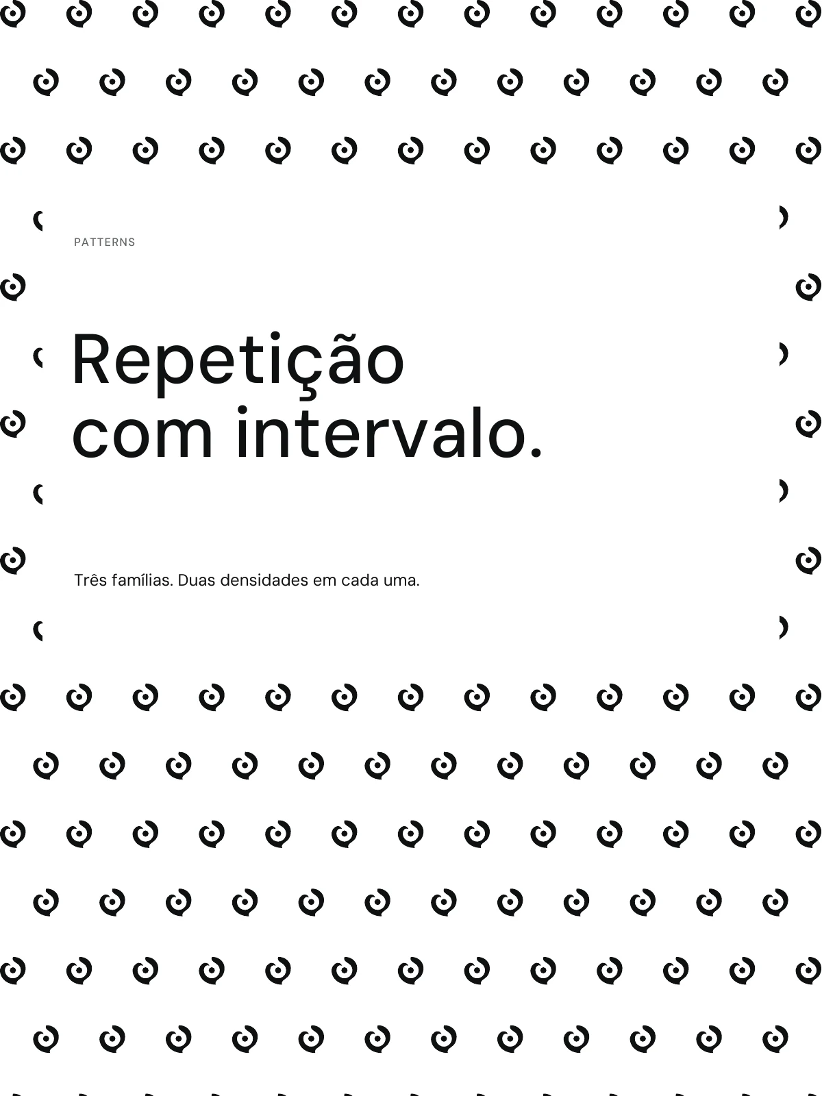
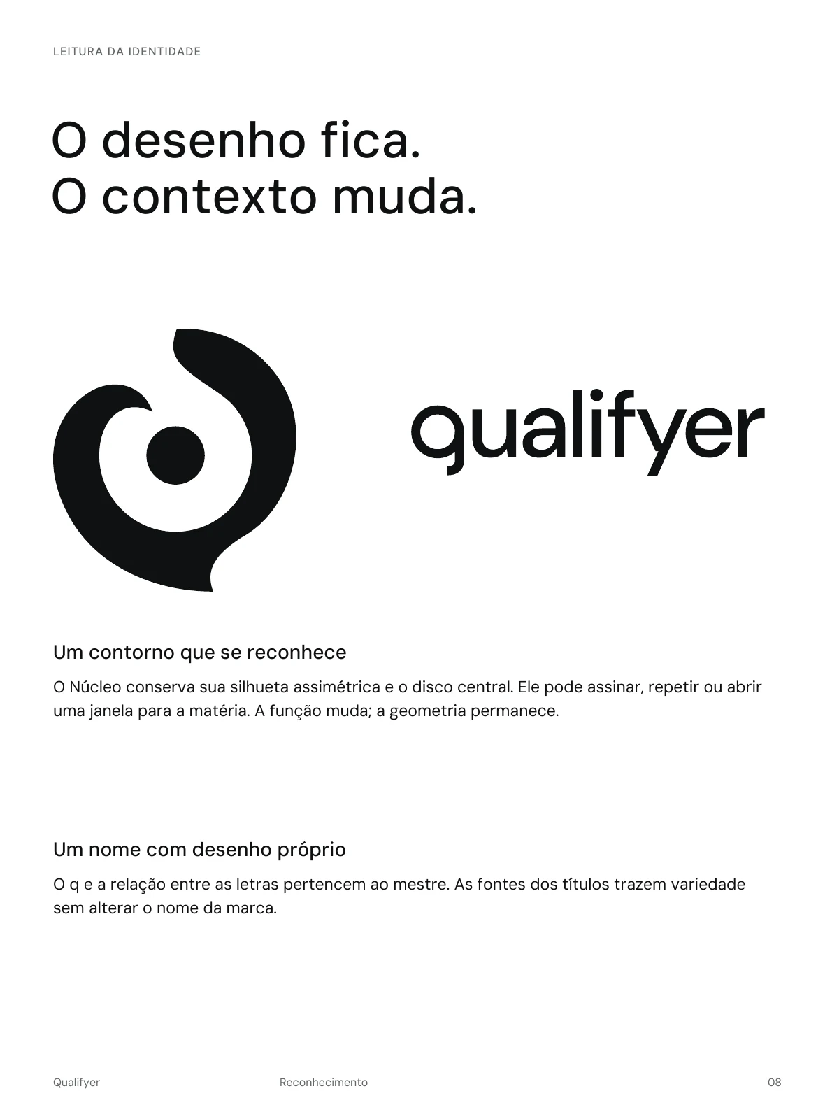
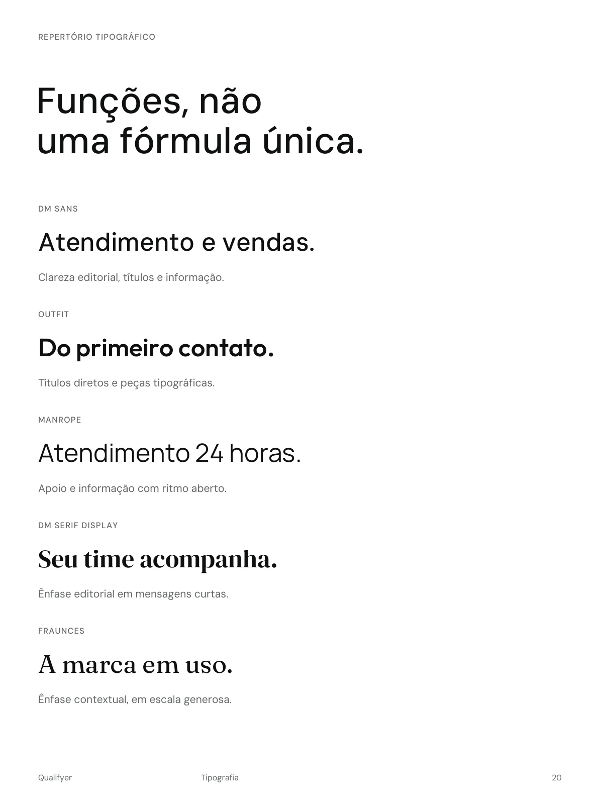
The Núcleo symbol preserves an asymmetric silhouette and its central disc. The custom lettering has its own q and spacing relationships. Those masters stay intact when the symbol becomes an avatar, a repeated pattern or a window into an image.
The system defines signature hierarchy, clear space and reduction rules. At small sizes the solid symbol takes priority; pictorial detail needs more room. Recognition comes from the drawing, while the surrounding composition adapts to the context.
03
Let the material carry expression
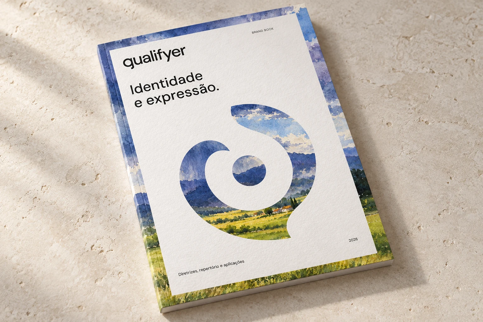
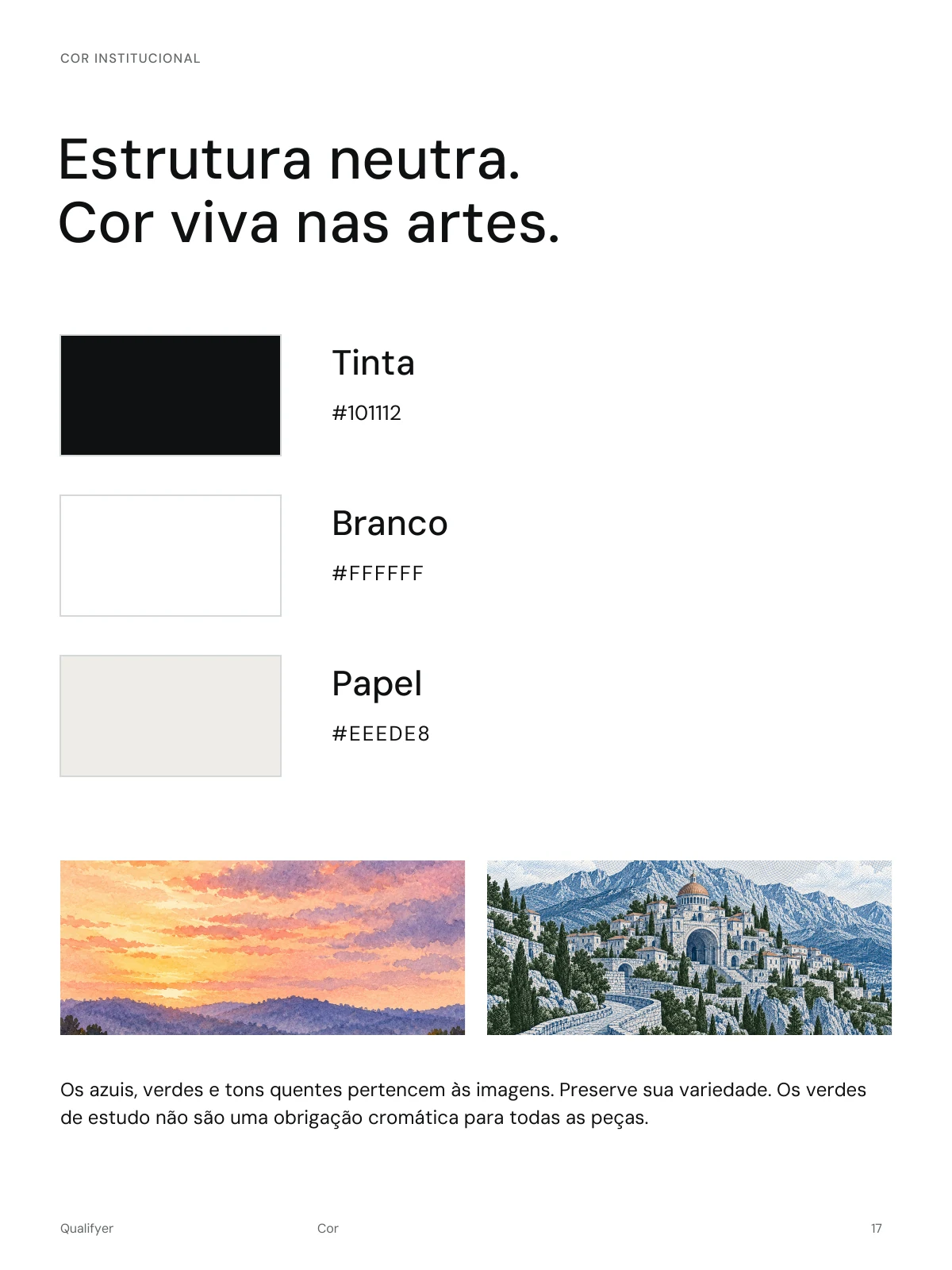
Ink, white and paper provide the neutral structure. Colour comes from the artwork: engraving, watercolour, oil painting and monotype retain their distinct textures and natural palettes.
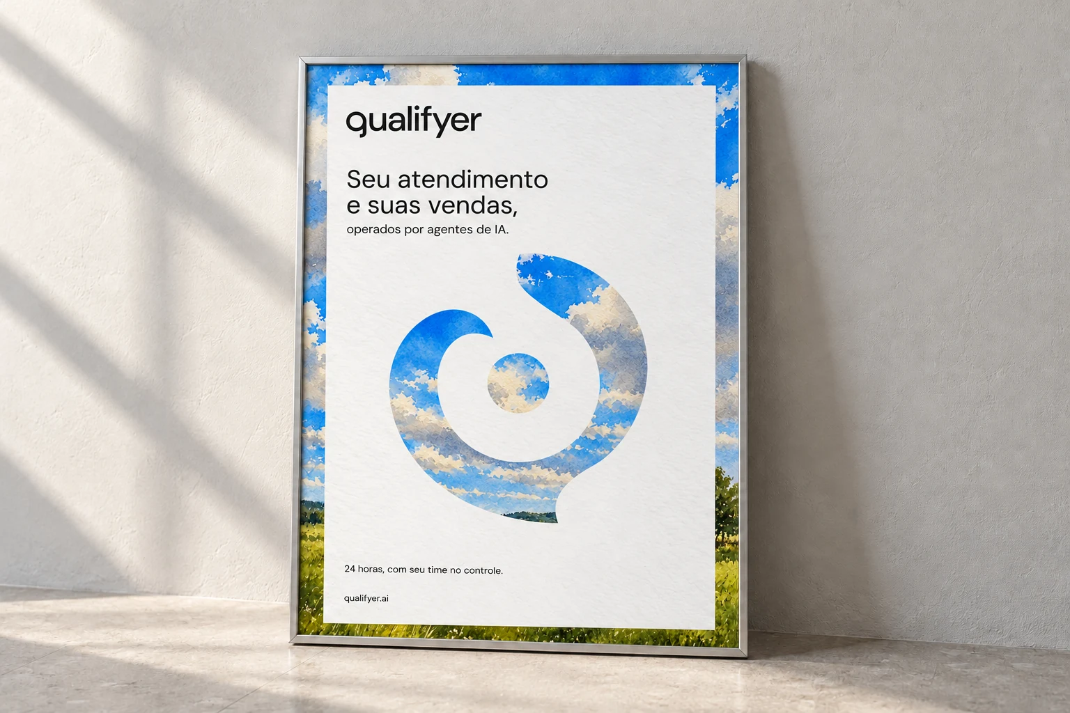
Composition studies explore wide images, paper windows, artwork inside the Núcleo and translucent layers. In the window treatment, the same image continues outside the paper and through the symbol. That continuity makes the mask part of the composition rather than a decorative logo effect.
04
Build a system people can use
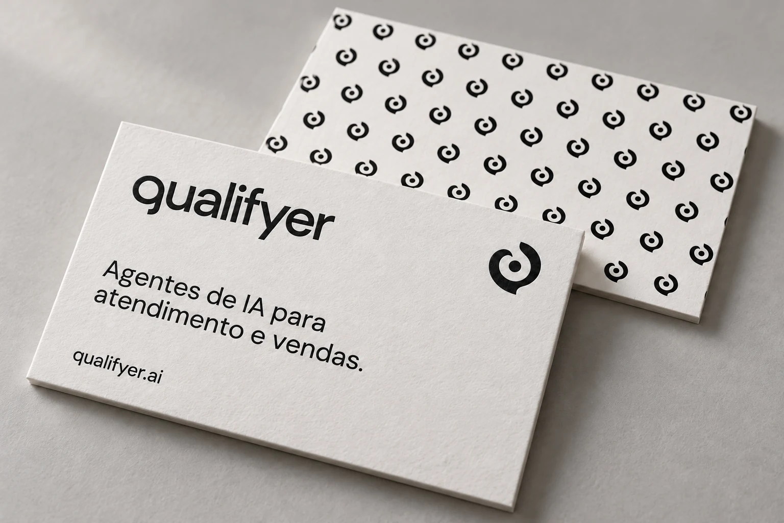
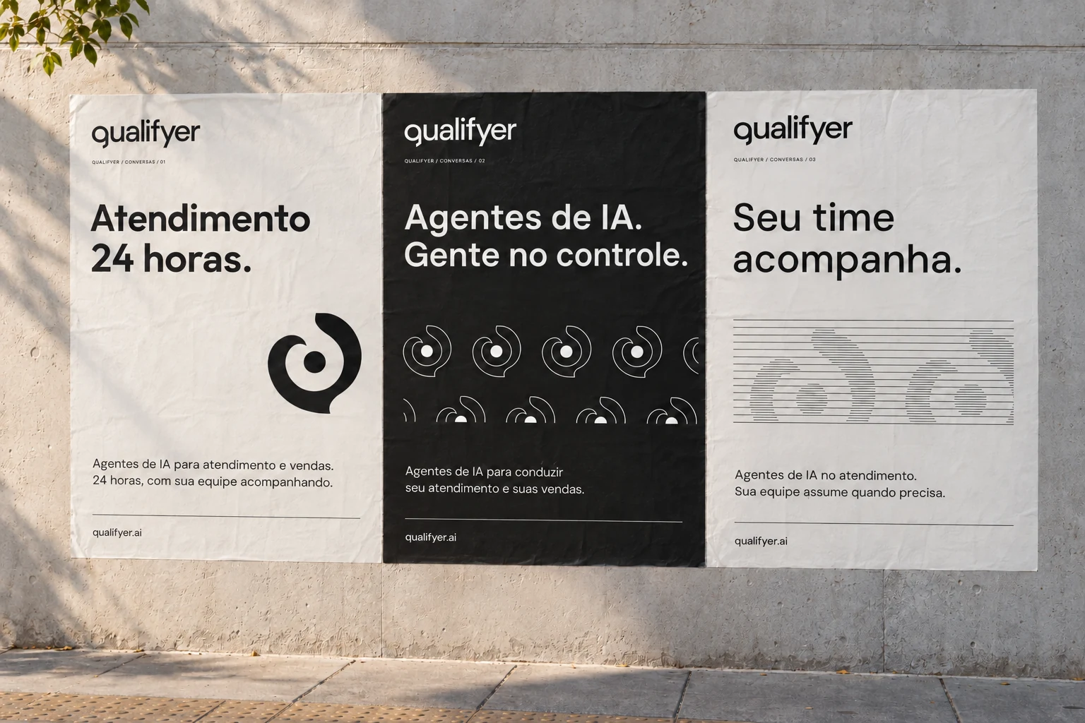
The kit connects the visual rules to stationery, credentials, signage, social formats and presentation material. Editable text, the mark and pictorial material are separated so a new message can be composed without rebuilding the identity.
Production guidance distinguishes digital references from print preparation. Dimensions, source resolution, colour handling and supplier checks accompany the applications. Mockups show the intended appearance; physical materials still require a production proof.
05
Give each message time to arrive
The motion system uses three rhythms: a signature reveal, a sequence of painting and paper, and a pattern that resolves into the mark. The Núcleo and name keep their geometry as the other elements enter.
Landscape and portrait versions recompose the scene for their format. A reading pause is part of the animation, alongside static alternatives. Motion extends the identity into a sequence people can follow.