Drag to explore. Scroll or pinch to zoom. Open Help for keyboard controls.

Yan
OPEN
TO WORK
Let’s talk
Yan Fontão Boring view
All work

Case 016Mobile app design

Univesell

A two-sided marketplace app for events. People planning an event track tasks, budget and guests in one place, while vendors follow their earnings on their own side.

Contribution
Product flows and interface design
Project status
Interface design · Figma archive
Univesell presentation cover from the original design file.
Presentation cover from the original file.

01

My contribution

Univesell is a two-sided marketplace app for events: people planning an event on one side, vendors on the other. Planners browse companies, professionals and agencies, and manage each event in the same app.

The file lays out both sides as user flows alongside the screens I designed. This case follows the event tools and ends on the vendor's earnings.
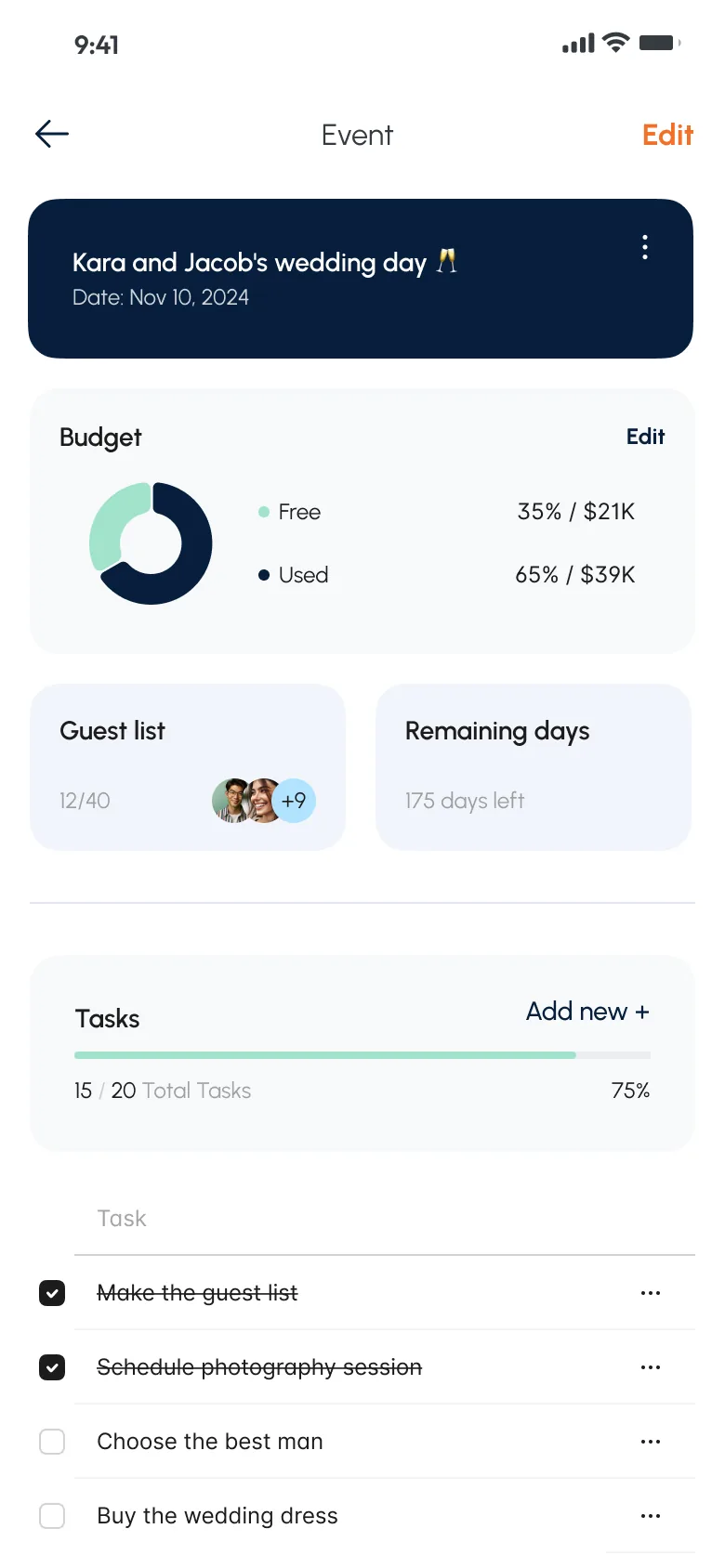
Event screen for a sample wedding with a dark header, a budget ring chart, a guest count, days remaining and a task checklist.
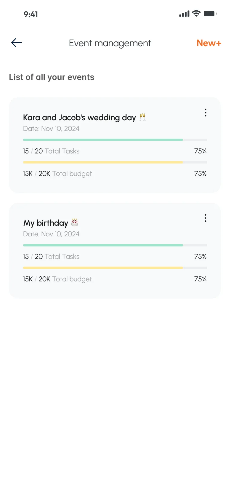
Event management screen listing a wedding and a birthday, each card with progress bars for tasks and budget, and a New button at the top.
A walkthrough of the design’s screens, not a recording: managing an event, from its details to the invitation and the vendor’s earnings. Event details: budget, guests, days left and tasks in one scroll. Sample data. Event list: tasks and budget as two bars on each card.

02

One event on one screen

Event details gathers the questions around an event into one scroll: how much of the budget is used, where the guest list stands, how many days remain and which tasks are still open. A dark header names the event, and each block below answers one question.

The list of events applies the same idea one level up. Each card shows tasks and budget as two progress bars, so you can see how events compare before opening one.

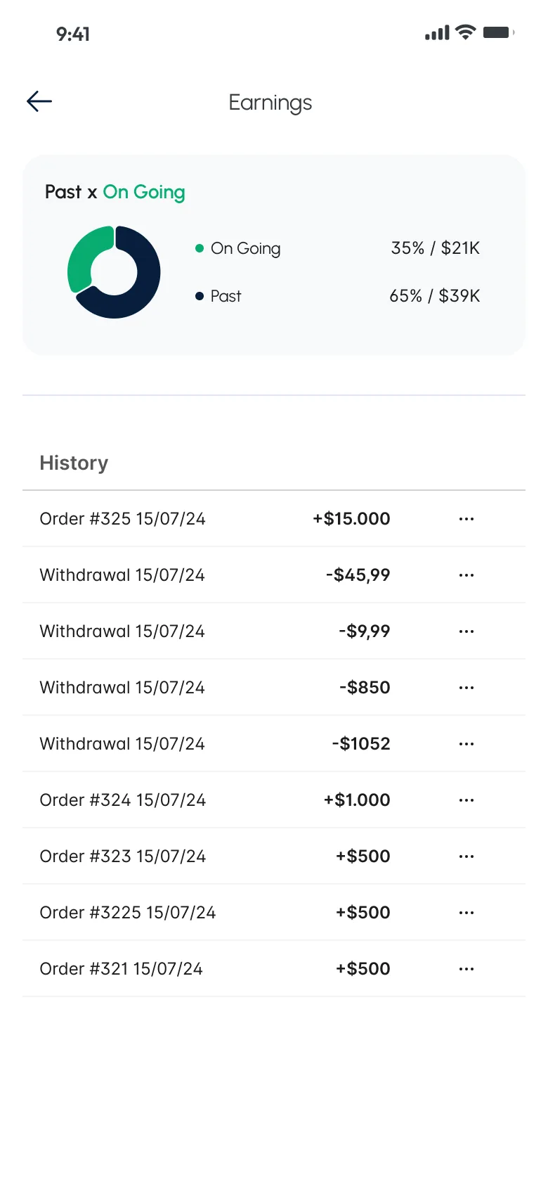
Earnings screen with a ring chart of ongoing and past amounts above a history of orders and withdrawals.
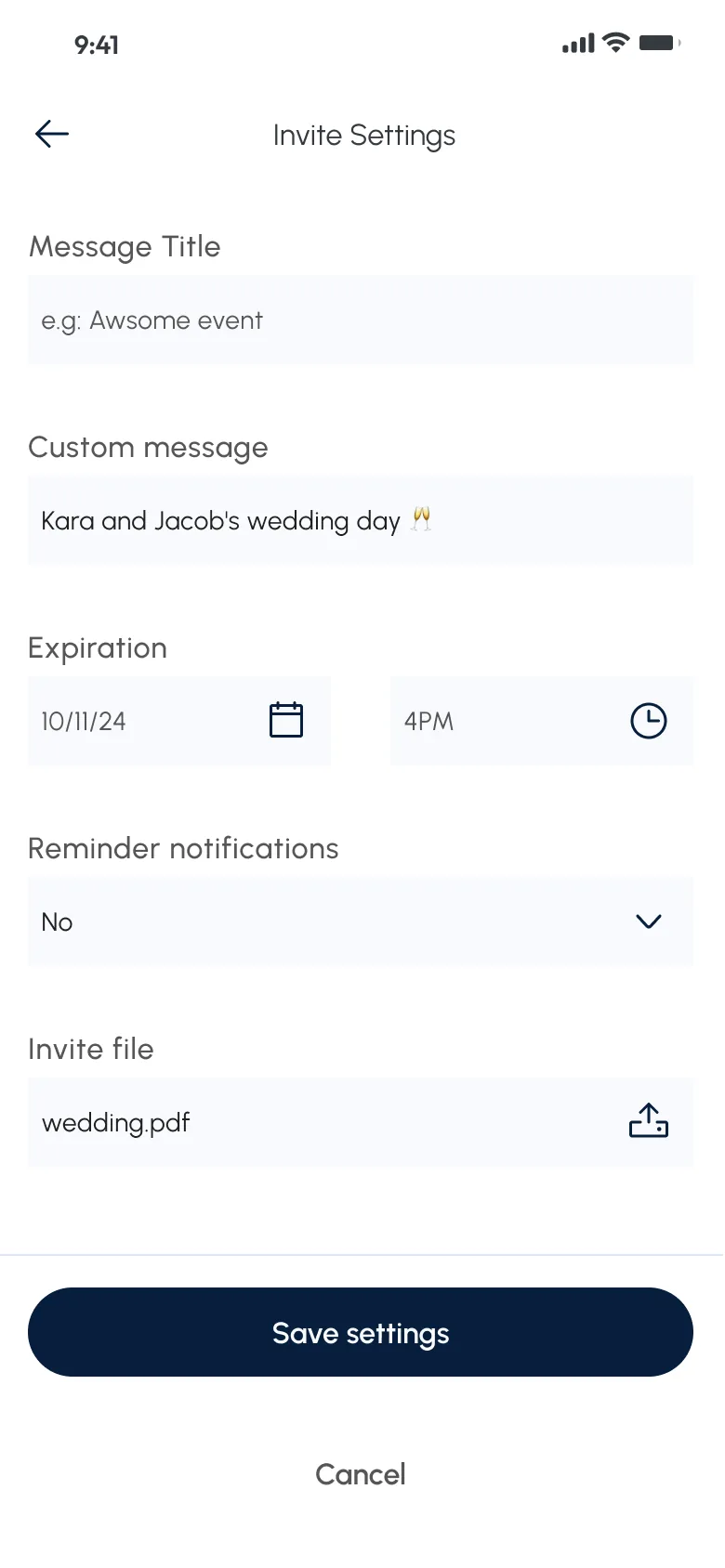
Invite settings form with fields for title, message, expiry date and time, reminders and an uploaded file, above Save settings and Cancel.
Vendor side: earnings, with the same chart and history pattern. Sample data. Invitations: message, expiry, reminders and an attached file.

03

The other side of the marketplace

On the vendor side, Earnings reuses the same structure: a ring chart on top and a history list below, now separating ongoing from past amounts, with orders and withdrawals in the list. Sharing one pattern keeps the two sides recognisable as one product.

Wide diagram of connected green and lilac boxes showing the screens of the user flow, from first access through the marketplace, orders and wallet to the event tools.
User flow for the planning side, colour-coded by status at that stage.

04

The whole product on one map

The user flow for the planning side runs from first access and sign-up through the marketplace, cart, orders and wallet to the event tools. Its colours mark which screens were done and which had not been started at that stage, so the map doubled as a working progress board.

000

Instructions

Yan Fontão
Tap
Open a screen
Click
Open a screen
Drag
Look around the board
Wheel
Mouse zooms, trackpad moves, pinch zooms
− +
Pull back to see the whole board, or come closer
Arrows
In a case: ↑↓ change case, ←→ change media. On the board: move
Space
Open, or go back
Enter
Open
Esc Backspace
Back
Home
Back to the center, then the introduction
PgUp PgDn
Previous or next channel
Tab
Walk projects and links
R
Random project
0–9
Type a channel, 1–61
?
This page
Shortcuts

Music on the board

Files compressed and levelled for the web.

OPEN
TO WORK
Let’s talk

New message to Yan

Tell me who you are and I’ll get back to you.

000

About Yan

Hello, I’m Yan

Product Designer/ Design Engineer

Most products lose something between design and code. Mine don’t: I research the problem, design the product and ship the interface myself, so what you approve is exactly what your users get.

  • 2018started in software
  • UI + codedesign and implementation

Worked with Motorola · Ambev Tech · Rei do Pitaco · OneTool · CESAR

Brazil · Remote, hybrid or on-site

Portrait of Yan Fontão seated, in a green sweater and glasses, holding a microphone.
OPEN
TO WORK
Let’s talk
OPEN
TO WORK
Let’s talk
000

locked channel

Under NDA

Enter the code

Ask Yan for the code ↗
OPEN
TO WORK
Let’s talk
YAN FONTÃO Case studies

Channel 16 Mobile app design

Univesell

A two-sided marketplace app for events. People planning an event track tasks, budget and guests in one place, while vendors follow their earnings on their own side.

Contribution
Product flows and interface design
Project status
Interface design · Figma archive
Univesell presentation cover from the original design file.
Presentation cover from the original file.

An event, its budget and its guests on one screen

Screens from the original Figma design file, with sample data.

My contribution

Univesell is a two-sided marketplace app for events: people planning an event on one side, vendors on the other. Planners browse companies, professionals and agencies, and manage each event in the same app.

The file lays out both sides as user flows alongside the screens I designed. This case follows the event tools and ends on the vendor's earnings.
A walkthrough of the design’s screens, not a recording: managing an event, from its details to the invitation and the vendor’s earnings.
Event screen for a sample wedding with a dark header, a budget ring chart, a guest count, days remaining and a task checklist.
Event details: budget, guests, days left and tasks in one scroll. Sample data.

One event on one screen

Event details gathers the questions around an event into one scroll: how much of the budget is used, where the guest list stands, how many days remain and which tasks are still open. A dark header names the event, and each block below answers one question.

The list of events applies the same idea one level up. Each card shows tasks and budget as two progress bars, so you can see how events compare before opening one.
Event management screen listing a wedding and a birthday, each card with progress bars for tasks and budget, and a New button at the top.
Event list: tasks and budget as two bars on each card.

The other side of the marketplace

On the vendor side, Earnings reuses the same structure: a ring chart on top and a history list below, now separating ongoing from past amounts, with orders and withdrawals in the list. Sharing one pattern keeps the two sides recognisable as one product.

Earnings screen with a ring chart of ongoing and past amounts above a history of orders and withdrawals.
Vendor side: earnings, with the same chart and history pattern. Sample data.
Invite settings form with fields for title, message, expiry date and time, reminders and an uploaded file, above Save settings and Cancel.
Invitations: message, expiry, reminders and an attached file.

The whole product on one map

The user flow for the planning side runs from first access and sign-up through the marketplace, cart, orders and wallet to the event tools. Its colours mark which screens were done and which had not been started at that stage, so the map doubled as a working progress board.

Wide diagram of connected green and lilac boxes showing the screens of the user flow, from first access through the marketplace, orders and wallet to the event tools.
User flow for the planning side, colour-coded by status at that stage.