Drag to explore. Scroll or pinch to zoom. Open Help for keyboard controls.

Yan
OPEN
TO WORK
Let’s talk
Yan Fontão Boring view
All work

Case 020Mobile app design

NeverSoft

A Portuguese-language investment app that starts with how a portfolio is divided and goes down to each asset. Every name and figure on screen is sample data.

Contribution
Interface design
Project status
Interface design · Figma archive
NeverSoft presentation cover from the original design file.
Presentation cover from the original file.

01

My contribution

NeverSoft is an investment management app in Portuguese. Its two tabs answer different questions: Resumo shows how the whole portfolio is divided and how it is going, and Ativos looks at one holding at a time.

The same Figma file has a landing page for companies, investors, advisers and accountants. It still carries a stand-in brand, so here I stay with the app.

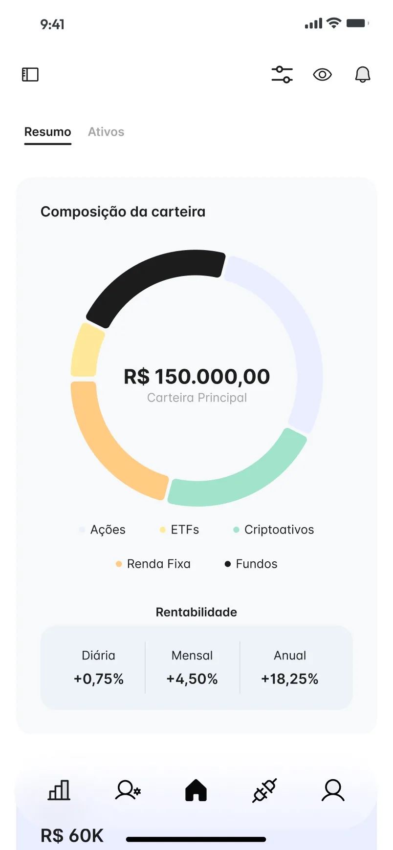
Portfolio summary screen with a composition ring around the total, and daily, monthly and yearly returns.
A scroll through the design: the assets list and each holding’s performance. A scroll through the design: the portfolio summary, from the allocation ring to the reports. The portfolio summary, with sample figures.
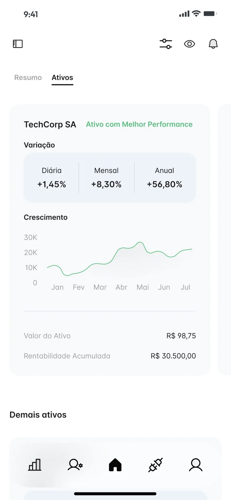
Assets screen showing the best performing asset with its variation and a growth chart.
Asset detail, with sample company names and figures.

02

The ring and the tiles are the same picture

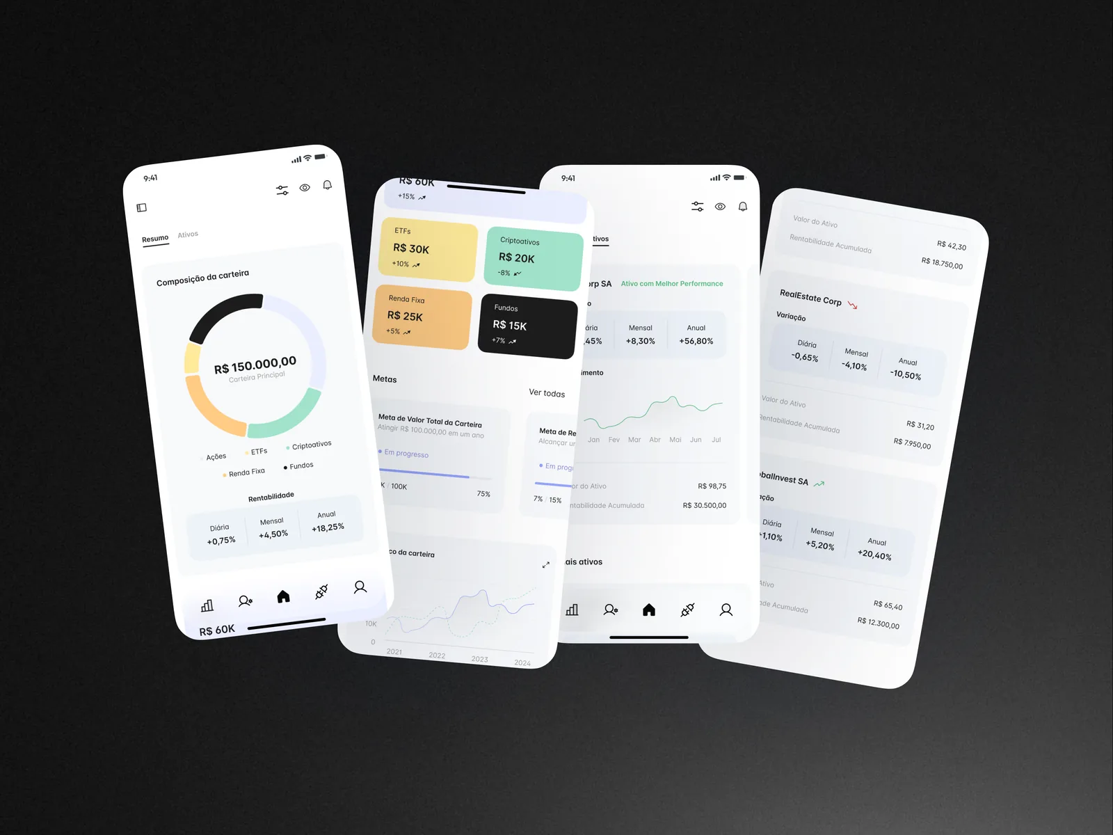
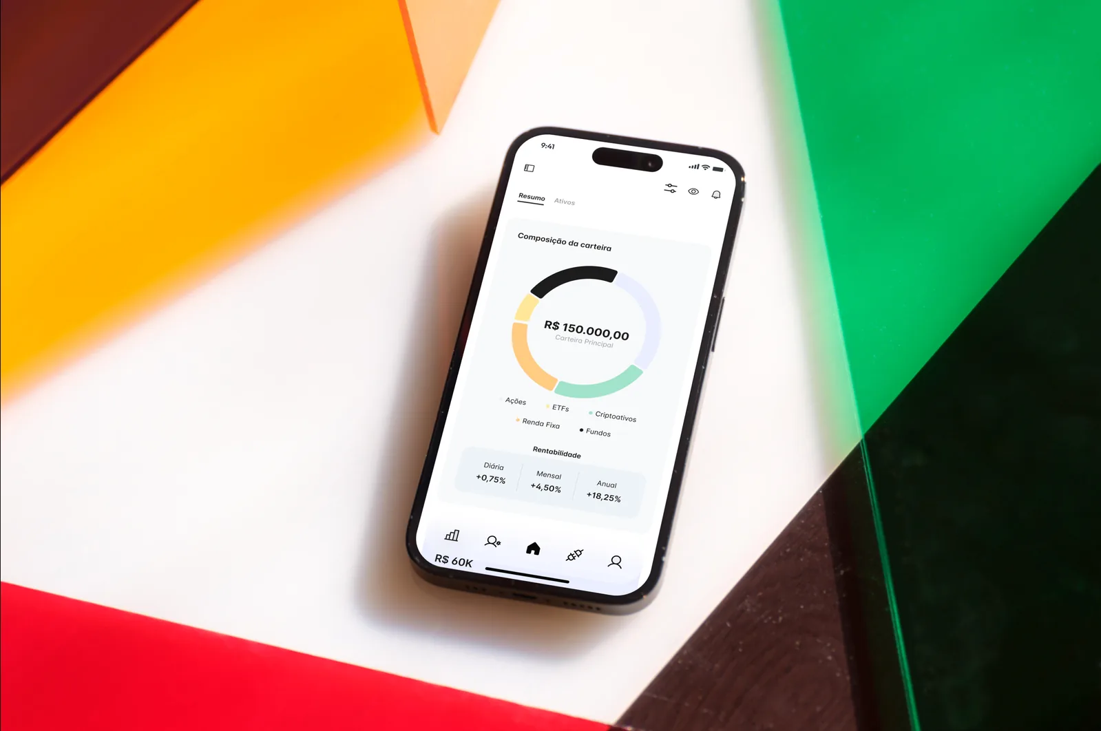
Resumo opens on a donut that splits the portfolio across Ações, ETFs, Criptoativos, Renda Fixa and Fundos, with the total in the middle and three plain figures underneath for daily, monthly and annual return. Scrolling down, each asset class becomes a tile in the colour of its slice, so the ring and the tiles read as one system.

The rest of the page is about direction over time: goal cards with progress bars, a history chart of contributions and dividends, and a list of PDF reports ready to download.

Four app screens tilted on a black background: the portfolio donut, category tiles with goals, a featured asset with a growth line, and a list of other assets.
The Resumo and Ativos tabs, from the whole portfolio down to each asset.

03

The same three numbers on every asset

In Ativos, every card repeats the same strip of daily, monthly and annual variation, so comparing holdings means reading the same row in the same place. The asset marked as best performer gets a fuller card with a growth line; the others follow in a list, each with a small green or red arrow for direction.

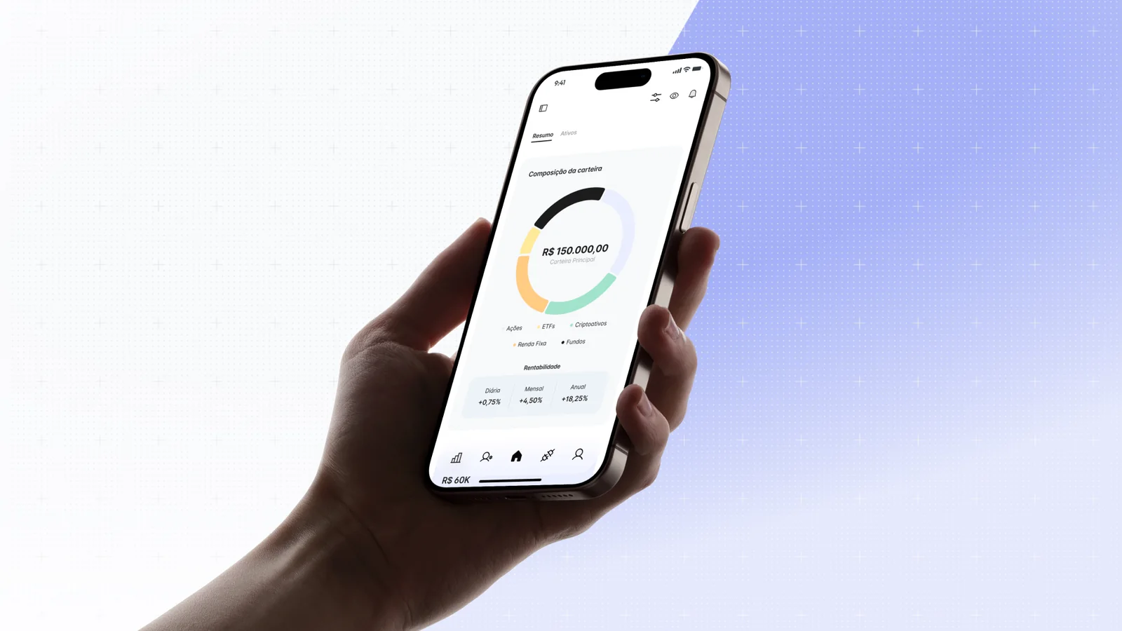
A phone lying on a white surface between orange, green and red acrylic sheets, showing the donut with its legend and return figures.
Five asset classes, each with its own colour in the ring and the legend.
000

Instructions

Yan Fontão
Tap
Open a screen
Click
Open a screen
Drag
Look around the board
Wheel
Mouse zooms, trackpad moves, pinch zooms
− +
Pull back to see the whole board, or come closer
Arrows
In a case: ↑↓ change case, ←→ change media. On the board: move
Space
Open, or go back
Enter
Open
Esc Backspace
Back
Home
Back to the center, then the introduction
PgUp PgDn
Previous or next channel
Tab
Walk projects and links
R
Random project
0–9
Type a channel, 1–61
?
This page
Shortcuts

Music on the board

Files compressed and levelled for the web.

OPEN
TO WORK
Let’s talk

New message to Yan

Tell me who you are and I’ll get back to you.

000

About Yan

Hello, I’m Yan

Product Designer/ Design Engineer

Most products lose something between design and code. Mine don’t: I research the problem, design the product and ship the interface myself, so what you approve is exactly what your users get.

  • 2018started in software
  • UI + codedesign and implementation

Worked with Motorola · Ambev Tech · Rei do Pitaco · OneTool · CESAR

Brazil · Remote, hybrid or on-site

Portrait of Yan Fontão seated, in a green sweater and glasses, holding a microphone.
OPEN
TO WORK
Let’s talk
OPEN
TO WORK
Let’s talk
000

locked channel

Under NDA

Enter the code

Ask Yan for the code ↗
OPEN
TO WORK
Let’s talk
YAN FONTÃO Case studies

Channel 20 Mobile app design

NeverSoft

A Portuguese-language investment app that starts with how a portfolio is divided and goes down to each asset. Every name and figure on screen is sample data.

Contribution
Interface design
Project status
Interface design · Figma archive

See it on Dribbble

NeverSoft presentation cover from the original design file.
Presentation cover from the original file.

A portfolio read from the whole down to each asset

Screens from the original design in Figma and Dribbble, with sample data.

My contribution

NeverSoft is an investment management app in Portuguese. Its two tabs answer different questions: Resumo shows how the whole portfolio is divided and how it is going, and Ativos looks at one holding at a time.

The same Figma file has a landing page for companies, investors, advisers and accountants. It still carries a stand-in brand, so here I stay with the app.
A scroll through the design: the assets list and each holding’s performance.
A scroll through the design: the portfolio summary, from the allocation ring to the reports.

The ring and the tiles are the same picture

Resumo opens on a donut that splits the portfolio across Ações, ETFs, Criptoativos, Renda Fixa and Fundos, with the total in the middle and three plain figures underneath for daily, monthly and annual return. Scrolling down, each asset class becomes a tile in the colour of its slice, so the ring and the tiles read as one system.

The rest of the page is about direction over time: goal cards with progress bars, a history chart of contributions and dividends, and a list of PDF reports ready to download.
Portfolio summary screen with a composition ring around the total, and daily, monthly and yearly returns.
The portfolio summary, with sample figures.
Assets screen showing the best performing asset with its variation and a growth chart.
Asset detail, with sample company names and figures.

The same three numbers on every asset

In Ativos, every card repeats the same strip of daily, monthly and annual variation, so comparing holdings means reading the same row in the same place. The asset marked as best performer gets a fuller card with a growth line; the others follow in a list, each with a small green or red arrow for direction.
Four app screens tilted on a black background: the portfolio donut, category tiles with goals, a featured asset with a growth line, and a list of other assets.
The Resumo and Ativos tabs, from the whole portfolio down to each asset.
A phone lying on a white surface between orange, green and red acrylic sheets, showing the donut with its legend and return figures.
Five asset classes, each with its own colour in the ring and the legend.