Case 046Web app and dashboard design
Manaus Mais Humana
A Portuguese dashboard and login for the nonprofit Manaus Mais Humana, organized around donations, goals and neighbourhoods. Every figure on the screens is a sample value.
- Contribution
- Interface design
- Project status
- Interface design · Figma archive
01
My contribution
Manaus Mais Humana is a Portuguese web dashboard for a nonprofit, with a login, a home screen for donations and goals, and a small visual guide.
This case shows how the screens are organized. The amounts, counts and dates on them are sample values, not results.
02
One warm card reads first
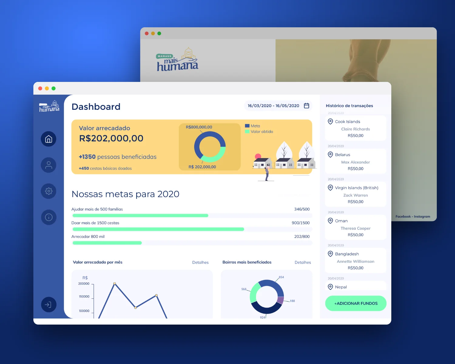
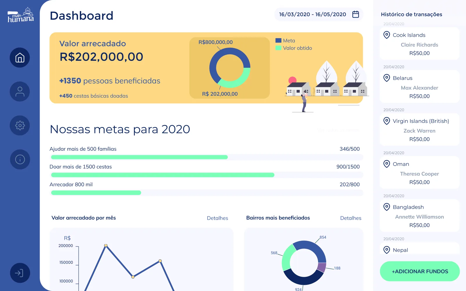
The home screen opens with a yellow card: the amount raised, people benefited and food baskets donated on the left, a donut comparing the amount with the goal in the middle, and a small illustration of houses and a person on the right. It is the only large area of warm colour on the page, so it reads before anything else.
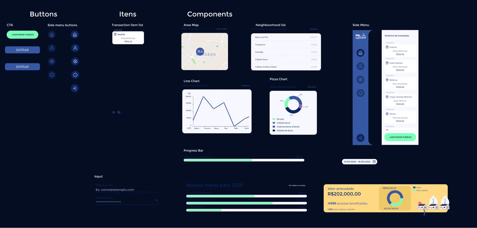
Goals follow as three plain progress bars with their counts at the end of each line, and monthly and neighbourhood charts continue below. A right column lists transactions as cards with date, place, name and amount, and the mint green of the progress bars returns in the +ADICIONAR FUNDOS button beneath it.
03
The entrance and the parts behind it
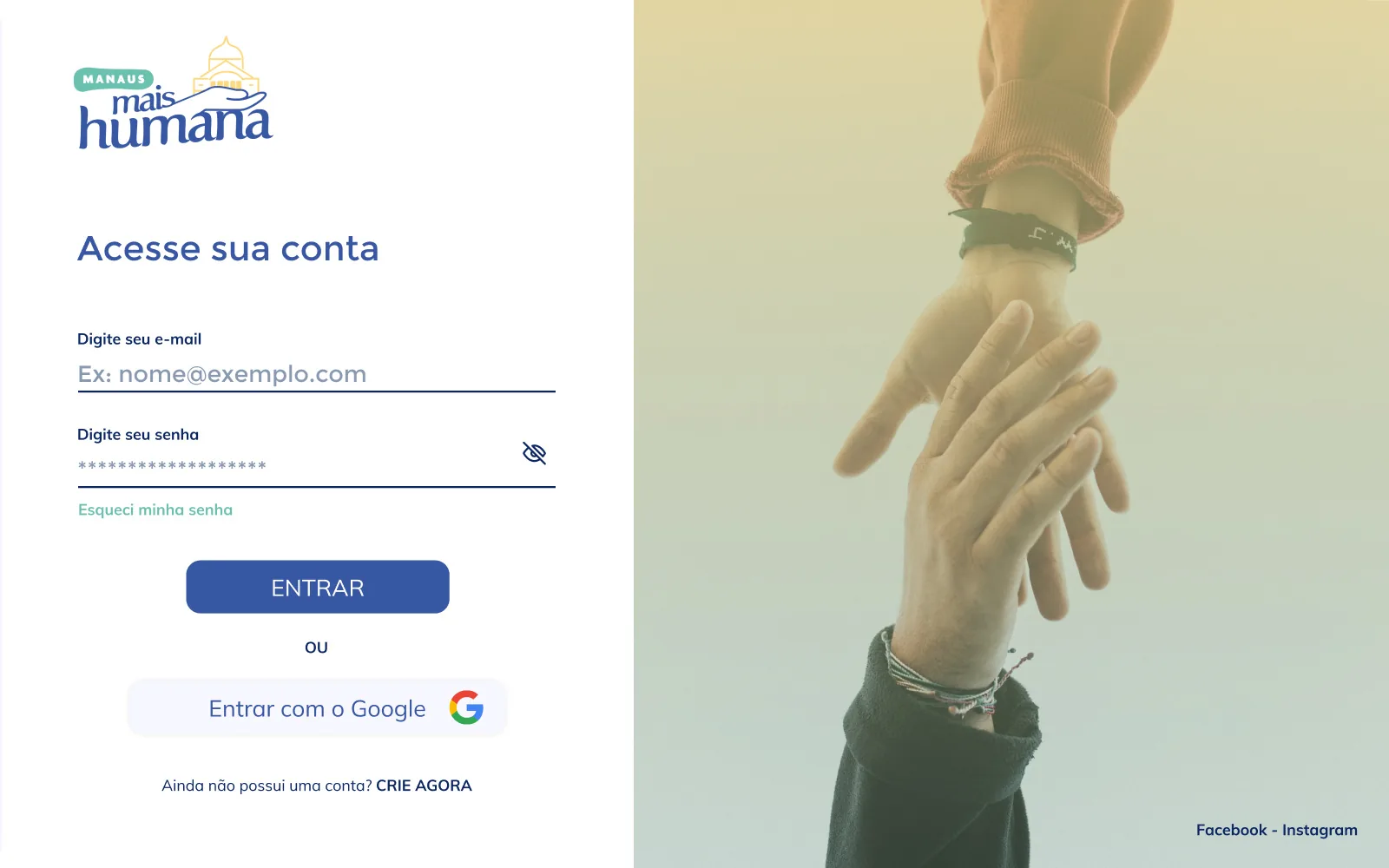
The login keeps one column of fields: email, password with a visibility toggle and a link for a forgotten password. ENTRAR is the solid action, the Google option comes after an OU, and creating an account is a last line of text. A photograph of two hands, tinted from yellow to teal, fills the other half with the palette of the dashboard.
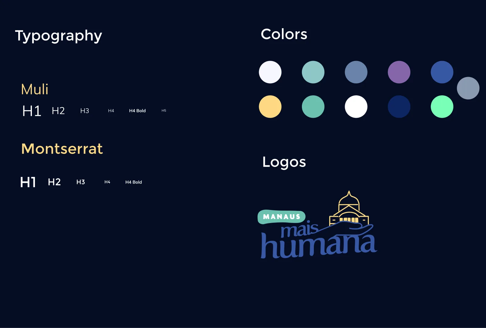
A guide sets the two typefaces, Muli and Montserrat, along with the colours and the logo. A second board separates buttons, side-menu states, the transaction item, charts, the progress bar, the map and the list, which shows how the home screen is assembled.