Drag to explore. Scroll or pinch to zoom. Open Help for keyboard controls.

Yan
OPEN
TO WORK
Let’s talk
Yan Fontão Boring view
All work

Case 059Brand identity

Pasta Morada

A brand identity for Pasta Morada in Manaus: a mark that puts a coil of pasta inside a house, carried onto tubs, bags, menus, uniforms and the site.

Contribution
Brand identity
Project status
Brand identity · Figma archive
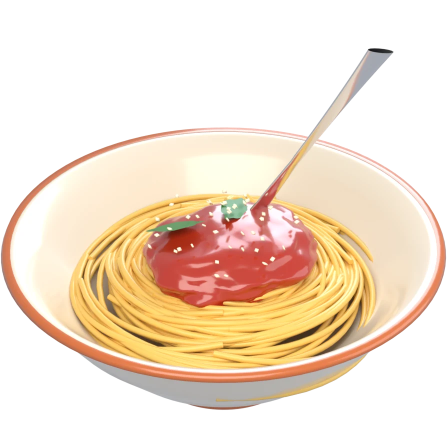
A 3D bowl of pasta with a fork twirling in it.
A 3D object made for this board.

01

My contribution

Morada means home, and the mark takes the name literally: a sage-green house with a chimney, and an orange ribbon of pasta that coils inside it and spills out below. The manual, marked V. 1, pairs it with the line “Onde cada sabor é uma história”, where every flavor is a story.
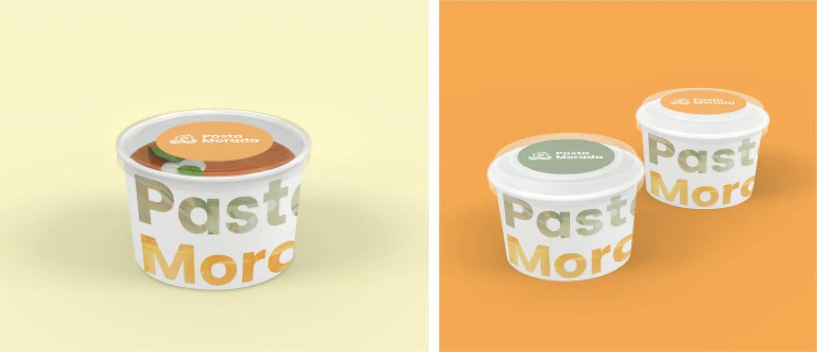
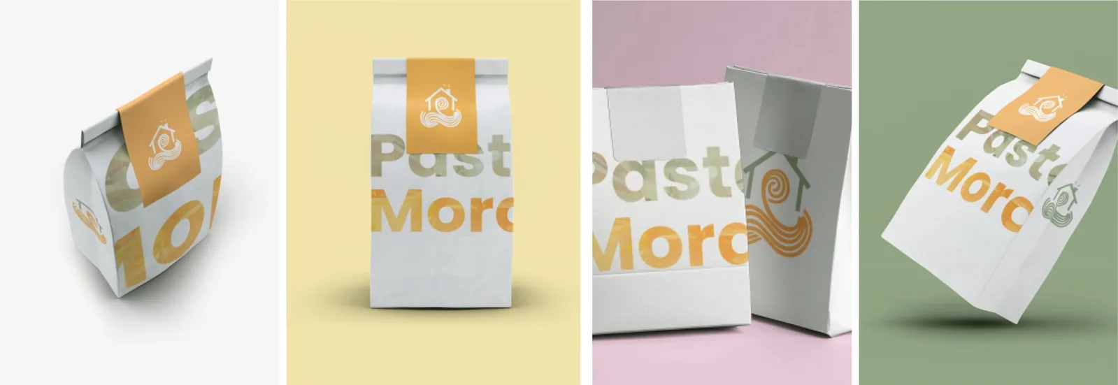
Mockups from the brand manual’s application pages, in sequence: tubs, bags, the menu, jars and the site.
Small takeaway tubs with the Pasta Morada wordmark, on cream and on orange.
The small tubs, from the brand manual’s mockups.
Paper delivery bags in cream, yellow, pink and sage backgrounds.
Delivery bags: the name, cropped large, wraps the paper.

02

A wide lockup with room around it

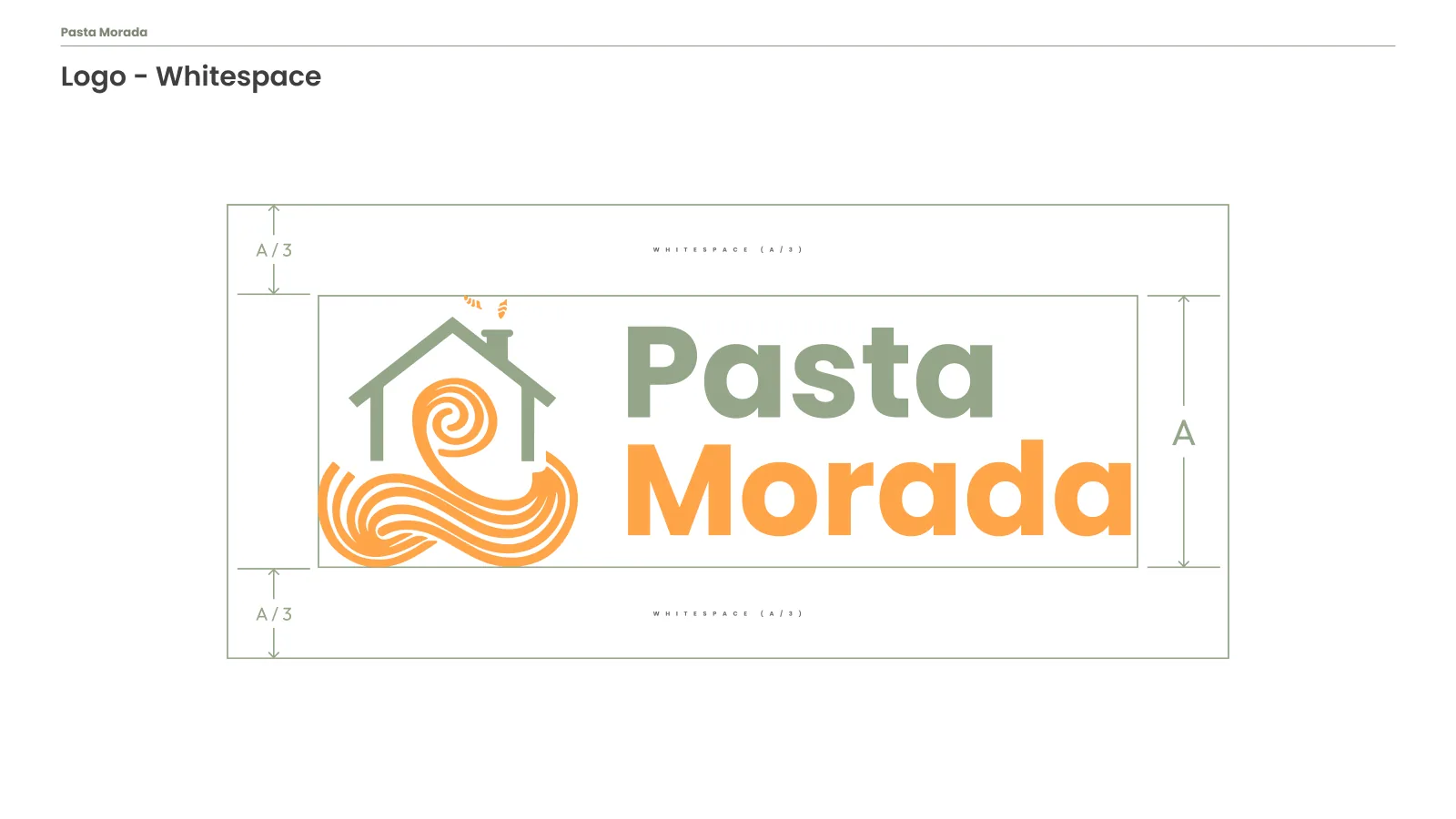
The full lockup places the symbol to the left of the name, with Pasta in sage and Morada in orange, so the two words repeat the colors of the house and the pasta. The whitespace slide sets a clear margin of a third of the logo’s height above and below it.
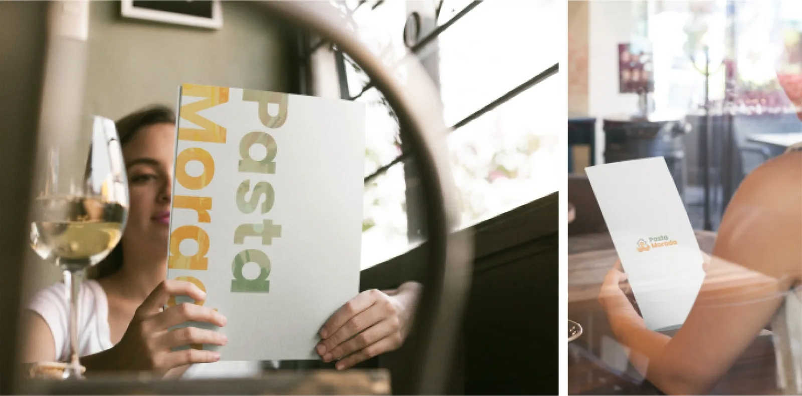
Printed menu with the large wordmark, held at a table.
The menu carries the same large wordmark to the table.
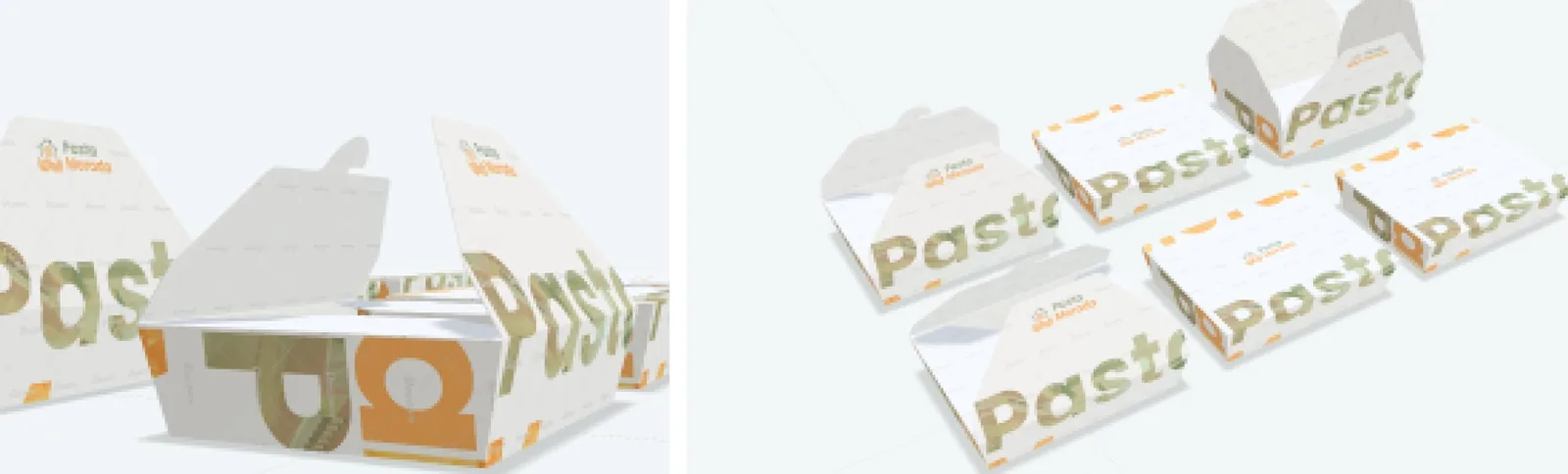
Takeaway trays and boxes with the wordmark.
Trays and boxes.

03

The name wraps the package

On takeaway packaging the wordmark grows until the edges crop it. Pasta in sage and Morada in orange run around the tubs, the delivery bags and the trays, so the name still reads when only part of it faces the customer.

These pieces are mockups from the manual’s application pages. They show how the brand behaves, not production photographs.
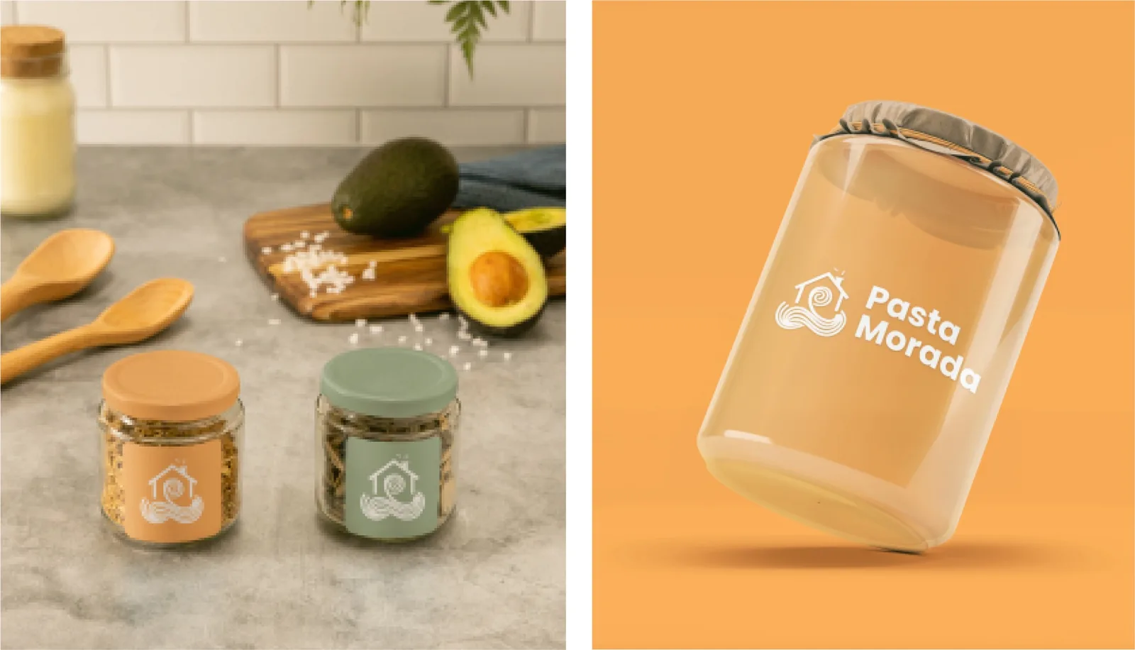
Glass jars with branded labels on a kitchen counter, and an orange jar mockup.
Glass jars for the shelf.
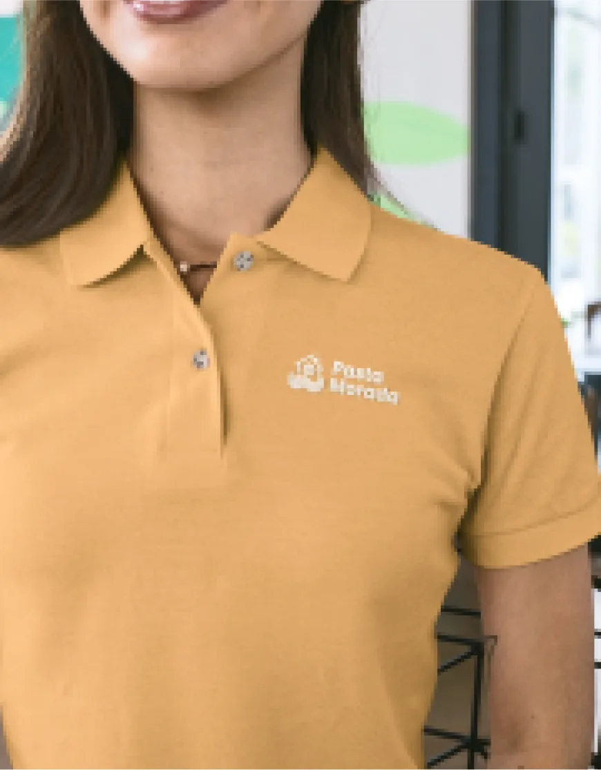
Orange polo shirt with the small logo on the chest.
The staff uniform.

04

Quieter at the table

Closer to the meal the mark gets smaller. The menu keeps the large wordmark, while the staff polo and the plates use only a small logo, and the photography direction leaves the pasta as the subject.
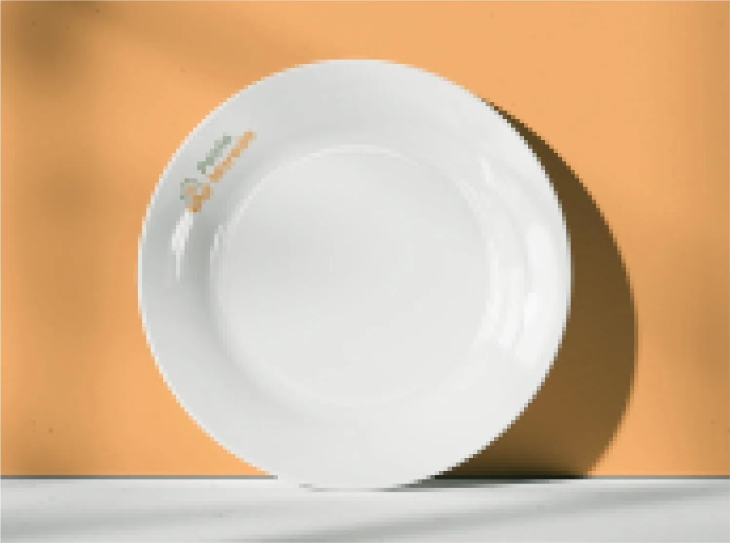
White plate with a discreet logo, on an orange backdrop.
On the plate, the mark steps back.
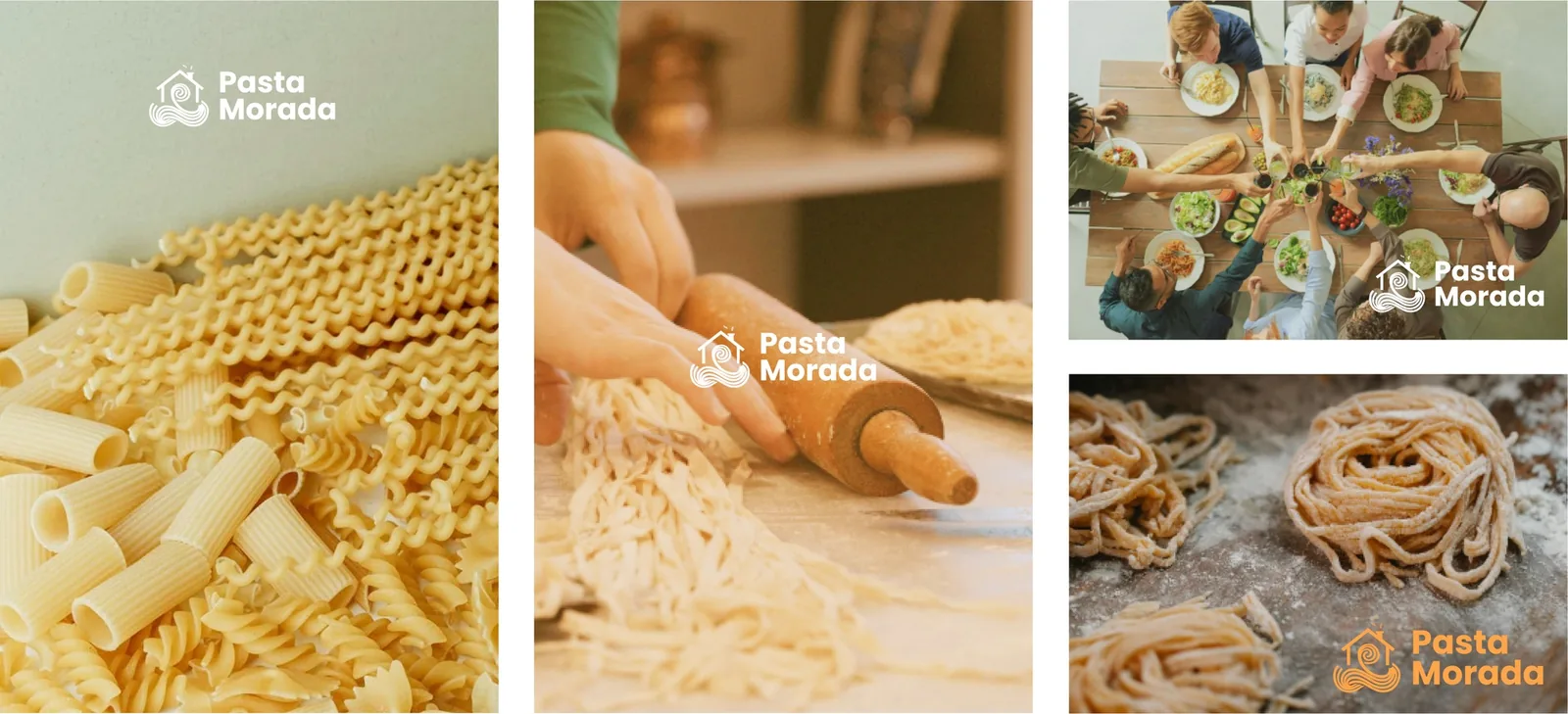
Photography direction: pasta shapes, dough being rolled and shared tables, with the mark over them.
Photography direction from the manual.

05

The same line on screen

The manual closes the applications with the site in tablet and phone, under the line “Onde cada sabor é uma história”.
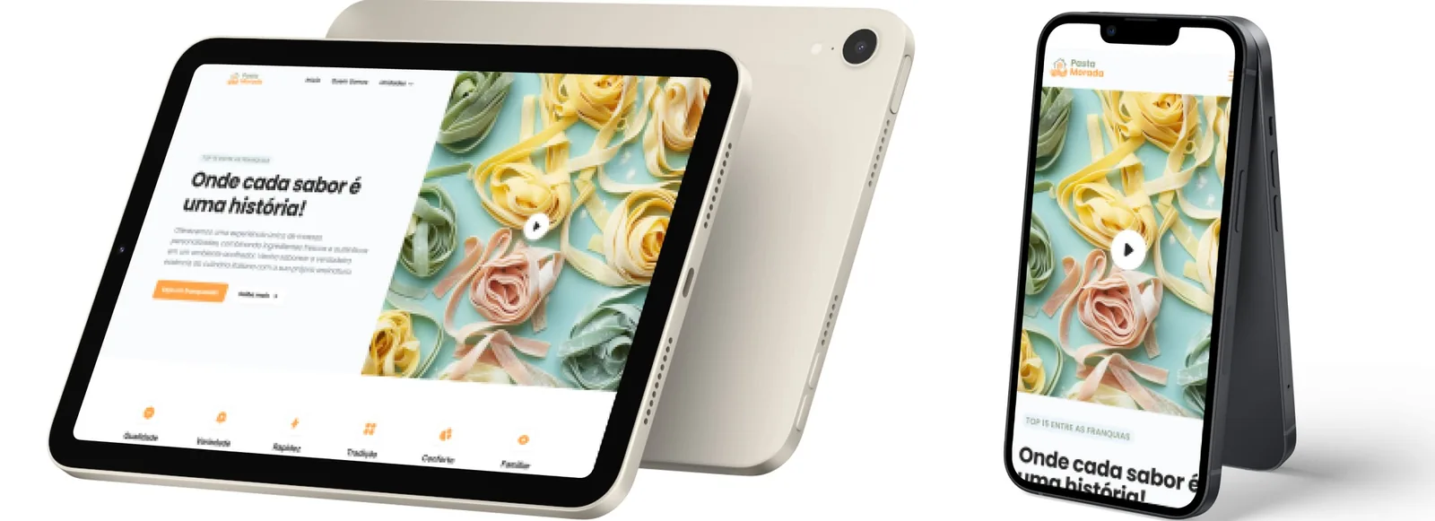
Tablet and phone mockups of the Pasta Morada site.
The site, from the manual’s applications.
Slide titled Logo - Whitespace: the horizontal logo inside a box of height A, with arrows marking a clear margin of A/3 above and below it.
Clear space around the lockup: a third of its height.
000

Instructions

Yan Fontão
Tap
Open a screen
Click
Open a screen
Drag
Look around the board
Wheel
Mouse zooms, trackpad moves, pinch zooms
− +
Pull back to see the whole board, or come closer
Arrows
In a case: ↑↓ change case, ←→ change media. On the board: move
Space
Open, or go back
Enter
Open
Esc Backspace
Back
Home
Back to the center, then the introduction
PgUp PgDn
Previous or next channel
Tab
Walk projects and links
R
Random project
0–9
Type a channel, 1–61
?
This page
Shortcuts

Music on the board

Files compressed and levelled for the web.

OPEN
TO WORK
Let’s talk

New message to Yan

Tell me who you are and I’ll get back to you.

000

About Yan

Hello, I’m Yan

Product Designer/ Design Engineer

Most products lose something between design and code. Mine don’t: I research the problem, design the product and ship the interface myself, so what you approve is exactly what your users get.

  • 2018started in software
  • UI + codedesign and implementation

Worked with Motorola · Ambev Tech · Rei do Pitaco · OneTool · CESAR

Brazil · Remote, hybrid or on-site

Portrait of Yan Fontão seated, in a green sweater and glasses, holding a microphone.
OPEN
TO WORK
Let’s talk
OPEN
TO WORK
Let’s talk
000

locked channel

Under NDA

Enter the code

Ask Yan for the code ↗
OPEN
TO WORK
Let’s talk
YAN FONTÃO Case studies

Channel 59 Brand identity

Pasta Morada

A brand identity for Pasta Morada in Manaus: a mark that puts a coil of pasta inside a house, carried onto tubs, bags, menus, uniforms and the site.

Contribution
Brand identity
Project status
Brand identity · Figma archive
A 3D bowl of pasta with a fork twirling in it.
A 3D object made for this board.

A house and a ribbon of pasta in one mark

Pages and application mockups from the original identity manual in Figma, marked V. 1.

My contribution

Morada means home, and the mark takes the name literally: a sage-green house with a chimney, and an orange ribbon of pasta that coils inside it and spills out below. The manual, marked V. 1, pairs it with the line “Onde cada sabor é uma história”, where every flavor is a story.

Mockups from the brand manual’s application pages, in sequence: tubs, bags, the menu, jars and the site.
Small takeaway tubs with the Pasta Morada wordmark, on cream and on orange.
The small tubs, from the brand manual’s mockups.
Paper delivery bags in cream, yellow, pink and sage backgrounds.
Delivery bags: the name, cropped large, wraps the paper.

A wide lockup with room around it

The full lockup places the symbol to the left of the name, with Pasta in sage and Morada in orange, so the two words repeat the colors of the house and the pasta. The whitespace slide sets a clear margin of a third of the logo’s height above and below it.

Printed menu with the large wordmark, held at a table.
The menu carries the same large wordmark to the table.
Takeaway trays and boxes with the wordmark.
Trays and boxes.

The name wraps the package

On takeaway packaging the wordmark grows until the edges crop it. Pasta in sage and Morada in orange run around the tubs, the delivery bags and the trays, so the name still reads when only part of it faces the customer.

These pieces are mockups from the manual’s application pages. They show how the brand behaves, not production photographs.

Glass jars with branded labels on a kitchen counter, and an orange jar mockup.
Glass jars for the shelf.
Orange polo shirt with the small logo on the chest.
The staff uniform.

Quieter at the table

Closer to the meal the mark gets smaller. The menu keeps the large wordmark, while the staff polo and the plates use only a small logo, and the photography direction leaves the pasta as the subject.

White plate with a discreet logo, on an orange backdrop.
On the plate, the mark steps back.
Photography direction: pasta shapes, dough being rolled and shared tables, with the mark over them.
Photography direction from the manual.

The same line on screen

The manual closes the applications with the site in tablet and phone, under the line “Onde cada sabor é uma história”.

Tablet and phone mockups of the Pasta Morada site.
The site, from the manual’s applications.
Slide titled Logo - Whitespace: the horizontal logo inside a box of height A, with arrows marking a clear margin of A/3 above and below it.
Clear space around the lockup: a third of its height.