Drag to explore. Scroll or pinch to zoom. Open Help for keyboard controls.

Yan
OPEN
TO WORK
Let’s talk
Yan Fontão Boring view
All work

Case 012Mobile app design

ShaktiGrid

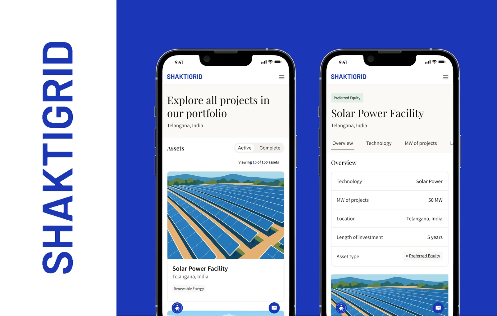
Mobile screens for browsing a portfolio of renewable-energy assets. Two screen types carry the work: a list of site cards and a detail page that sets out each asset's terms in a plain table.

Contribution
Interface design
Project status
Interface design · Figma archive
ShaktiGrid presentation cover from the original design file.
Presentation cover from the original file.

01

My contribution

ShaktiGrid shows a portfolio of renewable-energy assets on a phone. I designed two screen types, a list and a detail page, so this is a small case about getting from one to the other.

Every asset, figure and term on screen is sample data.
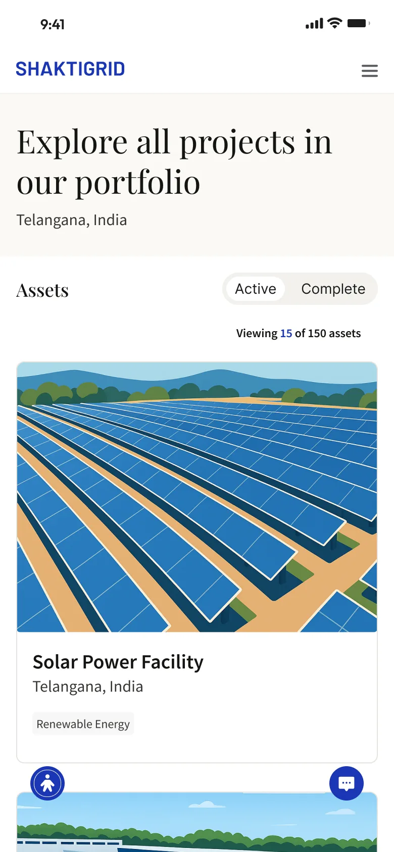
Assets list headed Explore all projects in our portfolio, with an Active and Complete switch, a count of 15 of 150 assets, and a card with a large illustration of rows of solar panels.
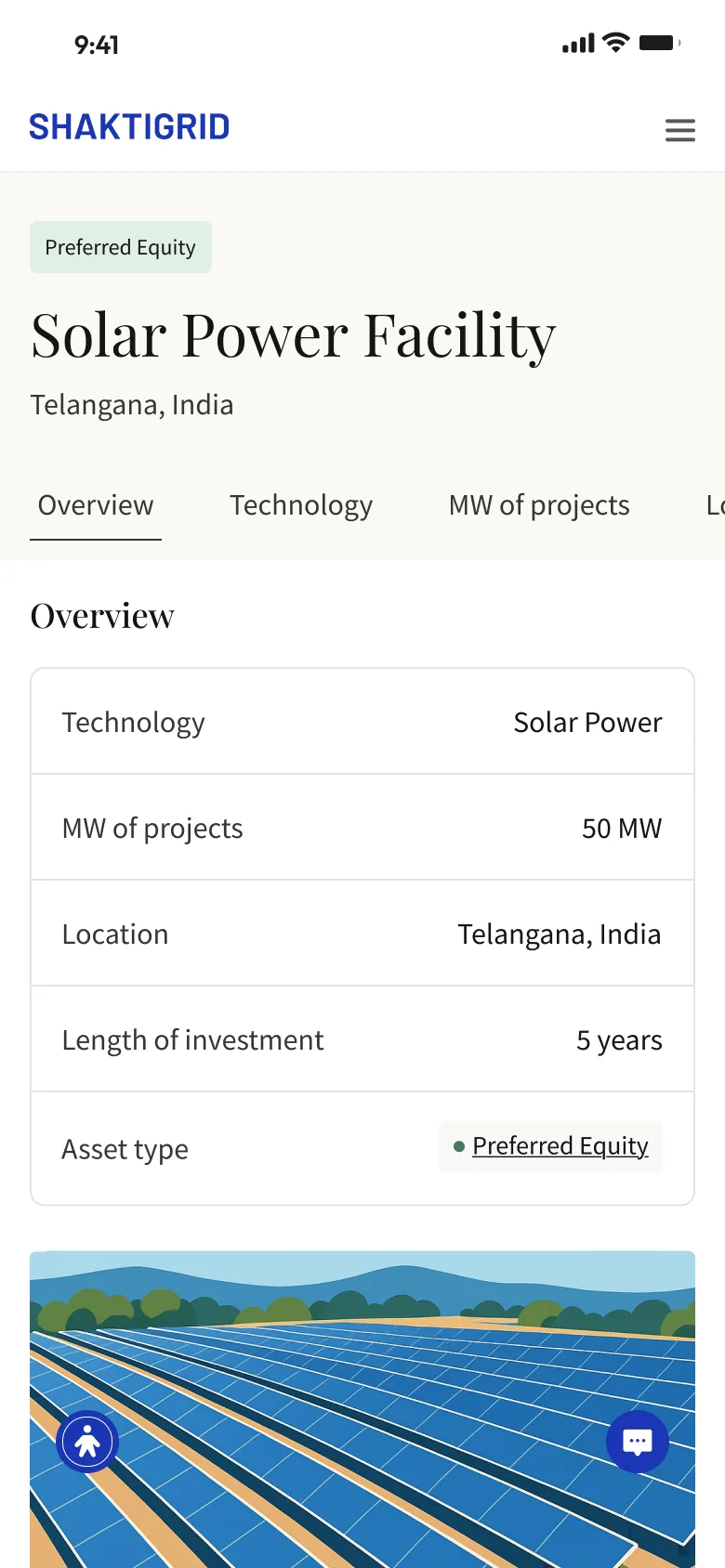
Detail page for a solar power facility in Telangana, India, with a Preferred Equity tag, a row of tabs, an overview table of five terms and the site illustration below.
Recorded from the Figma prototype. A project page, its menu, and the section tabs moving through the page. Assets: site cards with an Active and Complete switch. Sample data. Project detail: the asset's terms in a plain table. Sample data.

02

From a site card to its terms

The list opens with a serif headline, then an Active and Complete switch above a count of what is in view. Each card gives most of its area to an illustration of the site, with the name, location and a single tag underneath, so the place reads before the data does.

The detail page keeps the name and location at the top and moves the terms into a table: technology, MW of projects, location, length of investment and asset type. One label and one value per row make it quick to scan, and a row of tabs above runs past the edge of the screen to the other topics.

The same detail page with a solid blue header running up into the status bar and the wordmark in white.
Header version: solid blue up to the status bar, with the structure unchanged.

03

Two headers, one structure

Both screens exist in two versions: a white header with the blue wordmark, or solid blue running up into the status bar. Everything below the header stays the same, with serif titles for what the asset is and a plain sans for its details. Two floating buttons, one for accessibility and one for chat, stay at the bottom of the screen in both.

000

Instructions

Yan Fontão
Tap
Open a screen
Click
Open a screen
Drag
Look around the board
Wheel
Mouse zooms, trackpad moves, pinch zooms
− +
Pull back to see the whole board, or come closer
Arrows
In a case: ↑↓ change case, ←→ change media. On the board: move
Space
Open, or go back
Enter
Open
Esc Backspace
Back
Home
Back to the center, then the introduction
PgUp PgDn
Previous or next channel
Tab
Walk projects and links
R
Random project
0–9
Type a channel, 1–61
?
This page
Shortcuts

Music on the board

Files compressed and levelled for the web.

OPEN
TO WORK
Let’s talk

New message to Yan

Tell me who you are and I’ll get back to you.

000

About Yan

Hello, I’m Yan

Product Designer/ Design Engineer

Most products lose something between design and code. Mine don’t: I research the problem, design the product and ship the interface myself, so what you approve is exactly what your users get.

  • 2018started in software
  • UI + codedesign and implementation

Worked with Motorola · Ambev Tech · Rei do Pitaco · OneTool · CESAR

Brazil · Remote, hybrid or on-site

Portrait of Yan Fontão seated, in a green sweater and glasses, holding a microphone.
OPEN
TO WORK
Let’s talk
OPEN
TO WORK
Let’s talk
000

locked channel

Under NDA

Enter the code

Ask Yan for the code ↗
OPEN
TO WORK
Let’s talk
YAN FONTÃO Case studies

Channel 12 Mobile app design

ShaktiGrid

Mobile screens for browsing a portfolio of renewable-energy assets. Two screen types carry the work: a list of site cards and a detail page that sets out each asset's terms in a plain table.

Contribution
Interface design
Project status
Interface design · Figma archive
ShaktiGrid presentation cover from the original design file.
Presentation cover from the original file.

Renewable-energy assets, one card at a time

Screens from the original Figma design file, with sample data.

My contribution

ShaktiGrid shows a portfolio of renewable-energy assets on a phone. I designed two screen types, a list and a detail page, so this is a small case about getting from one to the other.

Every asset, figure and term on screen is sample data.
Recorded from the Figma prototype. A project page, its menu, and the section tabs moving through the page.
Assets list headed Explore all projects in our portfolio, with an Active and Complete switch, a count of 15 of 150 assets, and a card with a large illustration of rows of solar panels.
Assets: site cards with an Active and Complete switch. Sample data.

From a site card to its terms

The list opens with a serif headline, then an Active and Complete switch above a count of what is in view. Each card gives most of its area to an illustration of the site, with the name, location and a single tag underneath, so the place reads before the data does.

The detail page keeps the name and location at the top and moves the terms into a table: technology, MW of projects, location, length of investment and asset type. One label and one value per row make it quick to scan, and a row of tabs above runs past the edge of the screen to the other topics.
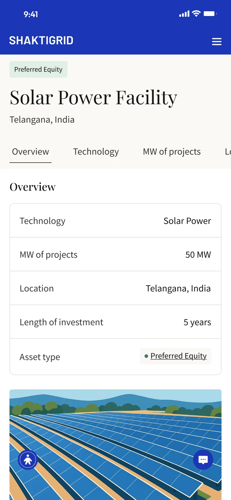
Detail page for a solar power facility in Telangana, India, with a Preferred Equity tag, a row of tabs, an overview table of five terms and the site illustration below.
Project detail: the asset's terms in a plain table. Sample data.

Two headers, one structure

Both screens exist in two versions: a white header with the blue wordmark, or solid blue running up into the status bar. Everything below the header stays the same, with serif titles for what the asset is and a plain sans for its details. Two floating buttons, one for accessibility and one for chat, stay at the bottom of the screen in both.

The same detail page with a solid blue header running up into the status bar and the wordmark in white.
Header version: solid blue up to the status bar, with the structure unchanged.