Drag to explore. Scroll or pinch to zoom. Open Help for keyboard controls.

Yan
OPEN
TO WORK
Let’s talk
Yan Fontão Boring view
All work

Case 002Web app and dashboard design

Rei do Pitaco

The sign-up flow of a waitlist for a betting product: choosing how to enter, giving details over short steps and confirming the email.

Contribution
Product flows and interface design
Project status
Interface design · Figma archive
Rei do Pitaco logo on a black disc.
The logo.

01

My contribution

I worked at Rei do Pitaco as a Product Designer from March to October 2022, on its fantasy game and on the launch of a new betting product. That meant UX and UI design, interaction design, usability testing, heuristic evaluation, UX research and product discovery.

This case follows the waitlist of the betting product, from the plan to the logged area. The user research behind it is a separate case, under code.

A scroll through the design: the waitlist page, from the prizes to how points work.
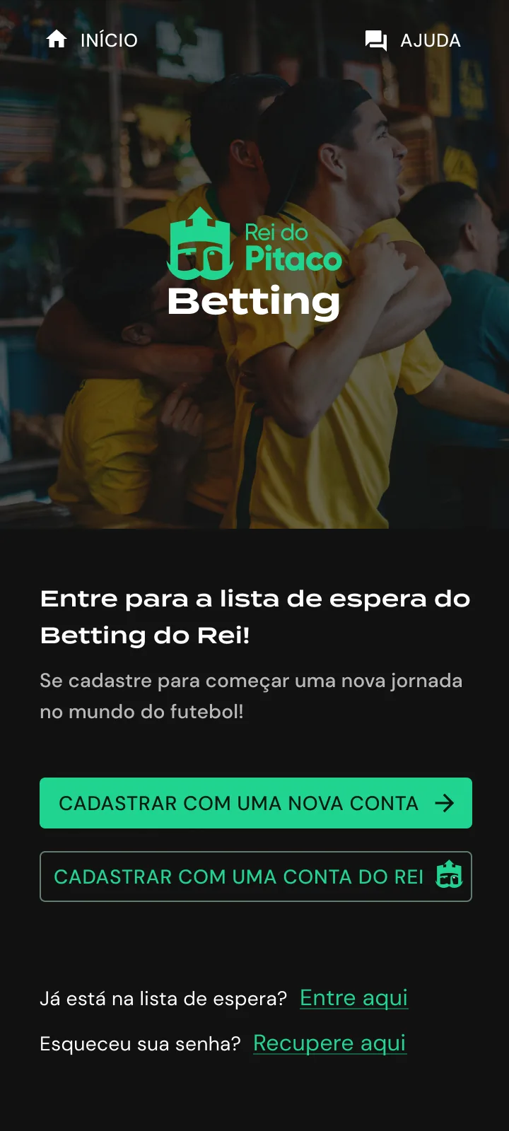
Phone screen with a photo of football fans in yellow shirts, the Rei do Pitaco Betting logo, two sign-up buttons and links to log in or recover a password.
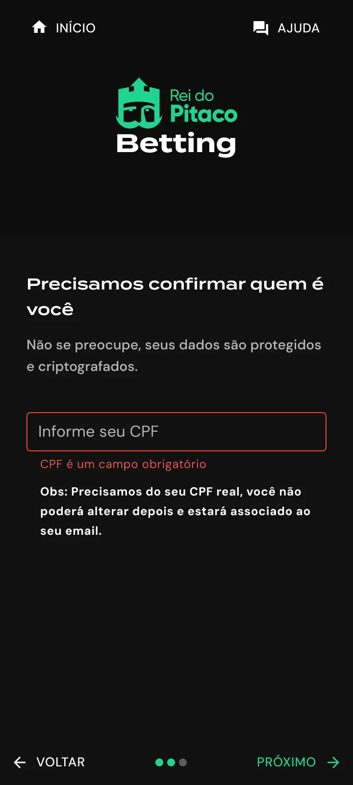
Dark phone screen asking for a CPF, with an empty field outlined in red, a required-field error, a note below it and Back and Next controls.
Recorded from the Figma prototype. The sign-up, one question at a time. An example email is blurred. The first sign-up screen separates a new account from an existing one. The identity step shows its error in place, with the field left empty.

02

Mapping the launch before drawing it

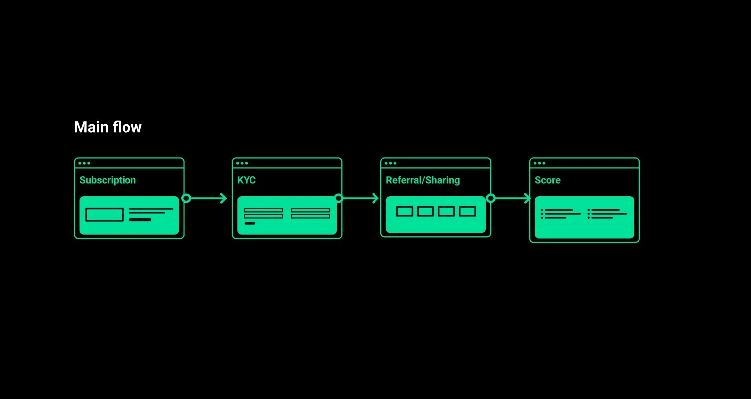
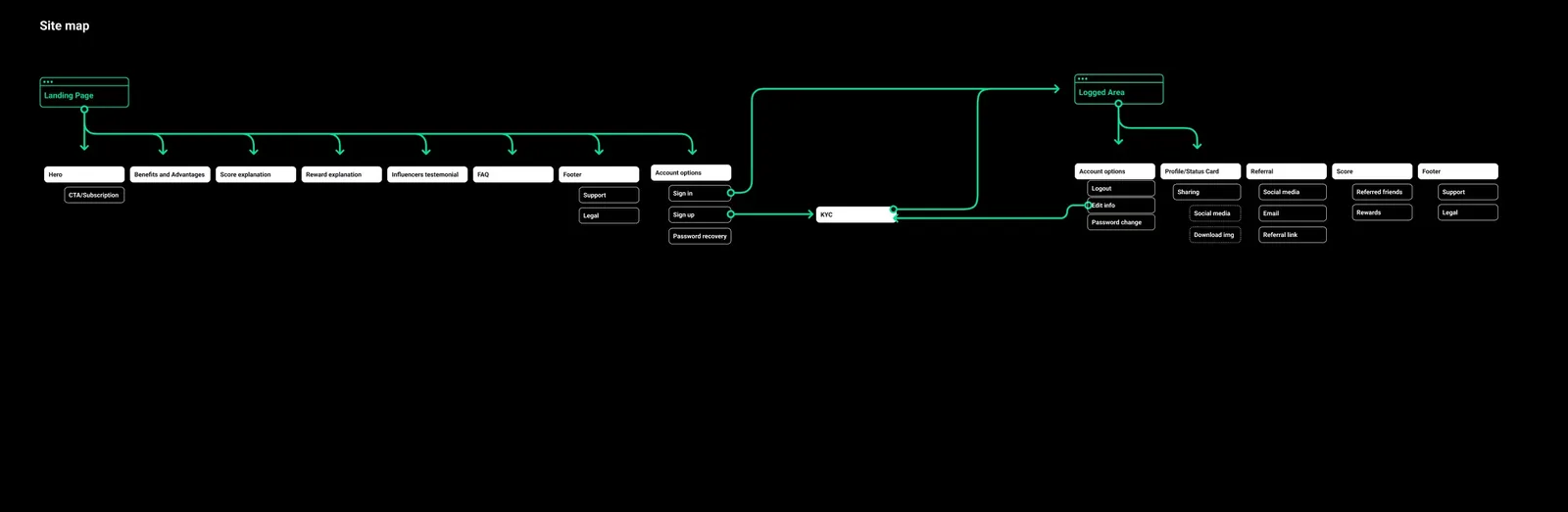
The work started as structure: a sitemap for the waitlist and a main flow in four stages. Subscription brings the person in, KYC confirms who they are, referral and sharing bring others along, and the score shows where they stand. Every screen that followed had to serve one of those stages.

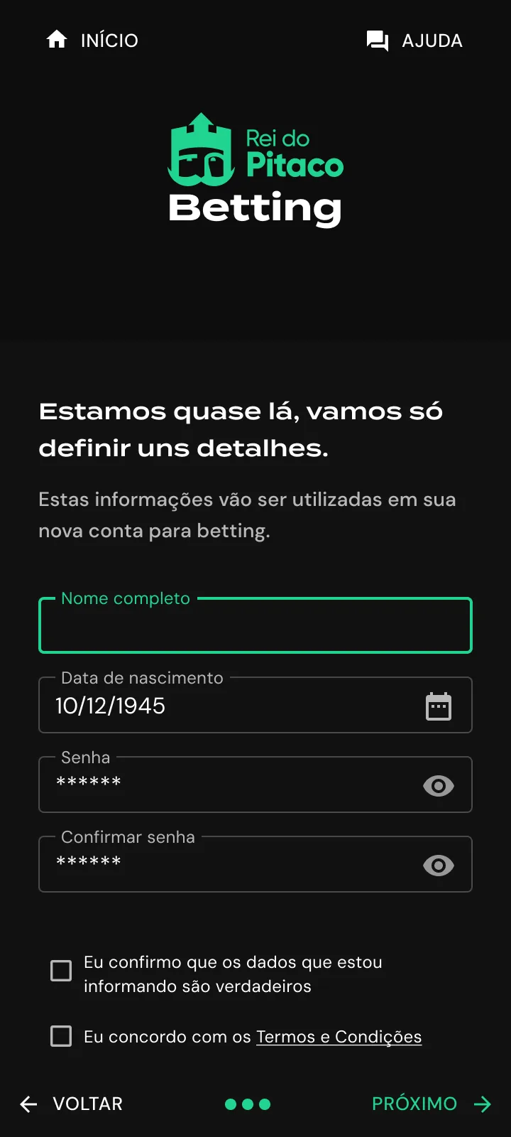
Dark phone screen with fields for full name, date of birth, password and password confirmation, two confirmation checkboxes and Back and Next controls.
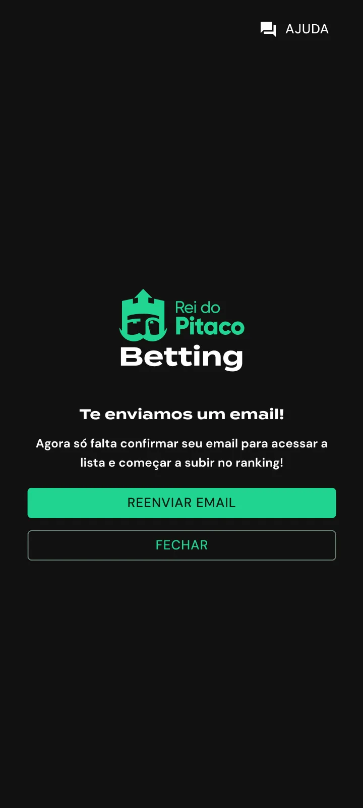
Dark phone screen with the logo, a message saying an email was sent, a green resend button and an outlined close button.
The last step gathers account details and two confirmations. The date shown is a sample. After sign-up, the flow asks for email confirmation and offers to resend the message.

03

Two ways in, one step at a time

The first screen separates two situations: creating a new account or using an existing Rei do Pitaco account. People coming back get their own links below those buttons, one to log in and another to recover a password.

Each later step keeps the same structure: logo at the top, one heading, the fields for that step, and Back and Next at the bottom around three progress dots. The CPF step shows the required-field error in place, with a note below it explaining that the number cannot be changed later. After the last step, the flow reduces to one message and two actions: resend the email or close.

Main flow: subscription, KYC, referral and sharing, and score.
The main flow, in four stages.

04

A waitlist that explains the prize

The landing page announces the new betting product with one line, “O betting do Rei vem aí!”, and one action: leave an email and join the list. Everything below it answers why that is worth doing, starting with more than R$ 1 million in prizes.

Prize tiers, how points work and a short FAQ come in that order, so the page settles the money question before it asks for anything else.

Sitemap of the waitlist.
The sitemap of the waitlist.

05

After signing up, a countdown

Once inside, the logged area keeps the launch present: days left, a prize ladder and the state of the account’s verification. The file holds both verified and unverified versions, so someone who stopped halfway can see what is missing.

The sign-up itself asks one thing per screen, from email to name and birth date, then CPF, with a plain note explaining why that number is needed.

Logged area with the ranking position, points and the verification checklist.
The logged area for an unverified account. Sample name and prizes hidden.
000

Instructions

Yan Fontão
Tap
Open a screen
Click
Open a screen
Drag
Look around the board
Wheel
Mouse zooms, trackpad moves, pinch zooms
− +
Pull back to see the whole board, or come closer
Arrows
In a case: ↑↓ change case, ←→ change media. On the board: move
Space
Open, or go back
Enter
Open
Esc Backspace
Back
Home
Back to the center, then the introduction
PgUp PgDn
Previous or next channel
Tab
Walk projects and links
R
Random project
0–9
Type a channel, 1–61
?
This page
Shortcuts

Music on the board

Files compressed and levelled for the web.

OPEN
TO WORK
Let’s talk

New message to Yan

Tell me who you are and I’ll get back to you.

000

About Yan

Hello, I’m Yan

Product Designer/ Design Engineer

Most products lose something between design and code. Mine don’t: I research the problem, design the product and ship the interface myself, so what you approve is exactly what your users get.

  • 2018started in software
  • UI + codedesign and implementation

Worked with Motorola · Ambev Tech · Rei do Pitaco · OneTool · CESAR

Brazil · Remote, hybrid or on-site

Portrait of Yan Fontão seated, in a green sweater and glasses, holding a microphone.
OPEN
TO WORK
Let’s talk
OPEN
TO WORK
Let’s talk
000

locked channel

Under NDA

Enter the code

Ask Yan for the code ↗
OPEN
TO WORK
Let’s talk
YAN FONTÃO Case studies

Channel 02 Web app and dashboard design

Rei do Pitaco

The sign-up flow of a waitlist for a betting product: choosing how to enter, giving details over short steps and confirming the email.

Contribution
Product flows and interface design
Project status
Interface design · Figma archive
Rei do Pitaco logo on a black disc.
The logo.

A waitlist with short steps

Screens from the original Figma design files, with sample data.

My contribution

I worked at Rei do Pitaco as a Product Designer from March to October 2022, on its fantasy game and on the launch of a new betting product. That meant UX and UI design, interaction design, usability testing, heuristic evaluation, UX research and product discovery.

This case follows the waitlist of the betting product, from the plan to the logged area. The user research behind it is a separate case, under code.
Recorded from the Figma prototype. The sign-up, one question at a time. An example email is blurred.

Mapping the launch before drawing it

The work started as structure: a sitemap for the waitlist and a main flow in four stages. Subscription brings the person in, KYC confirms who they are, referral and sharing bring others along, and the score shows where they stand. Every screen that followed had to serve one of those stages.
Main flow: subscription, KYC, referral and sharing, and score.
The main flow, in four stages.
Sitemap of the waitlist.
The sitemap of the waitlist.

Two ways in, one step at a time

The first screen separates two situations: creating a new account or using an existing Rei do Pitaco account. People coming back get their own links below those buttons, one to log in and another to recover a password.

Each later step keeps the same structure: logo at the top, one heading, the fields for that step, and Back and Next at the bottom around three progress dots. The CPF step shows the required-field error in place, with a note below it explaining that the number cannot be changed later. After the last step, the flow reduces to one message and two actions: resend the email or close.
Phone screen with a photo of football fans in yellow shirts, the Rei do Pitaco Betting logo, two sign-up buttons and links to log in or recover a password.
The first sign-up screen separates a new account from an existing one.
Dark phone screen asking for a CPF, with an empty field outlined in red, a required-field error, a note below it and Back and Next controls.
The identity step shows its error in place, with the field left empty.
Dark phone screen with fields for full name, date of birth, password and password confirmation, two confirmation checkboxes and Back and Next controls.
The last step gathers account details and two confirmations. The date shown is a sample.
Dark phone screen with the logo, a message saying an email was sent, a green resend button and an outlined close button.
After sign-up, the flow asks for email confirmation and offers to resend the message.

A waitlist that explains the prize

The landing page announces the new betting product with one line, “O betting do Rei vem aí!”, and one action: leave an email and join the list. Everything below it answers why that is worth doing, starting with more than R$ 1 million in prizes.

Prize tiers, how points work and a short FAQ come in that order, so the page settles the money question before it asks for anything else.
A scroll through the design: the waitlist page, from the prizes to how points work.

After signing up, a countdown

Once inside, the logged area keeps the launch present: days left, a prize ladder and the state of the account’s verification. The file holds both verified and unverified versions, so someone who stopped halfway can see what is missing.

The sign-up itself asks one thing per screen, from email to name and birth date, then CPF, with a plain note explaining why that number is needed.
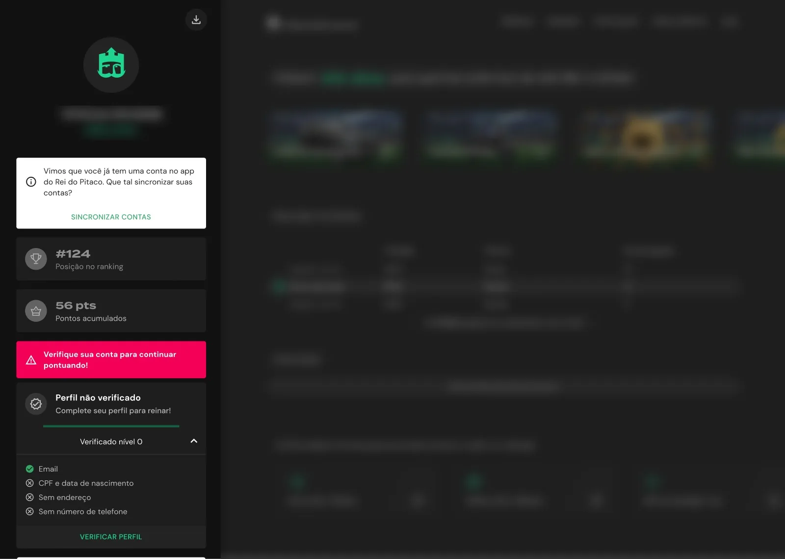
Logged area with the ranking position, points and the verification checklist.
The logged area for an unverified account. Sample name and prizes hidden.