Case 036Web app and dashboard design
Autopost.ai
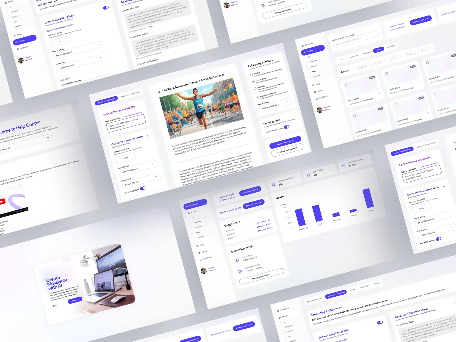
Interface design for a web app that generates articles with AI for WordPress sites, covering the dashboard, setup, the article editor and light and dark modes.
- Contribution
- Product flows and interface design
- Project status
- Interface design · Figma and Dribbble archive
01
My contribution
Autopost.ai is an English web app for generating articles with AI and preparing them for a WordPress site. My work here covers the interface from the first setup to the screen where an article gets reviewed and scheduled.
The Dribbble shot titled AI Content and SEO Generator shows the same product, so its screens are folded into this case. Usage figures, names and article titles are sample data.
02
Bring plan and usage into view
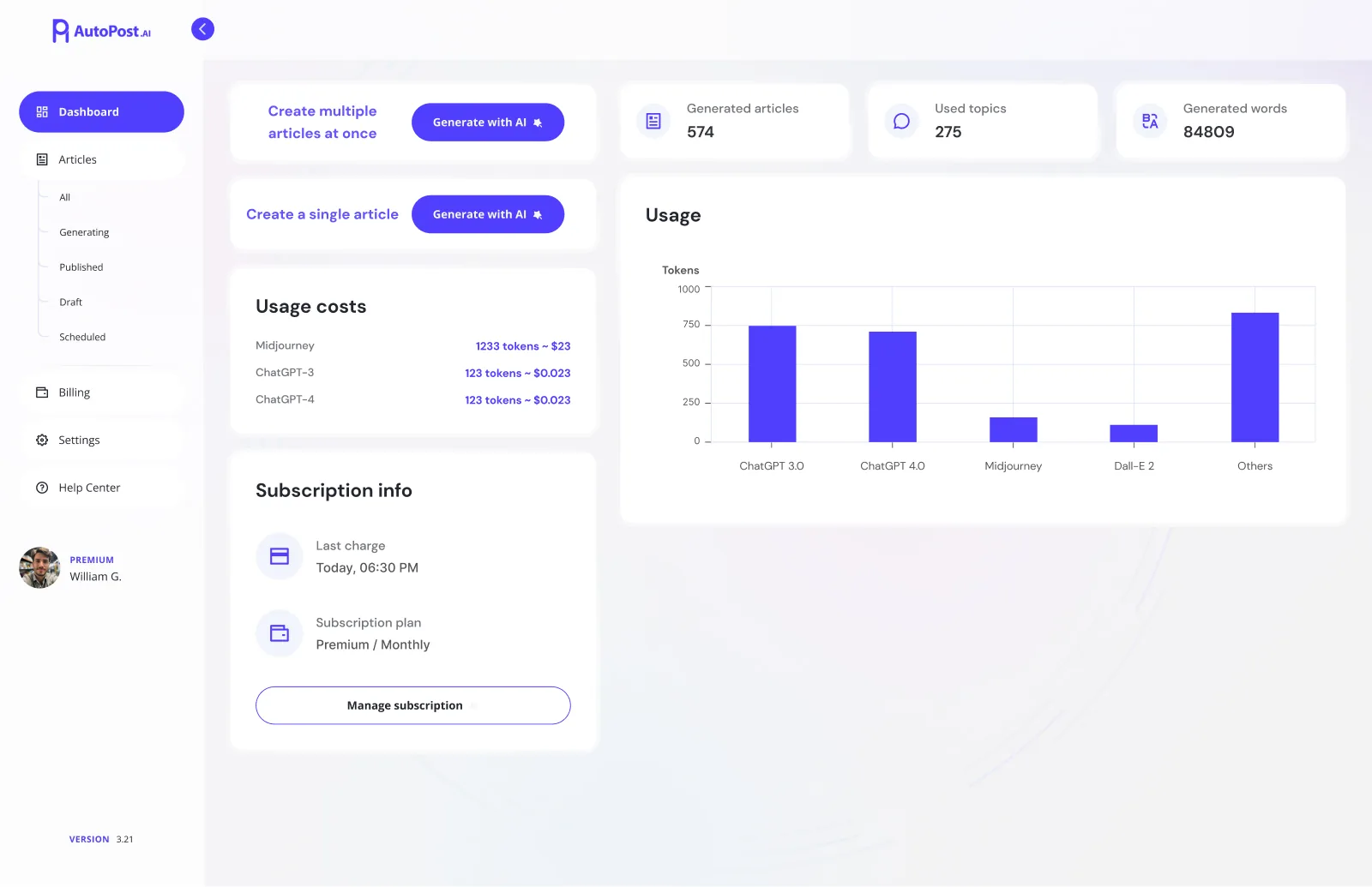
The dashboard starts with the two things someone comes to do: create several articles at once or create a single one. Both sit at the top of the first column with the same Generate with AI button, while counters for articles, topics and words run across the top of the second.
Below them, usage costs per model, subscription details and a chart of tokens by model answer the question that comes with any paid AI tool: how much has been used so far. Manage subscription sits with the plan, so a check can turn into an action on the same screen.
03
Connect the models first
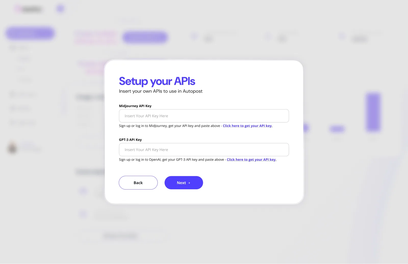
Setup happens over the blurred dashboard, so the product is already in sight behind the form. The Setup your APIs step asks for one key each for Midjourney and GPT-3. Under each field, a single line says where to sign in and links to the key, and Back and Next keep the step inside a sequence.
04
Review before it goes out
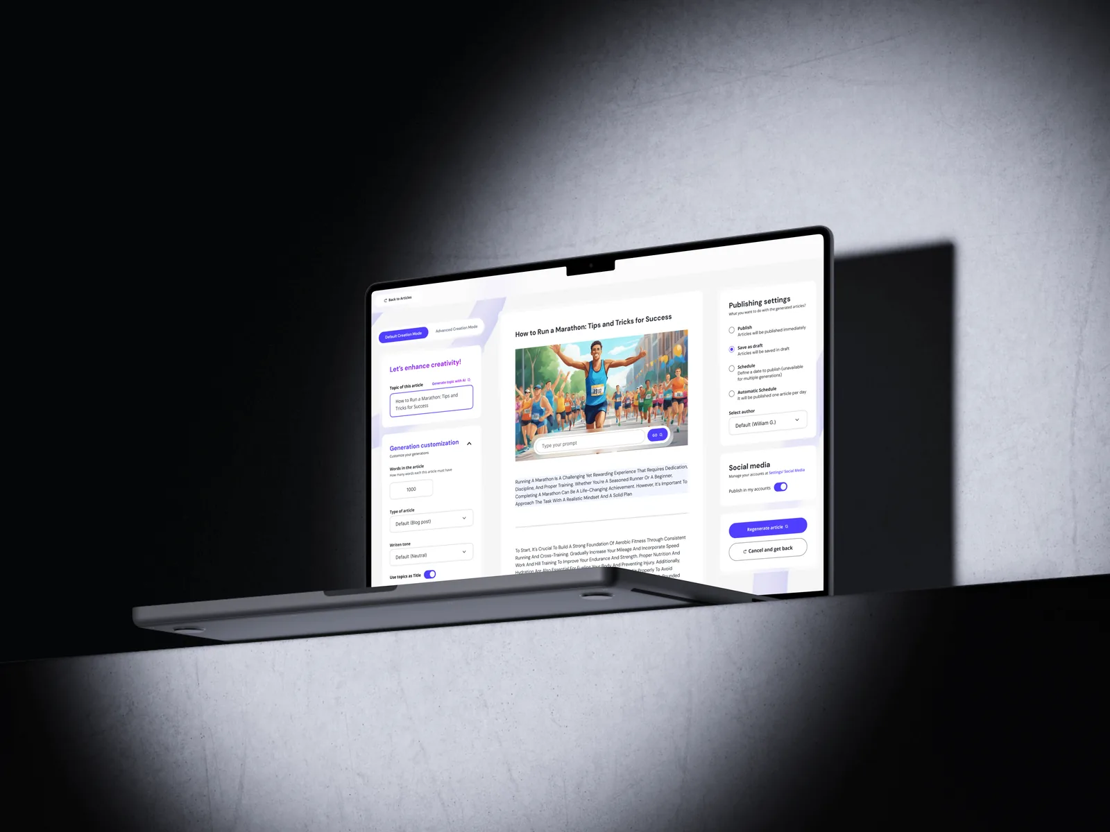
The article editor has three columns. The left one holds the topic and the generation settings, such as word count, article type and tone. The centre shows the generated article with its image. The right one decides what happens next: publish, save as draft, schedule or schedule automatically, with a choice of author, social accounts and a button to regenerate.
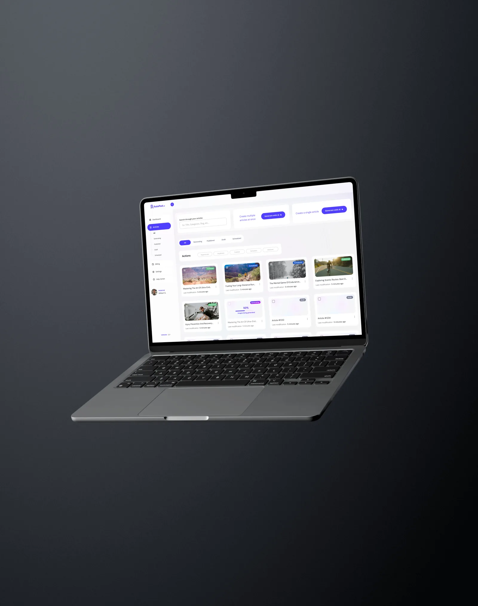
Back in the list, tabs and labels separate published, scheduled, draft and generating articles, and an article still generating shows its progress on the card.
05
Explore both surface treatments
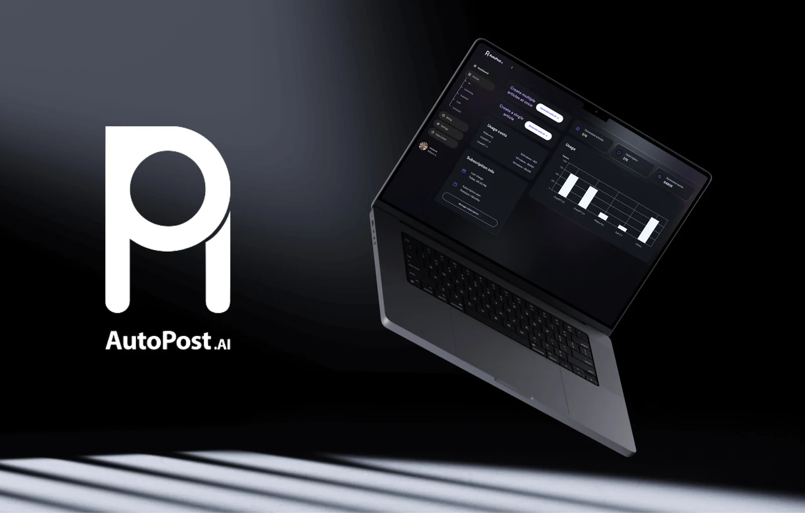
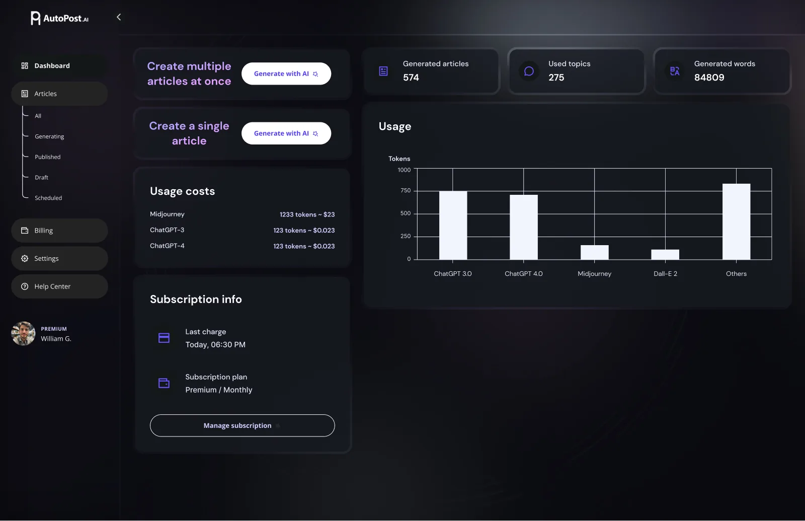
The screens exist in light and dark. The layout stays the same while the emphasis moves: in dark mode the buttons turn white, the headings go lilac and the chart bars turn pale, so the indigo of the light version does not have to carry the contrast on its own.