Drag to explore. Scroll or pinch to zoom. Open Help for keyboard controls.

Yan
OPEN
TO WORK
Let’s talk
Yan Fontão Boring view
All work

Case 007Mobile app and landing page

Hidratasport

A training and nutrition tracking app, shown on screen as Hidrata, with macros, workouts, supplementation and AI analysis, plus the landing page that presents it. All figures are sample data.

Contribution
Product flows and interface design
Project status
Interface design · Figma archive
Hidrata presentation cover from the original design file.
Presentation cover from the original file.

01

My contribution

Hidratasport appears on screen as Hidrata, a Portuguese-language app made to support training and nutrition. The app file is organised by flow, from first use and paywall through home, workouts, logging, ranking and profile, and a second file holds the landing page. Here I show the app’s daily screens and the page that presents them.
A scroll through the design: the landing page, from the app in hand to the PRO plan.
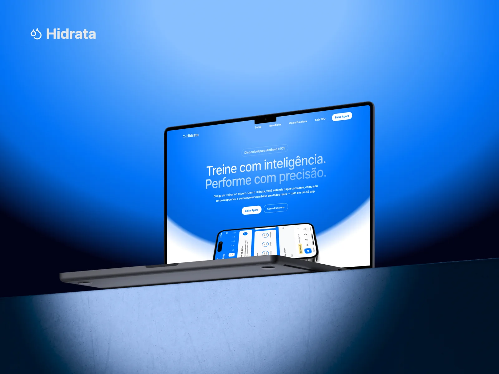
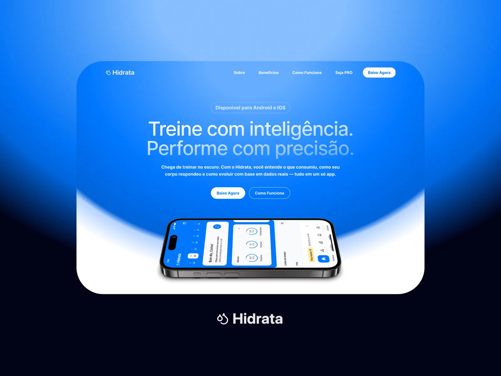
The landing page hero on a rounded panel over a blue and black gradient, with the headline, two buttons and a phone lying flat, above the Hidrata logo.
The landing page hero and the Hidrata mark.

02

Two versions of the same morning

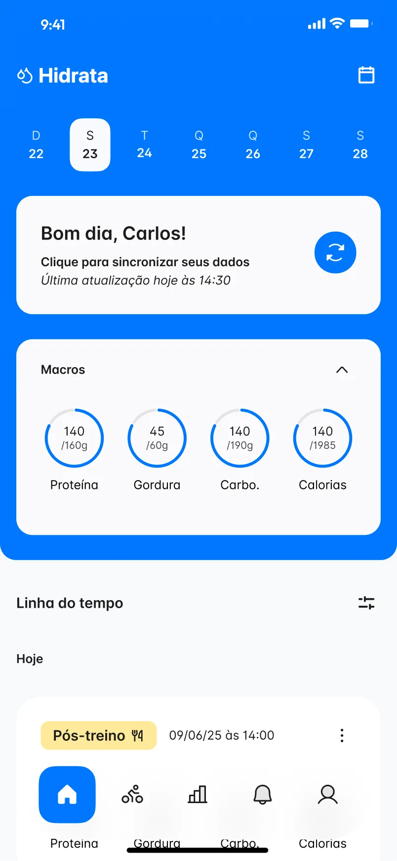
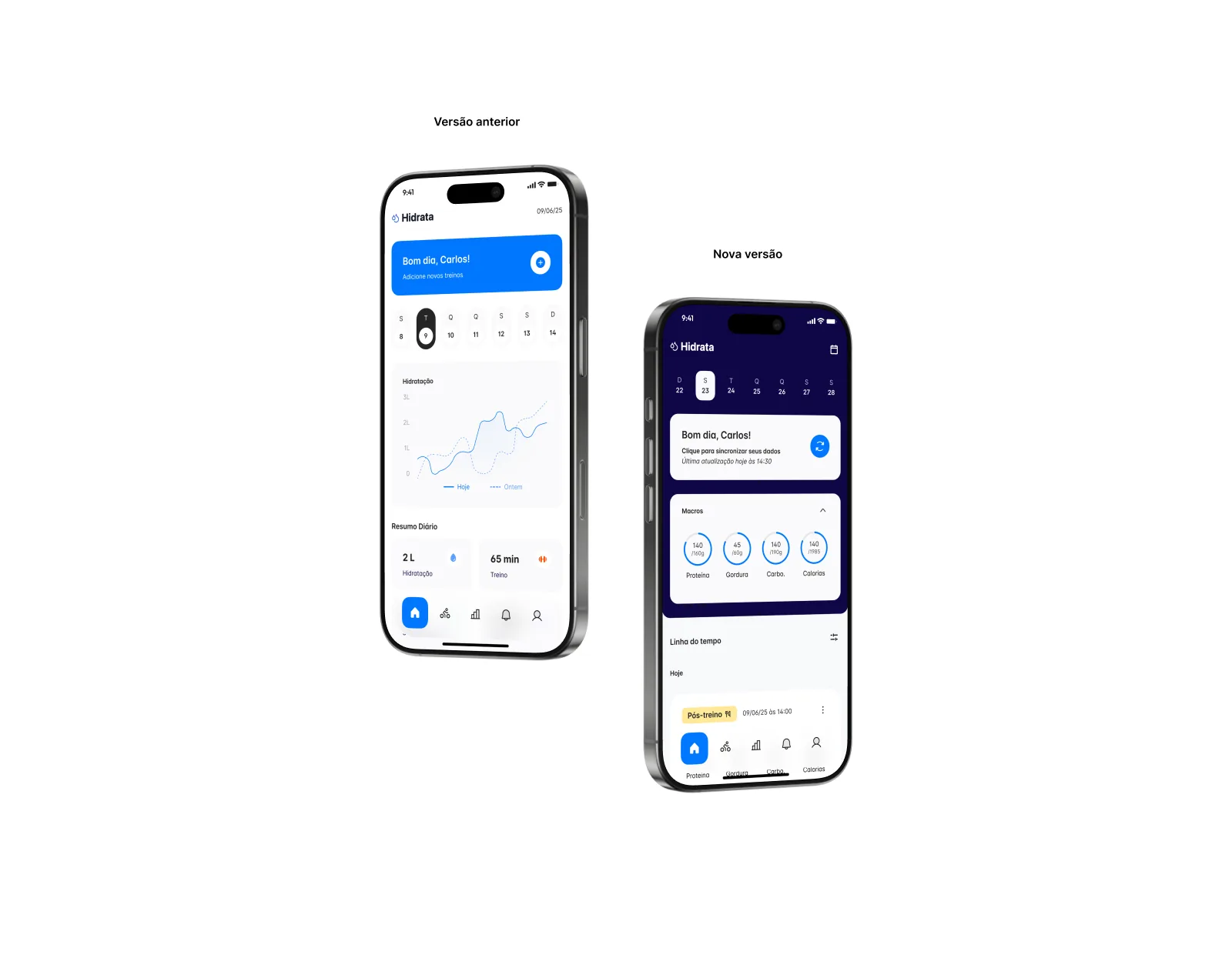
The file keeps an earlier home beside a newer one, and the difference is a change of priority. The earlier version led with a hydration chart and daily totals. The newer one puts data sync first, then macro rings for protein, fat, carbs and calories against their daily targets, and turns the rest of the page into a timeline of the day with tags such as Pós-treino.
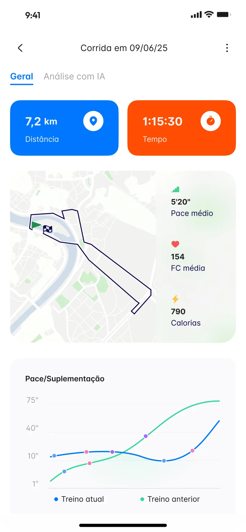
Run detail screen with distance and time tiles, a route on a map, pace, heart rate and calories, and a chart comparing the current and previous workout.
Home screen with a blue header, the Hidrata logo, a week strip, a sync card greeting Carlos, macro rings and the start of a timeline.
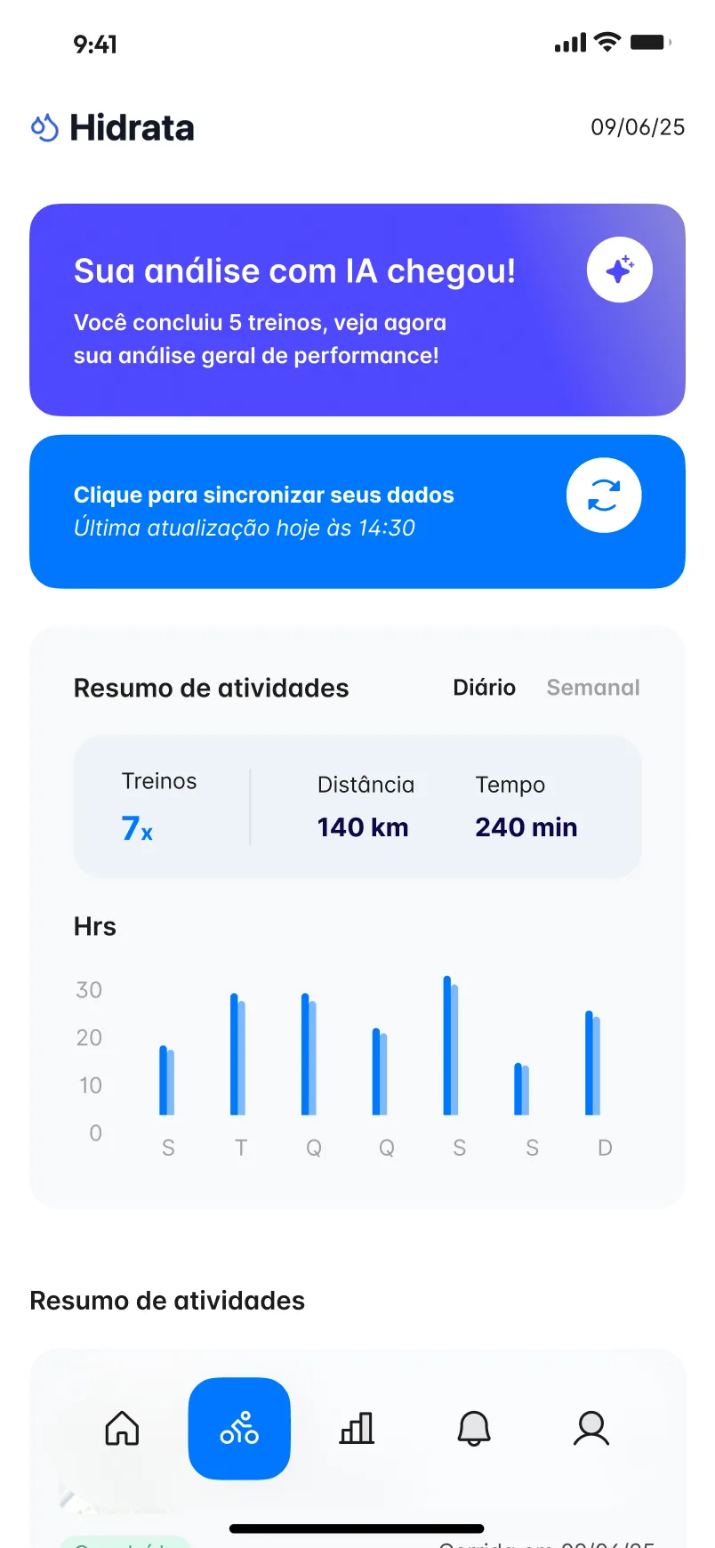
Activity screen with an AI analysis banner, a sync card, an activity summary and a bar chart of hours by weekday.
A workout page with route, pace, heart rate and a comparison chart. Home leads with data sync, macro rings and the day’s timeline. Activity summary by day or week, with a banner for AI analysis.

03

One run, read in layers

A workout page starts with distance and time in two large tiles, then the route on a map with pace, heart rate and calories beside it. Lower down, a chart lays the current workout over the previous one, with markers along the lines. The AI analysis has its own tab, so the plain numbers stay uncluttered.

The activity screen works at a wider scale: a daily or weekly summary of workouts, distance and time above a bar chart, with a banner when a new AI analysis is ready.

Two phones side by side, labelled Versão anterior and Nova versão, comparing an earlier home with a chart to a newer one with macro rings.
An earlier home beside the newer version in the Figma file.

04

A landing page that explains by showing

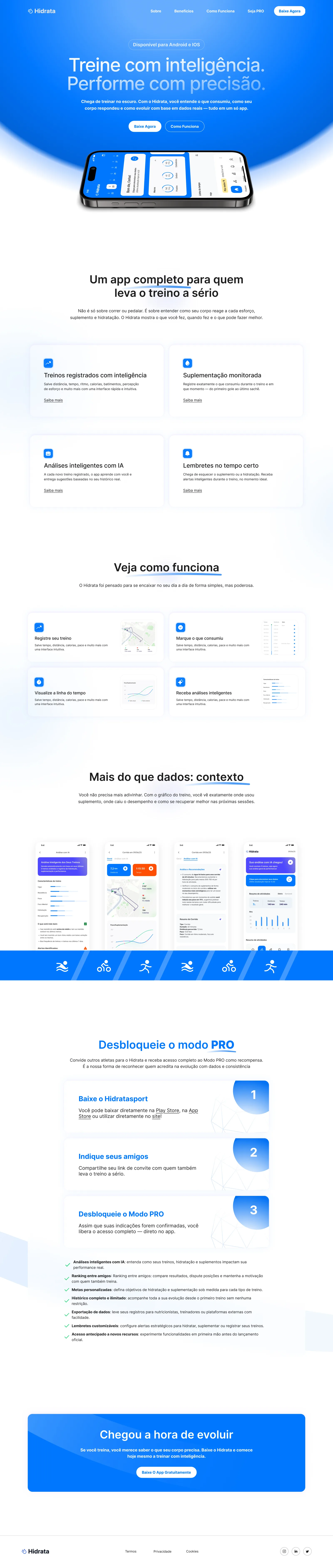
The landing page opens on “Treine com inteligência. Performe com precisão.” over the blue of the app, with the home screen on a phone below the headline. From there it moves through the main features, how the app fits into a routine, real screens under “Mais do que dados: contexto”, and three steps to unlock the PRO mode by inviting friends.

Full landing page: blue hero with the app on a phone, feature cards, a how-it-works block, app screens and a three-step PRO section.
The full landing page, from the hero to the PRO steps.
000

Instructions

Yan Fontão
Tap
Open a screen
Click
Open a screen
Drag
Look around the board
Wheel
Mouse zooms, trackpad moves, pinch zooms
− +
Pull back to see the whole board, or come closer
Arrows
In a case: ↑↓ change case, ←→ change media. On the board: move
Space
Open, or go back
Enter
Open
Esc Backspace
Back
Home
Back to the center, then the introduction
PgUp PgDn
Previous or next channel
Tab
Walk projects and links
R
Random project
0–9
Type a channel, 1–61
?
This page
Shortcuts

Music on the board

Files compressed and levelled for the web.

OPEN
TO WORK
Let’s talk

New message to Yan

Tell me who you are and I’ll get back to you.

000

About Yan

Hello, I’m Yan

Product Designer/ Design Engineer

Most products lose something between design and code. Mine don’t: I research the problem, design the product and ship the interface myself, so what you approve is exactly what your users get.

  • 2018started in software
  • UI + codedesign and implementation

Worked with Motorola · Ambev Tech · Rei do Pitaco · OneTool · CESAR

Brazil · Remote, hybrid or on-site

Portrait of Yan Fontão seated, in a green sweater and glasses, holding a microphone.
OPEN
TO WORK
Let’s talk
OPEN
TO WORK
Let’s talk
000

locked channel

Under NDA

Enter the code

Ask Yan for the code ↗
OPEN
TO WORK
Let’s talk
YAN FONTÃO Case studies

Channel 07 Mobile app and landing page

Hidratasport

A training and nutrition tracking app, shown on screen as Hidrata, with macros, workouts, supplementation and AI analysis, plus the landing page that presents it. All figures are sample data.

Contribution
Product flows and interface design
Project status
Interface design · Figma archive
Hidrata presentation cover from the original design file.
Presentation cover from the original file.

Training and nutrition on the same timeline

Screens from the original Figma design file, with sample data.

My contribution

Hidratasport appears on screen as Hidrata, a Portuguese-language app made to support training and nutrition. The app file is organised by flow, from first use and paywall through home, workouts, logging, ranking and profile, and a second file holds the landing page. Here I show the app’s daily screens and the page that presents them.

A scroll through the design: the landing page, from the app in hand to the PRO plan.
The landing page hero on a rounded panel over a blue and black gradient, with the headline, two buttons and a phone lying flat, above the Hidrata logo.
The landing page hero and the Hidrata mark.

Two versions of the same morning

The file keeps an earlier home beside a newer one, and the difference is a change of priority. The earlier version led with a hydration chart and daily totals. The newer one puts data sync first, then macro rings for protein, fat, carbs and calories against their daily targets, and turns the rest of the page into a timeline of the day with tags such as Pós-treino.
Run detail screen with distance and time tiles, a route on a map, pace, heart rate and calories, and a chart comparing the current and previous workout.
A workout page with route, pace, heart rate and a comparison chart.
Home screen with a blue header, the Hidrata logo, a week strip, a sync card greeting Carlos, macro rings and the start of a timeline.
Home leads with data sync, macro rings and the day’s timeline.

One run, read in layers

A workout page starts with distance and time in two large tiles, then the route on a map with pace, heart rate and calories beside it. Lower down, a chart lays the current workout over the previous one, with markers along the lines. The AI analysis has its own tab, so the plain numbers stay uncluttered.

The activity screen works at a wider scale: a daily or weekly summary of workouts, distance and time above a bar chart, with a banner when a new AI analysis is ready.
Activity screen with an AI analysis banner, a sync card, an activity summary and a bar chart of hours by weekday.
Activity summary by day or week, with a banner for AI analysis.
Two phones side by side, labelled Versão anterior and Nova versão, comparing an earlier home with a chart to a newer one with macro rings.
An earlier home beside the newer version in the Figma file.

A landing page that explains by showing

The landing page opens on “Treine com inteligência. Performe com precisão.” over the blue of the app, with the home screen on a phone below the headline. From there it moves through the main features, how the app fits into a routine, real screens under “Mais do que dados: contexto”, and three steps to unlock the PRO mode by inviting friends.
Full landing page: blue hero with the app on a phone, feature cards, a how-it-works block, app screens and a three-step PRO section.
The full landing page, from the hero to the PRO steps.