Drag to explore. Scroll or pinch to zoom. Open Help for keyboard controls.

Yan
OPEN
TO WORK
Let’s talk
Yan Fontão Boring view
All work

Case 008Mobile app design

Boomerang Video Editor

An iPhone editor for turning short clips into loops, designed from the project grid to the export sheet. A dark interface with one hot-pink accent keeps attention on the footage.

Contribution
Product flows and interface design
Project status
Interface design · Figma archive
Boomerang presentation cover from the original design file.
Presentation cover from the original file.

01

My contribution

Boomerang Video Editor is a dark iPhone app for making loops from short clips. Its Home screen calls it Boomerang Maker, and the splash sums up the idea in one line: “Create loops that Wow!”

I designed the flow from onboarding through Home, media selection, a paywall, trimming, editing, filters and export. This case stays with the screens where the editing decisions show most clearly.
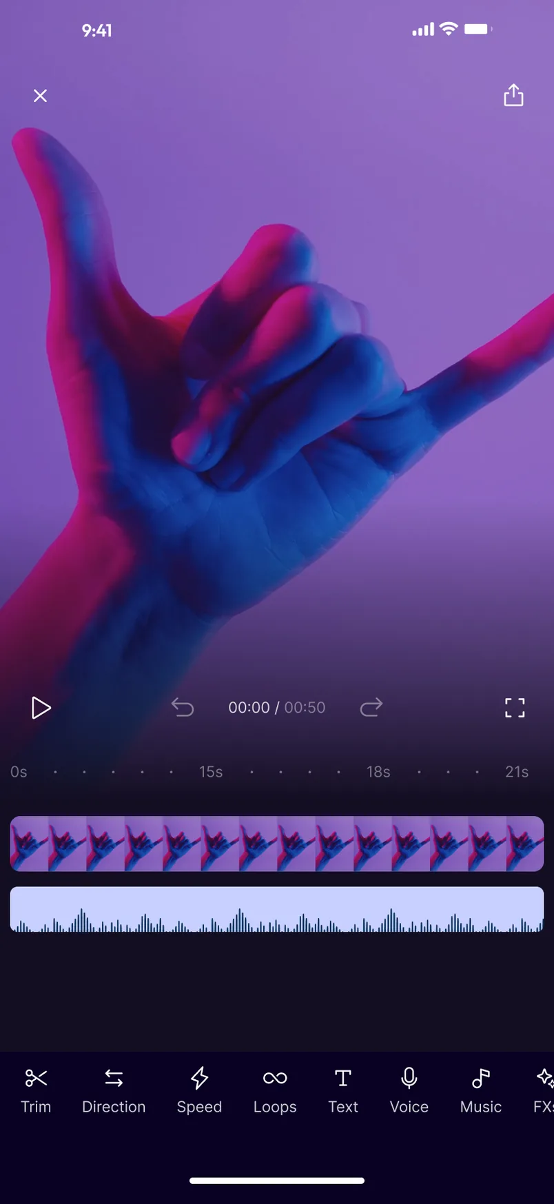
Editing screen with a neon-lit hand filling the top, video and audio tracks on a timeline, and a row of tools labelled Trim, Direction, Speed, Loops, Text, Voice and Music.
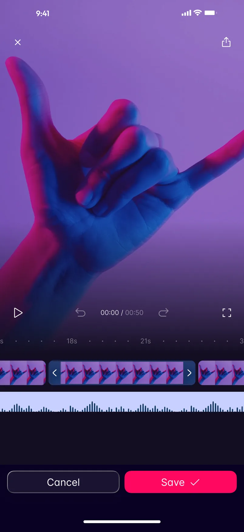
Trim screen with the same clip, a highlighted timeline segment between two handles, and Cancel and Save buttons at the bottom.
Recorded from the Figma prototype. From the splash through onboarding to a project open in the editor. Editing: the clip above, the tracks below and one row of tools along the bottom. Trim: two handles set the stretch to keep, and the tools give way to Cancel and Save.

02

The clip gets the screen

On the editing screen the clip fills everything above the timeline, and the controls sit on a dark gradient that grows out of the footage. Play, undo and redo, the 00:00 / 00:50 counter and fullscreen share one line, directly above the tracks they act on.

Below them, video and audio share one ruler. The tools run in a single row along the bottom that continues past the edge of the screen: Trim, Direction, Speed, Loops, Text, Voice, Music and FXs. Each one pairs an icon with a word, so nothing depends on the symbol alone.

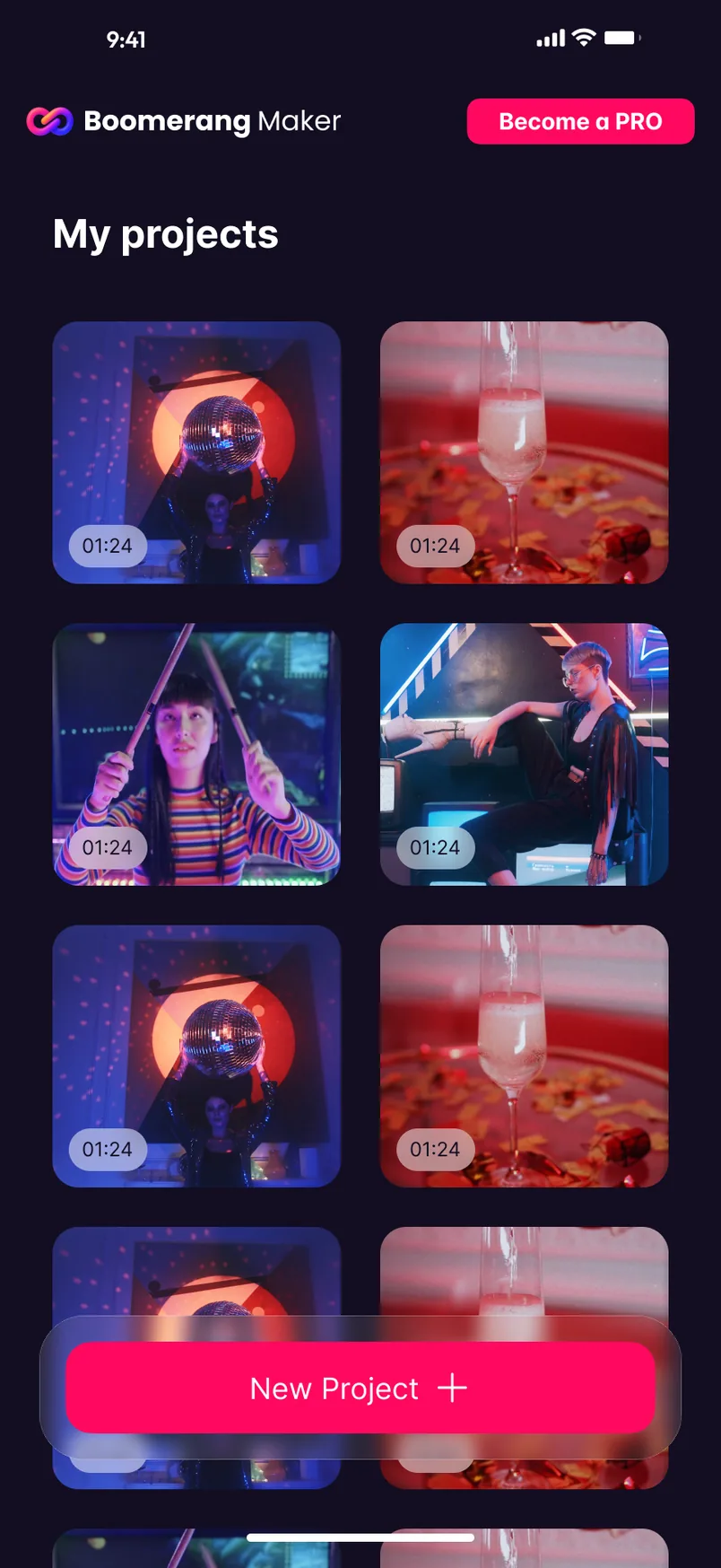
My projects screen with a two-column grid of video thumbnails showing durations, a pink New Project button and a Become a PRO button at the top.
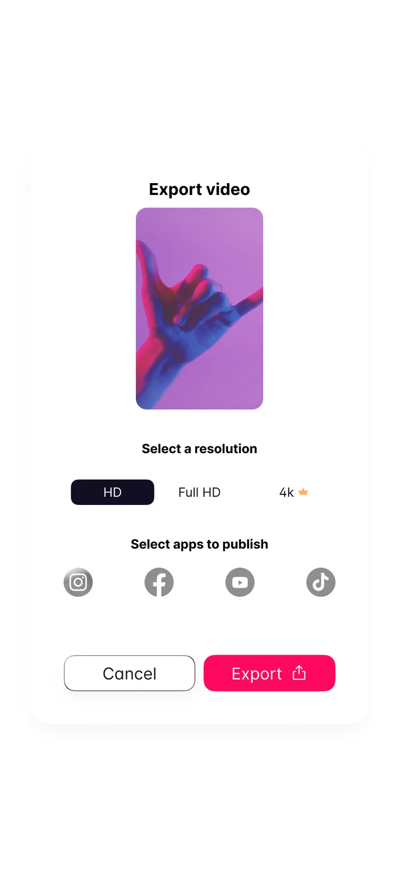
Export video card with a preview of the clip, a choice of HD, Full HD or 4K, four social network icons, and Cancel and Export buttons.
Home: projects in a two-column grid, with New Project always within reach. Export: choose a resolution and where to publish.

03

One job at a time

Trim changes only the lower half of the screen. The tool row gives way to Cancel and Save, and the selected stretch sits between two handles on the timeline. The only open decision is where the clip starts and ends.

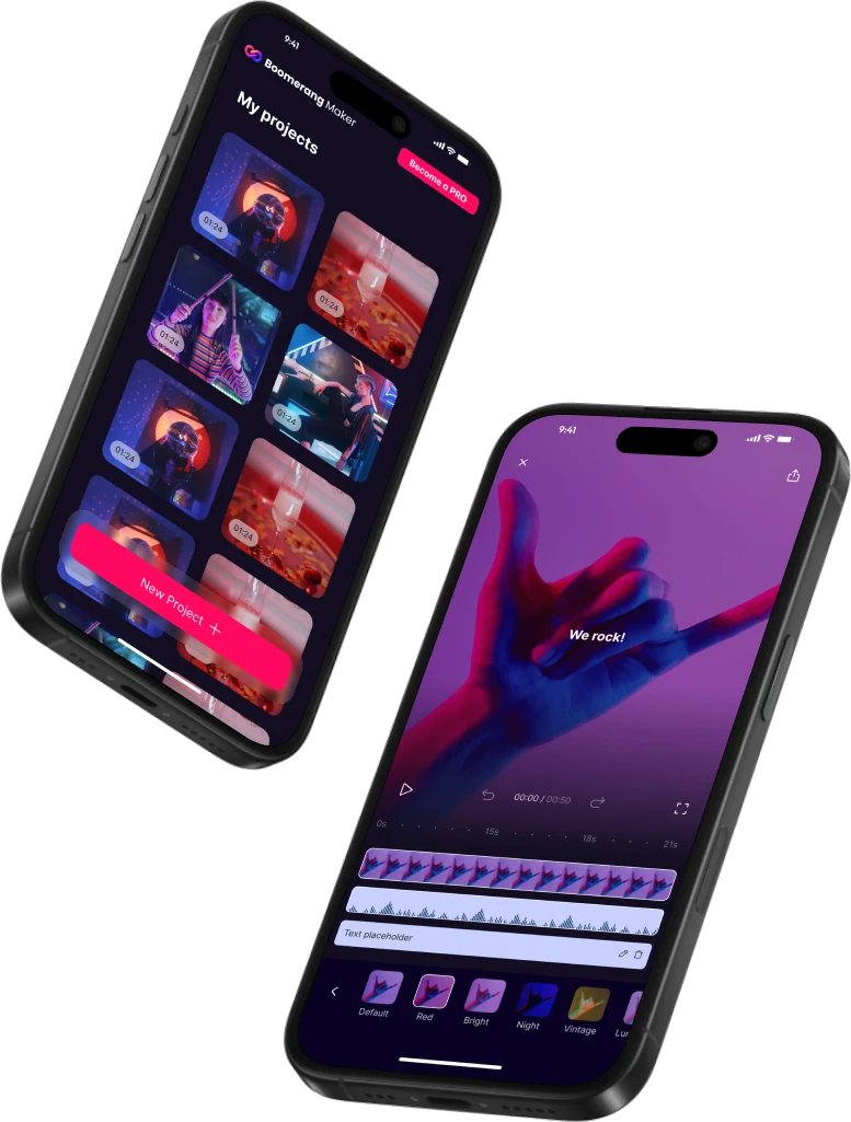
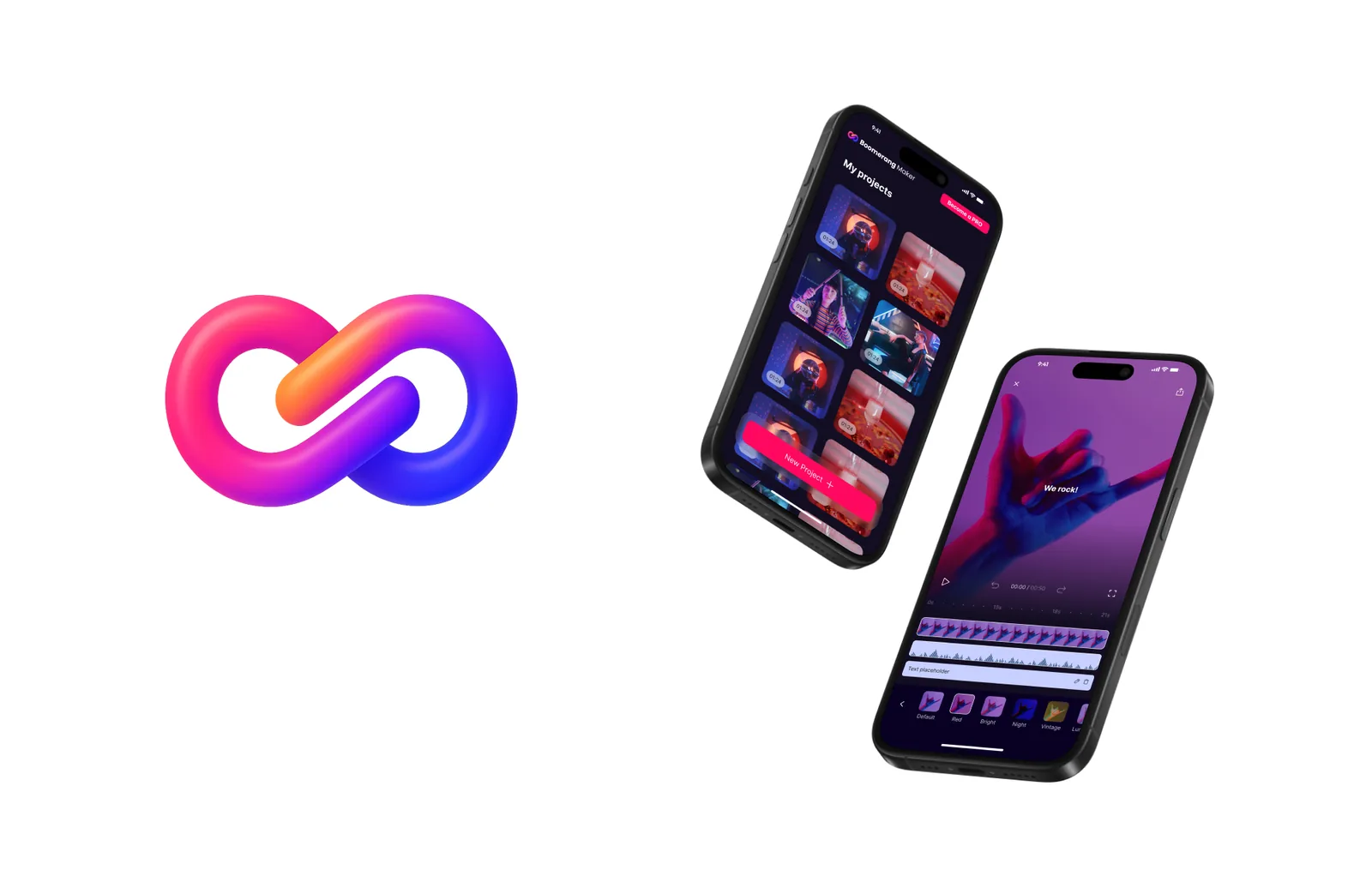
Presentation image with the app's pink and blue looped mark beside two tilted phones showing the Home and editing screens.
Presentation frame with the looped app mark, Home and the editor.

04

Before and after the edit

Home shows projects in a two-column grid with their durations, under a New Project button that stays fixed over the content. At the other end, the export sheet asks two things: a resolution, with 4K marked by a small crown, and the apps to publish to.

Pink follows the next step throughout: New Project, Save, Export. It also marks Become a PRO, the one action on Home that sits outside the editing flow.

000

Instructions

Yan Fontão
Tap
Open a screen
Click
Open a screen
Drag
Look around the board
Wheel
Mouse zooms, trackpad moves, pinch zooms
− +
Pull back to see the whole board, or come closer
Arrows
In a case: ↑↓ change case, ←→ change media. On the board: move
Space
Open, or go back
Enter
Open
Esc Backspace
Back
Home
Back to the center, then the introduction
PgUp PgDn
Previous or next channel
Tab
Walk projects and links
R
Random project
0–9
Type a channel, 1–61
?
This page
Shortcuts

Music on the board

Files compressed and levelled for the web.

OPEN
TO WORK
Let’s talk

New message to Yan

Tell me who you are and I’ll get back to you.

000

About Yan

Hello, I’m Yan

Product Designer/ Design Engineer

Most products lose something between design and code. Mine don’t: I research the problem, design the product and ship the interface myself, so what you approve is exactly what your users get.

  • 2018started in software
  • UI + codedesign and implementation

Worked with Motorola · Ambev Tech · Rei do Pitaco · OneTool · CESAR

Brazil · Remote, hybrid or on-site

Portrait of Yan Fontão seated, in a green sweater and glasses, holding a microphone.
OPEN
TO WORK
Let’s talk
OPEN
TO WORK
Let’s talk
000

locked channel

Under NDA

Enter the code

Ask Yan for the code ↗
OPEN
TO WORK
Let’s talk
YAN FONTÃO Case studies

Channel 08 Mobile app design

Boomerang Video Editor

An iPhone editor for turning short clips into loops, designed from the project grid to the export sheet. A dark interface with one hot-pink accent keeps attention on the footage.

Contribution
Product flows and interface design
Project status
Interface design · Figma archive
Boomerang presentation cover from the original design file.
Presentation cover from the original file.

Short clips into loops, with the video always in view

Screens from the original Figma design file, with sample footage.

My contribution

Boomerang Video Editor is a dark iPhone app for making loops from short clips. Its Home screen calls it Boomerang Maker, and the splash sums up the idea in one line: “Create loops that Wow!”

I designed the flow from onboarding through Home, media selection, a paywall, trimming, editing, filters and export. This case stays with the screens where the editing decisions show most clearly.
Recorded from the Figma prototype. From the splash through onboarding to a project open in the editor.
Editing screen with a neon-lit hand filling the top, video and audio tracks on a timeline, and a row of tools labelled Trim, Direction, Speed, Loops, Text, Voice and Music.
Editing: the clip above, the tracks below and one row of tools along the bottom.

The clip gets the screen

On the editing screen the clip fills everything above the timeline, and the controls sit on a dark gradient that grows out of the footage. Play, undo and redo, the 00:00 / 00:50 counter and fullscreen share one line, directly above the tracks they act on.

Below them, video and audio share one ruler. The tools run in a single row along the bottom that continues past the edge of the screen: Trim, Direction, Speed, Loops, Text, Voice, Music and FXs. Each one pairs an icon with a word, so nothing depends on the symbol alone.
Trim screen with the same clip, a highlighted timeline segment between two handles, and Cancel and Save buttons at the bottom.
Trim: two handles set the stretch to keep, and the tools give way to Cancel and Save.

One job at a time

Trim changes only the lower half of the screen. The tool row gives way to Cancel and Save, and the selected stretch sits between two handles on the timeline. The only open decision is where the clip starts and ends.
My projects screen with a two-column grid of video thumbnails showing durations, a pink New Project button and a Become a PRO button at the top.
Home: projects in a two-column grid, with New Project always within reach.
Export video card with a preview of the clip, a choice of HD, Full HD or 4K, four social network icons, and Cancel and Export buttons.
Export: choose a resolution and where to publish.

Before and after the edit

Home shows projects in a two-column grid with their durations, under a New Project button that stays fixed over the content. At the other end, the export sheet asks two things: a resolution, with 4K marked by a small crown, and the apps to publish to.

Pink follows the next step throughout: New Project, Save, Export. It also marks Become a PRO, the one action on Home that sits outside the editing flow.

Presentation image with the app's pink and blue looped mark beside two tilted phones showing the Home and editing screens.
Presentation frame with the looped app mark, Home and the editor.