Case 020Mobile app design
NeverSoft
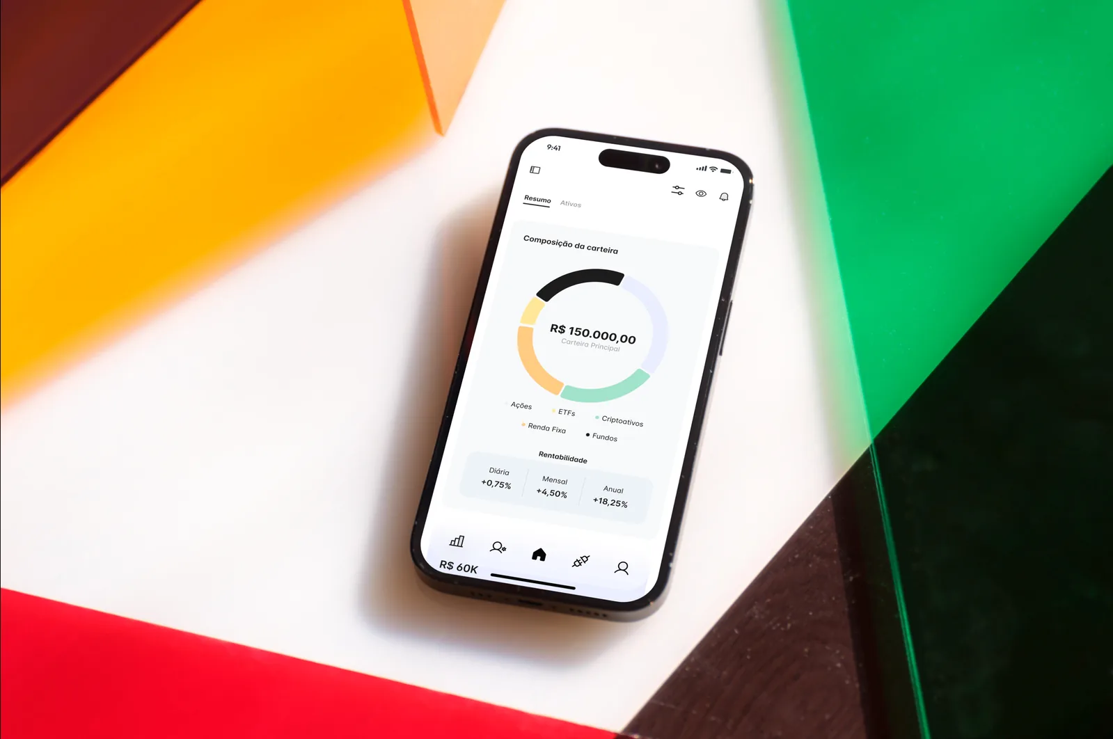
A Portuguese-language investment app that starts with how a portfolio is divided and goes down to each asset. Every name and figure on screen is sample data.
- Contribution
- Interface design
- Project status
- Interface design · Figma archive
01
My contribution
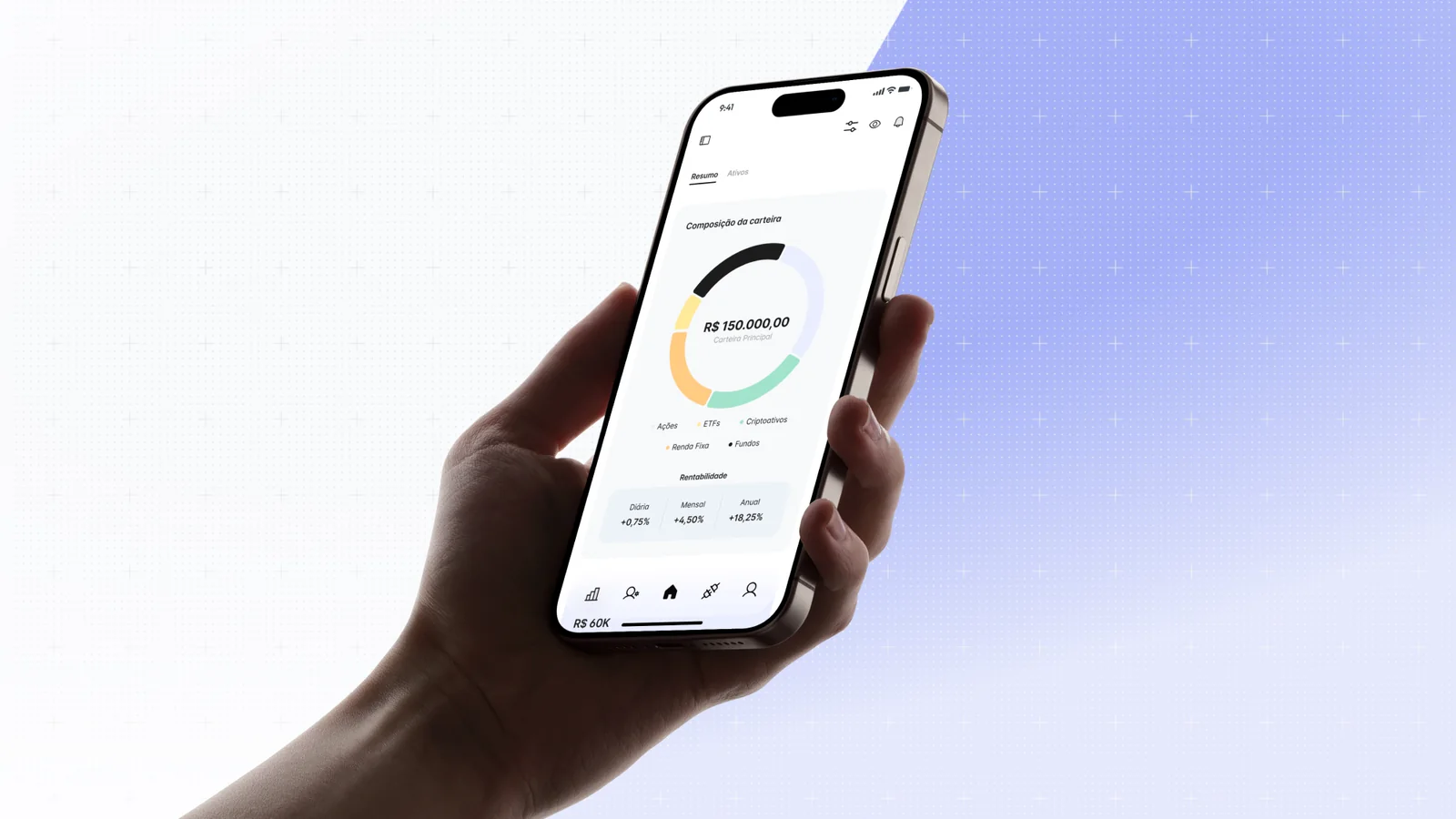
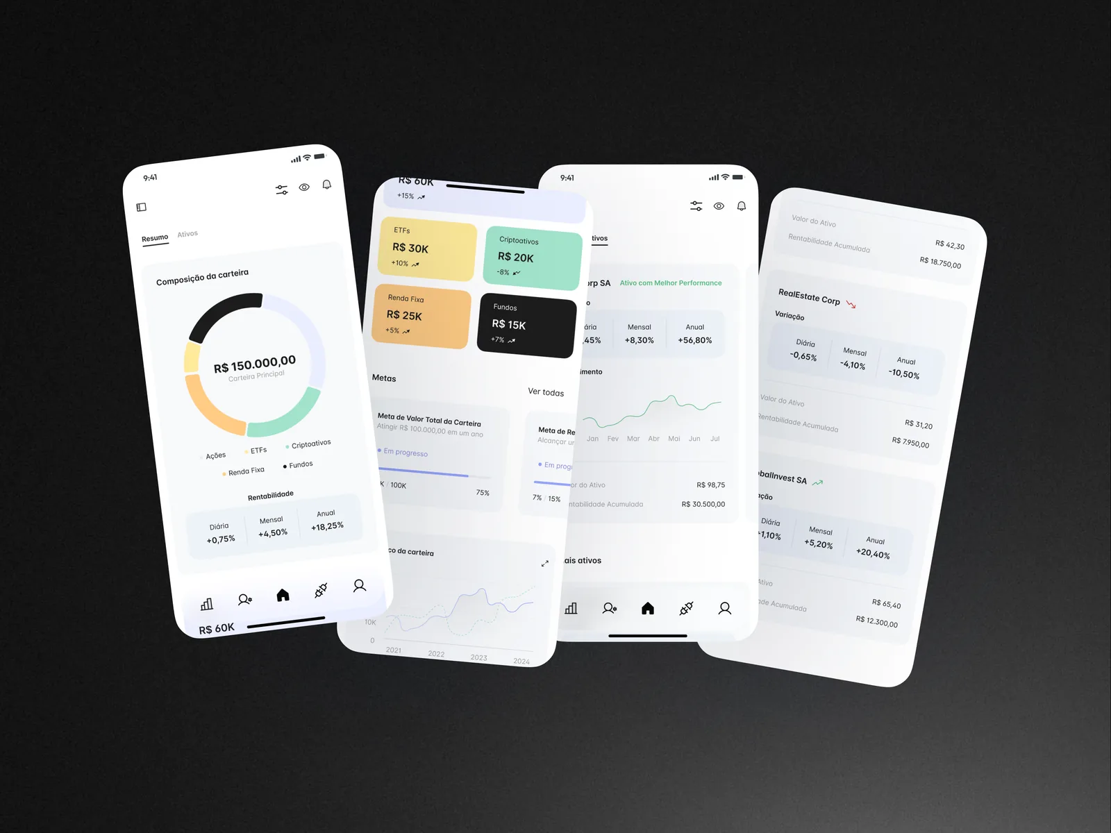
NeverSoft is an investment management app in Portuguese. Its two tabs answer different questions: Resumo shows how the whole portfolio is divided and how it is going, and Ativos looks at one holding at a time.
The same Figma file has a landing page for companies, investors, advisers and accountants. It still carries a stand-in brand, so here I stay with the app.

02
The ring and the tiles are the same picture
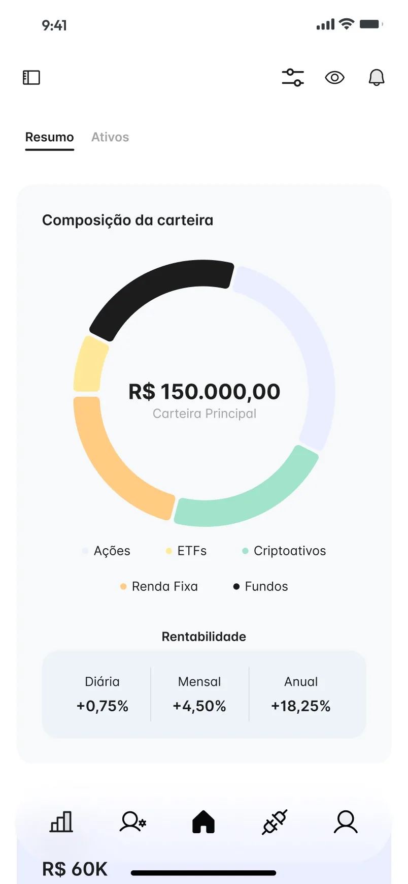
Resumo opens on a donut that splits the portfolio across Ações, ETFs, Criptoativos, Renda Fixa and Fundos, with the total in the middle and three plain figures underneath for daily, monthly and annual return. Scrolling down, each asset class becomes a tile in the colour of its slice, so the ring and the tiles read as one system.
The rest of the page is about direction over time: goal cards with progress bars, a history chart of contributions and dividends, and a list of PDF reports ready to download.
03
The same three numbers on every asset
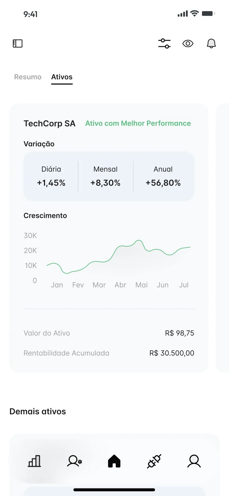
In Ativos, every card repeats the same strip of daily, monthly and annual variation, so comparing holdings means reading the same row in the same place. The asset marked as best performer gets a fuller card with a growth line; the others follow in a list, each with a small green or red arrow for direction.