Drag to explore. Scroll or pinch to zoom. Open Help for keyboard controls.

Yan
OPEN
TO WORK
Let’s talk
Yan Fontão Boring view
All work

Case 052Landing page design

Lex by Alexandria

A Portuguese landing page and logo for an electricity-bill offer, with three mobile hero treatments around the same opening question.

Contribution
Interface design
Project status
Interface design · Figma archive
Lex by Alexandria logo on a white disc.
The logo.

01

My contribution

Lex by Alexandria is a Portuguese landing page for an electricity-bill offer, aimed at homes and businesses. The file holds desktop and mobile versions of the page, along with logo variants.

The headline and tags on these screens are the page’s own marketing copy, not results I can verify. This case looks at how the page is built.
A scroll through the design: the landing page, from the offer to how it works.
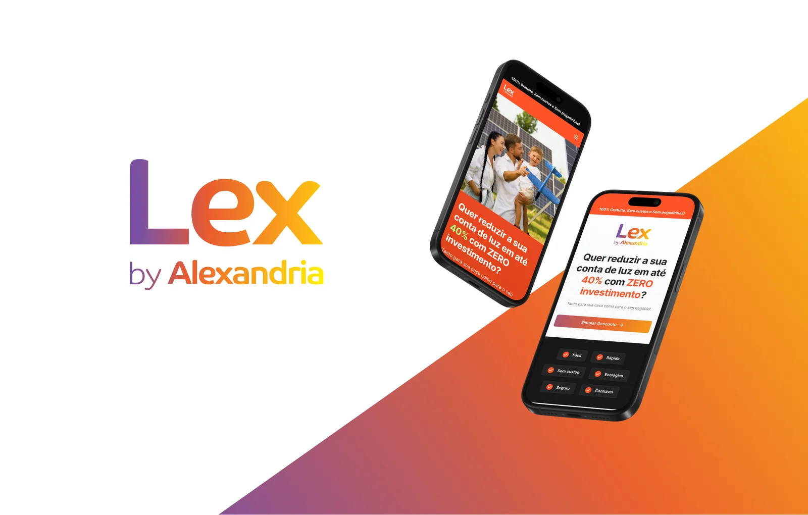
Gradient Lex by Alexandria logo on white beside two tilted phones showing the landing page, over a diagonal purple to yellow shape.
The logo beside two mobile versions of the landing page.

02

Three ways to open on a phone

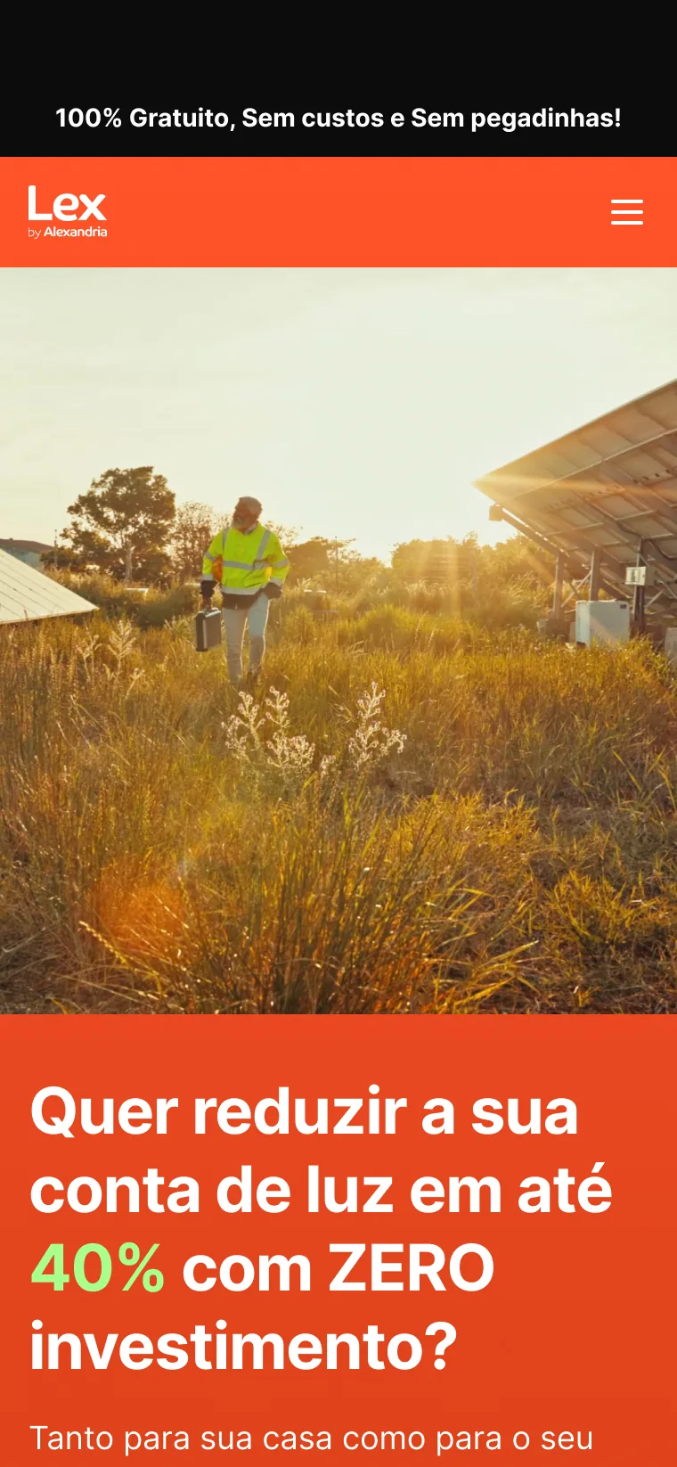
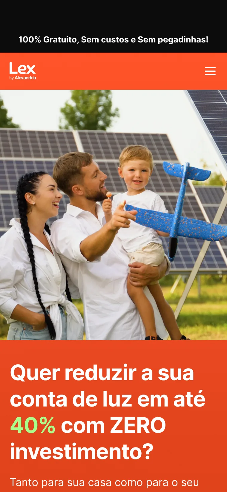
The mobile frames explore three treatments of the same first screen. Two lead with a photograph, a family beside solar panels or a technician walking through a solar field, and set the question on an orange panel. The third drops the photo, puts the gradient logo on white and brings the Simular Desconto button into the first view.

That version also ends the first view with six short tags on a dark band, a small summary before the page continues.
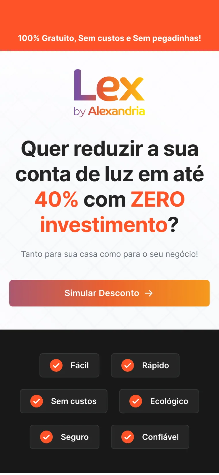
Phone screen with an orange top bar, the gradient logo on white, a question about the electricity bill, a gradient Simular Desconto button and six tags on a dark band.
Phone screen with a black top strip, an orange bar with the white logo, a photo of a family in front of solar panels and a headline on an orange panel.
The same layout with a photo of a technician in a high-visibility jacket walking through tall grass between solar panels at sunset.
This version brings the logo, the question and the button into the first view. A photo version sets the question on an orange panel. The same layout with a second photograph.

03

A gradient that holds the page together

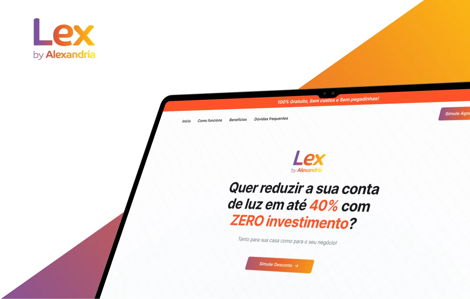
The logo runs from purple through orange to yellow, and the same gradient fills the main button and the diagonal shapes of the presentation frames. On the orange bar of the photo versions the mark switches to white, so it stays legible without changing shape.

Angled laptop close-up of the desktop hero with a small navigation, the gradient logo, a large headline and a Simular Desconto button, beside the logo and gradient shapes.
The desktop hero centres the logo, the question and one button.
000

Instructions

Yan Fontão
Tap
Open a screen
Click
Open a screen
Drag
Look around the board
Wheel
Mouse zooms, trackpad moves, pinch zooms
− +
Pull back to see the whole board, or come closer
Arrows
In a case: ↑↓ change case, ←→ change media. On the board: move
Space
Open, or go back
Enter
Open
Esc Backspace
Back
Home
Back to the center, then the introduction
PgUp PgDn
Previous or next channel
Tab
Walk projects and links
R
Random project
0–9
Type a channel, 1–61
?
This page
Shortcuts

Music on the board

Files compressed and levelled for the web.

OPEN
TO WORK
Let’s talk

New message to Yan

Tell me who you are and I’ll get back to you.

000

About Yan

Hello, I’m Yan

Product Designer/ Design Engineer

Most products lose something between design and code. Mine don’t: I research the problem, design the product and ship the interface myself, so what you approve is exactly what your users get.

  • 2018started in software
  • UI + codedesign and implementation

Worked with Motorola · Ambev Tech · Rei do Pitaco · OneTool · CESAR

Brazil · Remote, hybrid or on-site

Portrait of Yan Fontão seated, in a green sweater and glasses, holding a microphone.
OPEN
TO WORK
Let’s talk
OPEN
TO WORK
Let’s talk
000

locked channel

Under NDA

Enter the code

Ask Yan for the code ↗
OPEN
TO WORK
Let’s talk
YAN FONTÃO Case studies

Channel 52 Landing page design

Lex by Alexandria

A Portuguese landing page and logo for an electricity-bill offer, with three mobile hero treatments around the same opening question.

Contribution
Interface design
Project status
Interface design · Figma archive
Lex by Alexandria logo on a white disc.
The logo.

A landing page that opens with one question

Screens from the original Figma design file. Headlines are the page’s own marketing copy.

My contribution

Lex by Alexandria is a Portuguese landing page for an electricity-bill offer, aimed at homes and businesses. The file holds desktop and mobile versions of the page, along with logo variants.

The headline and tags on these screens are the page’s own marketing copy, not results I can verify. This case looks at how the page is built.

A scroll through the design: the landing page, from the offer to how it works.
Gradient Lex by Alexandria logo on white beside two tilted phones showing the landing page, over a diagonal purple to yellow shape.
The logo beside two mobile versions of the landing page.

Three ways to open on a phone

The mobile frames explore three treatments of the same first screen. Two lead with a photograph, a family beside solar panels or a technician walking through a solar field, and set the question on an orange panel. The third drops the photo, puts the gradient logo on white and brings the Simular Desconto button into the first view.

That version also ends the first view with six short tags on a dark band, a small summary before the page continues.
Phone screen with an orange top bar, the gradient logo on white, a question about the electricity bill, a gradient Simular Desconto button and six tags on a dark band.
This version brings the logo, the question and the button into the first view.
Phone screen with a black top strip, an orange bar with the white logo, a photo of a family in front of solar panels and a headline on an orange panel.
A photo version sets the question on an orange panel.

A gradient that holds the page together

The logo runs from purple through orange to yellow, and the same gradient fills the main button and the diagonal shapes of the presentation frames. On the orange bar of the photo versions the mark switches to white, so it stays legible without changing shape.
The same layout with a photo of a technician in a high-visibility jacket walking through tall grass between solar panels at sunset.
The same layout with a second photograph.
Angled laptop close-up of the desktop hero with a small navigation, the gradient logo, a large headline and a Simular Desconto button, beside the logo and gradient shapes.
The desktop hero centres the logo, the question and one button.