 YAN
Mobile app design
Boomerang Video Editor. Short clips into loops, with the video always in view
An iPhone editor for turning short clips into loops, designed from the project grid to the export sheet. A dark interface with one hot-pink accent keeps attention on the footage.
- Contribution
- Product flows and interface design
- Project status
- Interface design · Figma archive
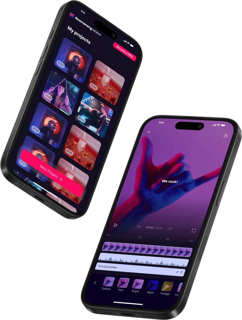
Screens from the original Figma design file, with sample footage.
My contribution
Boomerang Video Editor is a dark iPhone app for making loops from short clips. Its Home screen calls it Boomerang Maker, and the splash sums up the idea in one line: “Create loops that Wow!”
I designed the flow from onboarding through Home, media selection, a paywall, trimming, editing, filters and export. This case stays with the screens where the editing decisions show most clearly.
The clip gets the screen
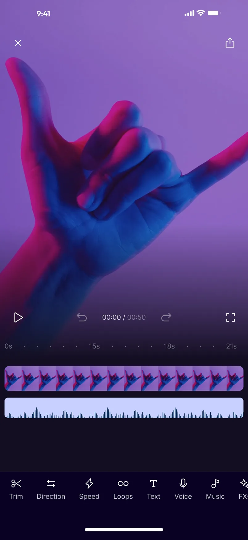
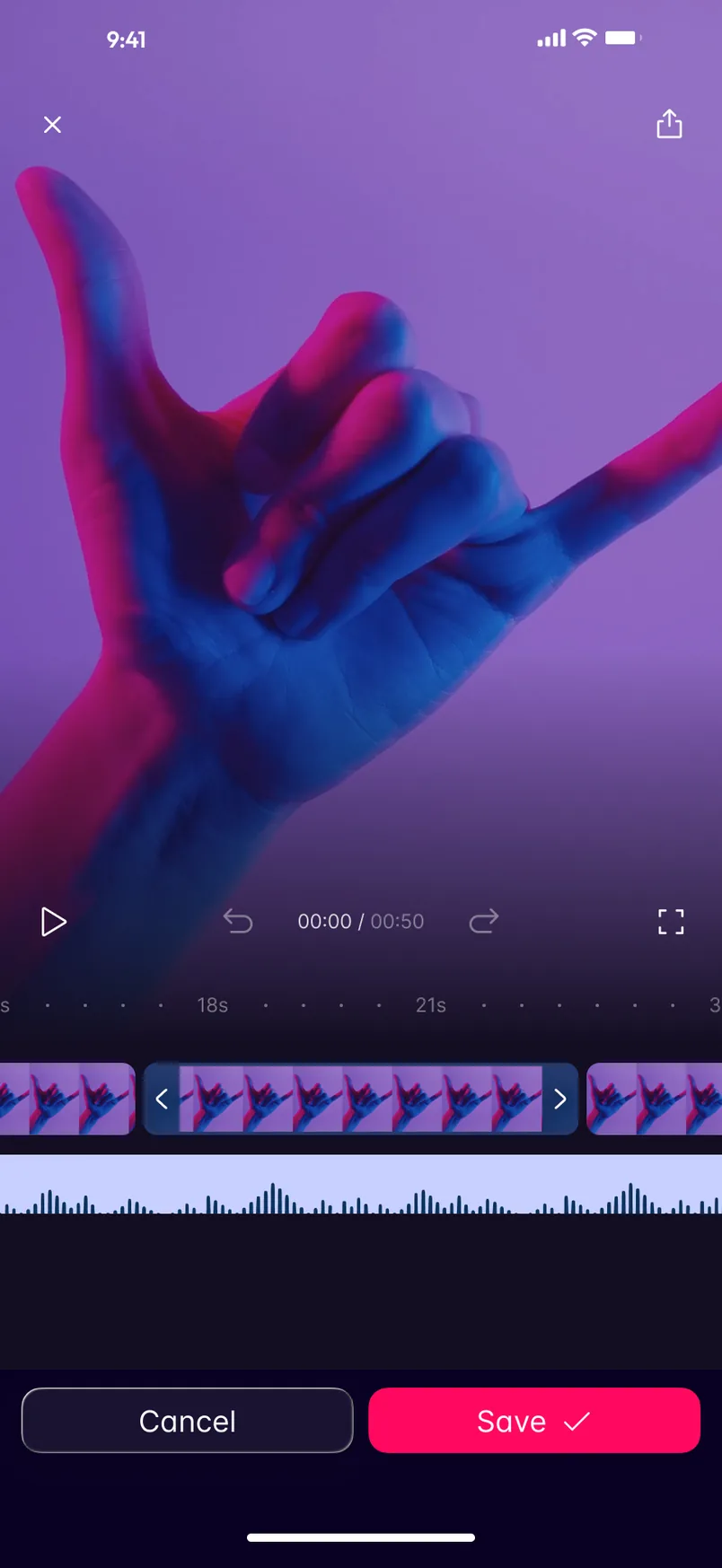
On the editing screen the clip fills everything above the timeline, and the controls sit on a dark gradient that grows out of the footage. Play, undo and redo, the 00:00 / 00:50 counter and fullscreen share one line, directly above the tracks they act on.
Below them, video and audio share one ruler. The tools run in a single row along the bottom that continues past the edge of the screen: Trim, Direction, Speed, Loops, Text, Voice, Music and FXs. Each one pairs an icon with a word, so nothing depends on the symbol alone.
One job at a time
Trim changes only the lower half of the screen. The tool row gives way to Cancel and Save, and the selected stretch sits between two handles on the timeline. The only open decision is where the clip starts and ends.
Before and after the edit
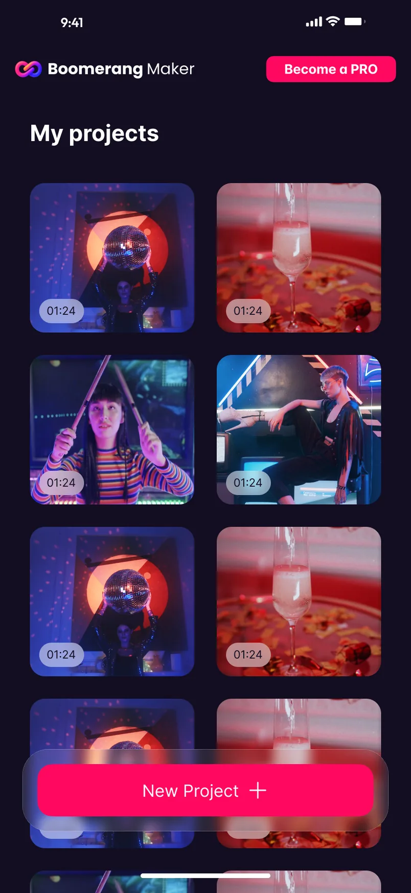
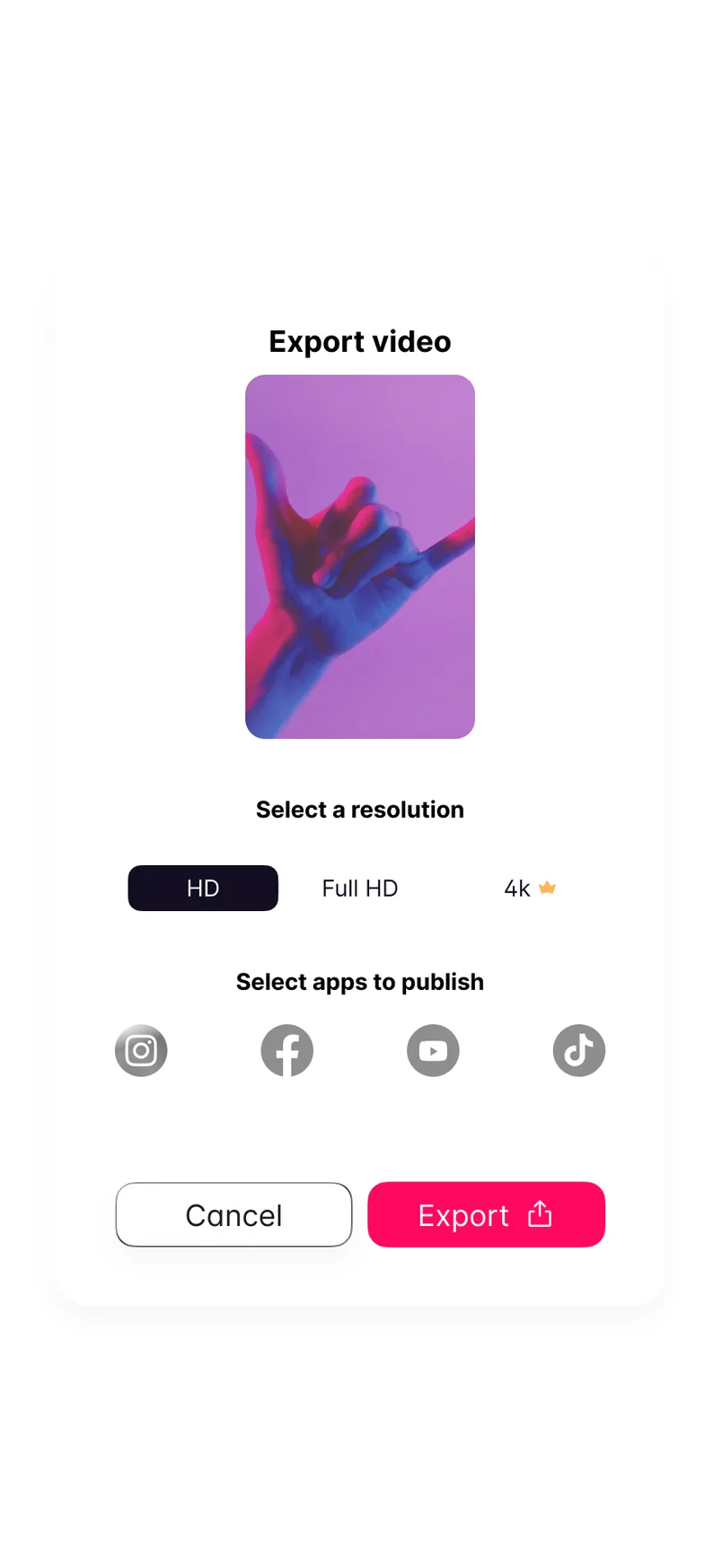
Home shows projects in a two-column grid with their durations, under a New Project button that stays fixed over the content. At the other end, the export sheet asks two things: a resolution, with 4K marked by a small crown, and the apps to publish to.
Pink follows the next step throughout: New Project, Save, Export. It also marks Become a PRO, the one action on Home that sits outside the editing flow.