 YAN
Mobile app design
ShaktiGrid. Renewable-energy assets, one card at a time
Mobile screens for browsing a portfolio of renewable-energy assets. Two screen types carry the work: a list of site cards and a detail page that sets out each asset's terms in a plain table.
- Contribution
- Interface design
- Project status
- Interface design · Figma archive
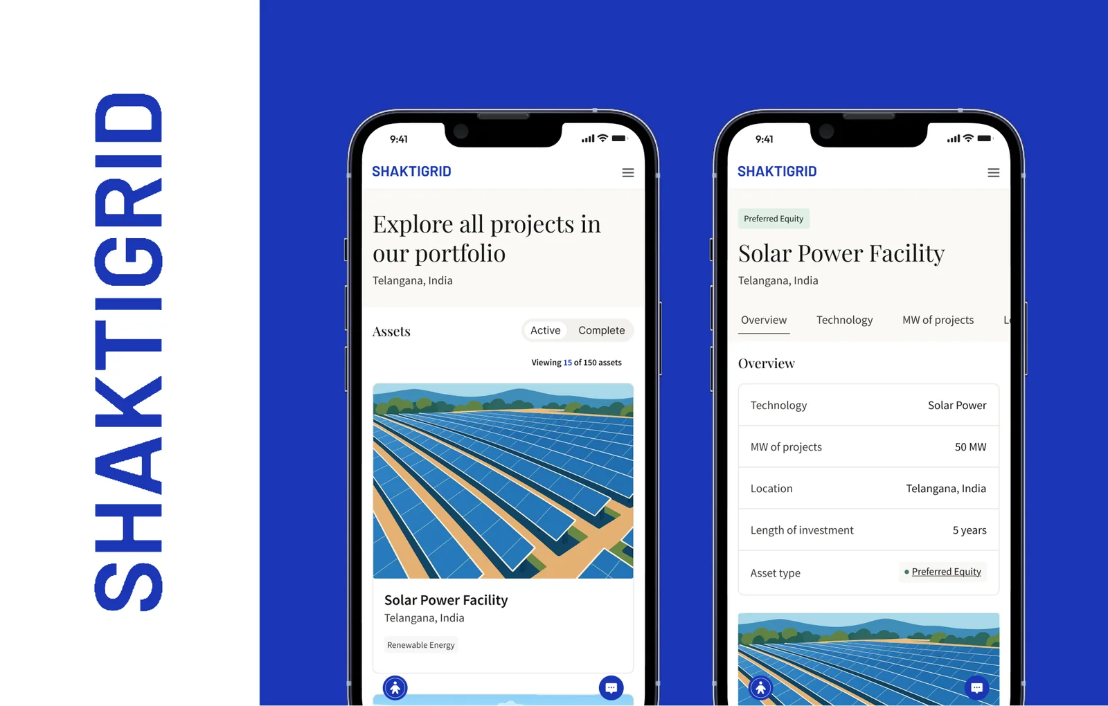
Screens from the original Figma design file, with sample data.
My contribution
ShaktiGrid shows a portfolio of renewable-energy assets on a phone. I designed two screen types, a list and a detail page, so this is a small case about getting from one to the other.
Every asset, figure and term on screen is sample data.
From a site card to its terms
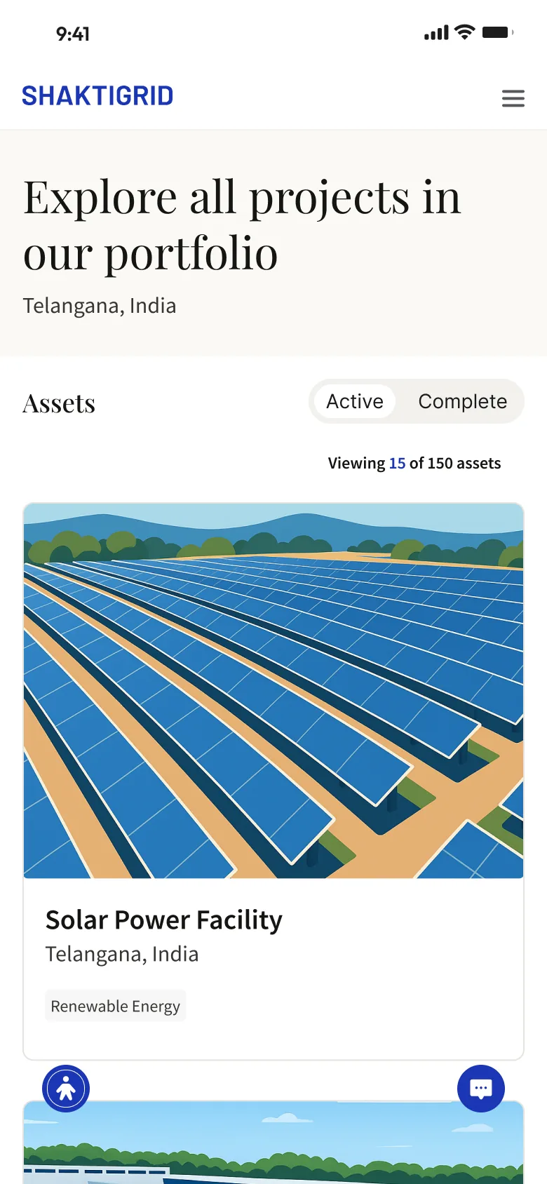
The list opens with a serif headline, then an Active and Complete switch above a count of what is in view. Each card gives most of its area to an illustration of the site, with the name, location and a single tag underneath, so the place reads before the data does.
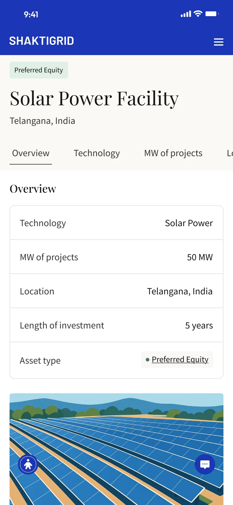
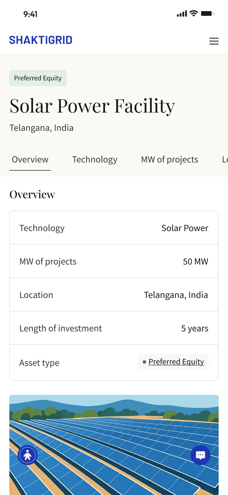
The detail page keeps the name and location at the top and moves the terms into a table: technology, MW of projects, location, length of investment and asset type. One label and one value per row make it quick to scan, and a row of tabs above runs past the edge of the screen to the other topics.
Two headers, one structure
Both screens exist in two versions: a white header with the blue wordmark, or solid blue running up into the status bar. Everything below the header stays the same, with serif titles for what the asset is and a plain sans for its details. Two floating buttons, one for accessibility and one for chat, stay at the bottom of the screen in both.