 YAN
Brand identity
Pasta Morada. A house and a ribbon of pasta in one mark
A brand identity for Pasta Morada in Manaus: a mark that puts a coil of pasta inside a house, carried onto tubs, bags, menus, uniforms and the site.
- Contribution
- Brand identity
- Project status
- Brand identity · Figma archive

Pages and application mockups from the original identity manual in Figma, marked V. 1.
My contribution
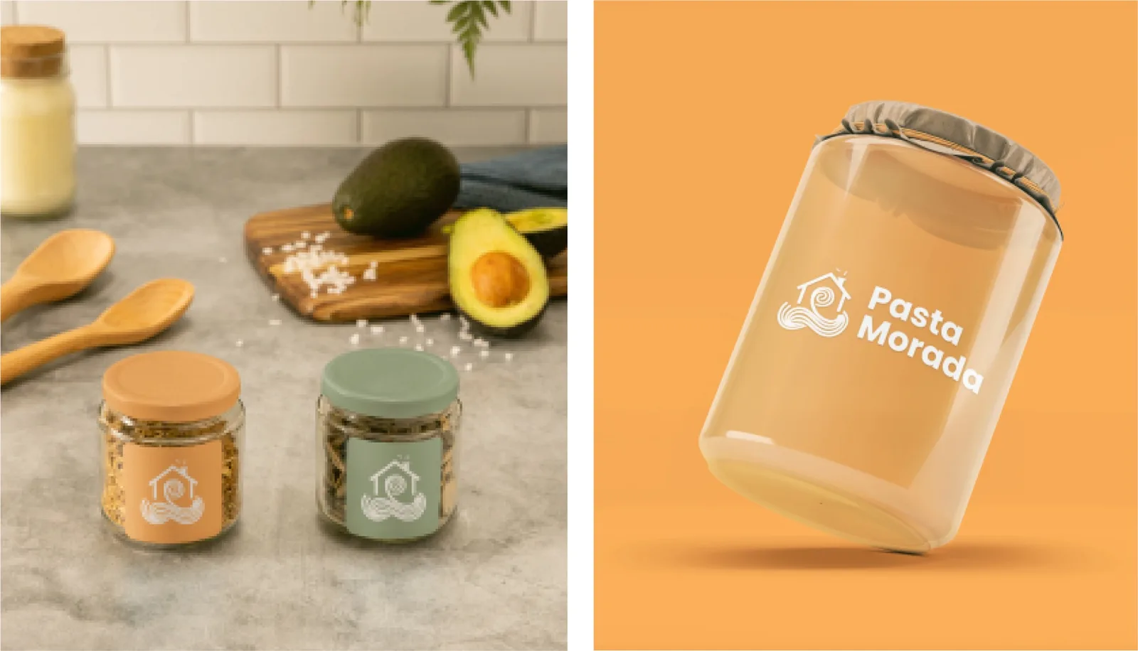
Morada means home, and the mark takes the name literally: a sage-green house with a chimney, and an orange ribbon of pasta that coils inside it and spills out below. The manual, marked V. 1, pairs it with the line “Onde cada sabor é uma história”, where every flavor is a story.
A wide lockup with room around it
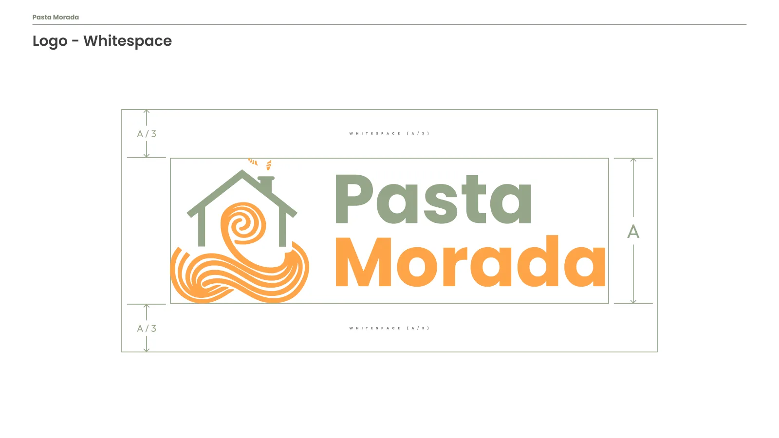
The full lockup places the symbol to the left of the name, with Pasta in sage and Morada in orange, so the two words repeat the colors of the house and the pasta. The whitespace slide sets a clear margin of a third of the logo’s height above and below it.
The name wraps the package
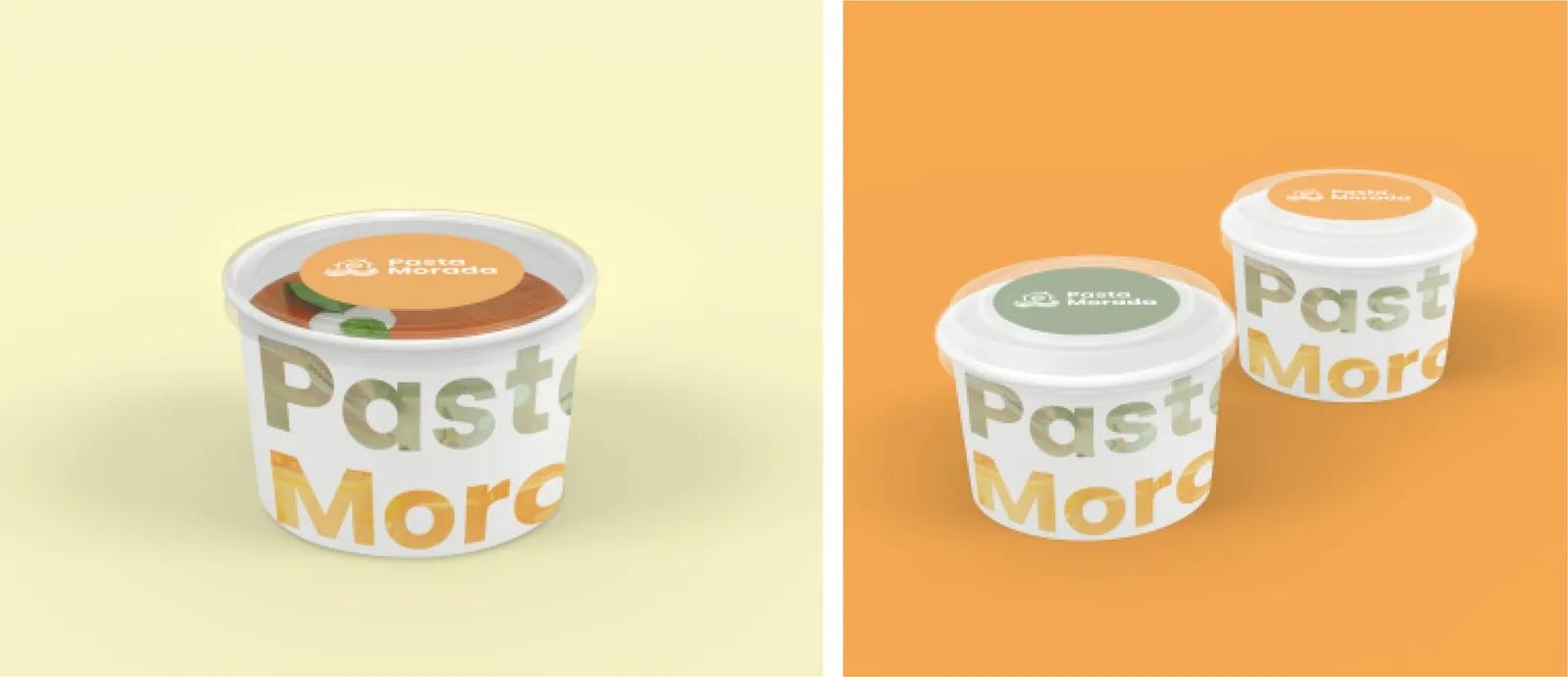
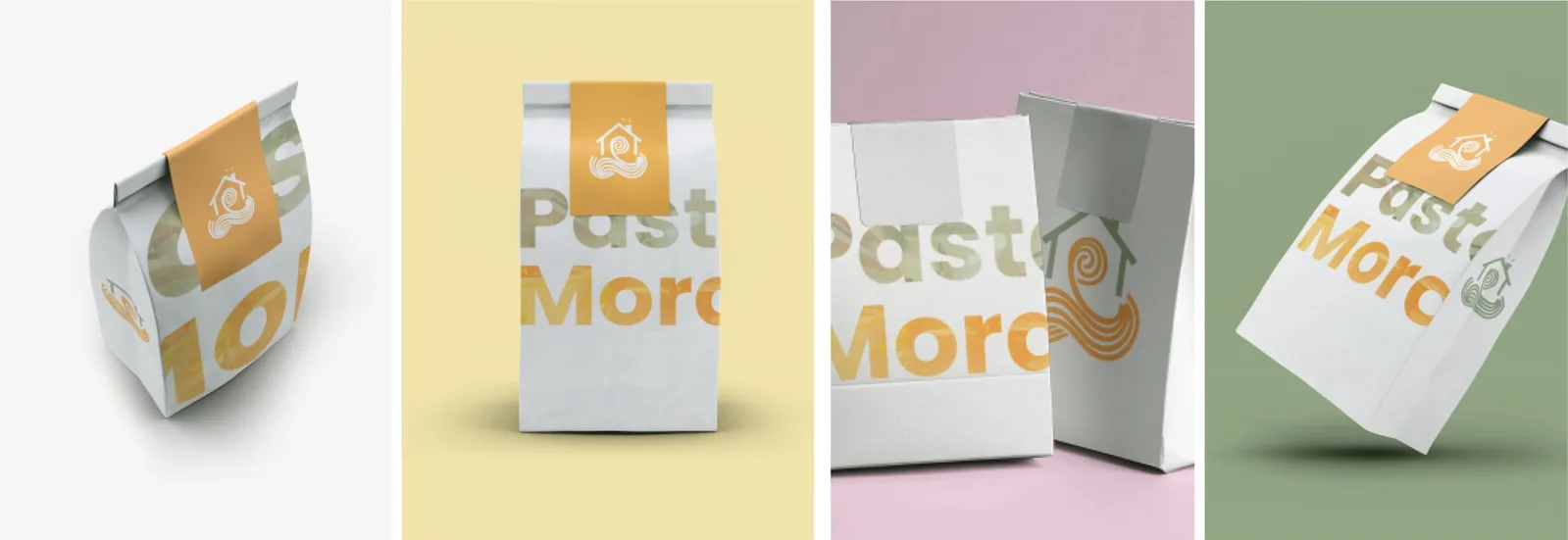
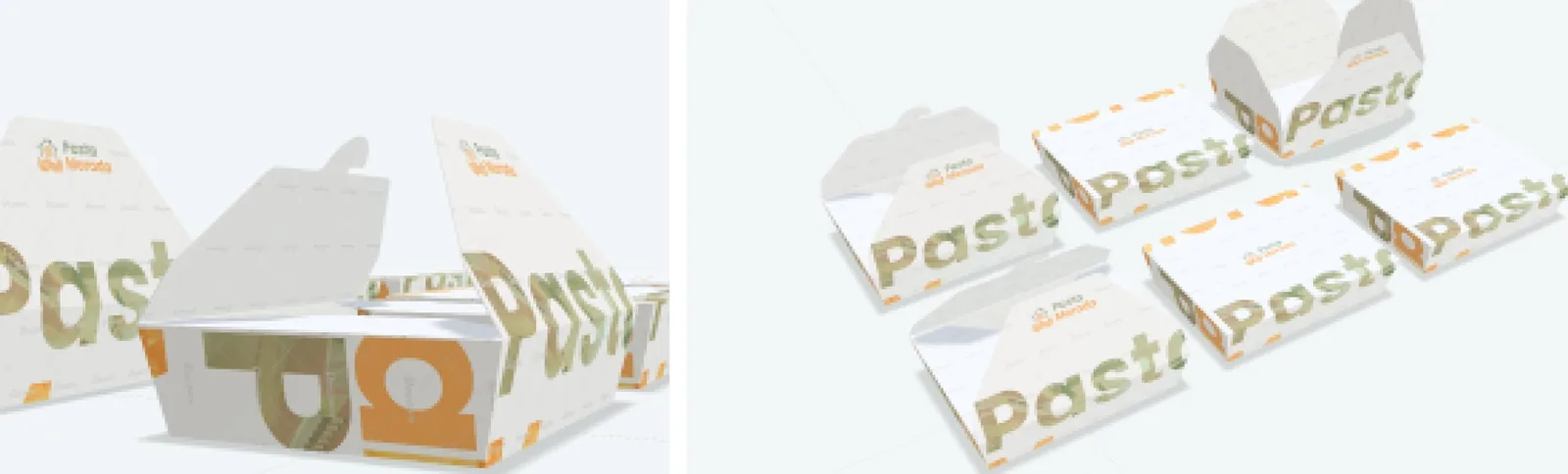
On takeaway packaging the wordmark grows until the edges crop it. Pasta in sage and Morada in orange run around the tubs, the delivery bags and the trays, so the name still reads when only part of it faces the customer.
These pieces are mockups from the manual’s application pages. They show how the brand behaves, not production photographs.
Quieter at the table
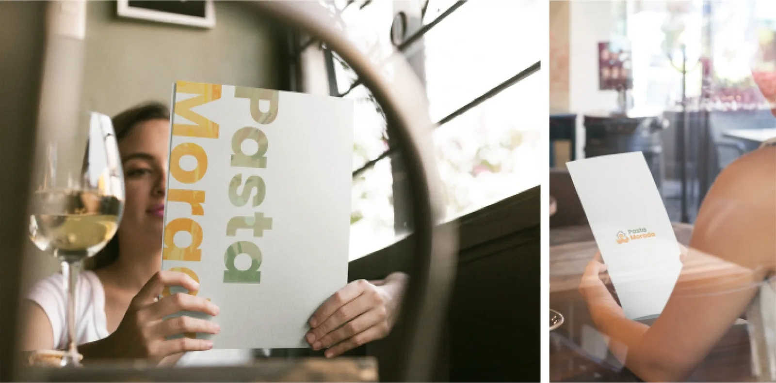
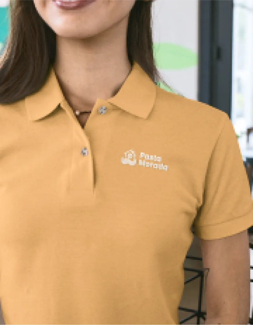
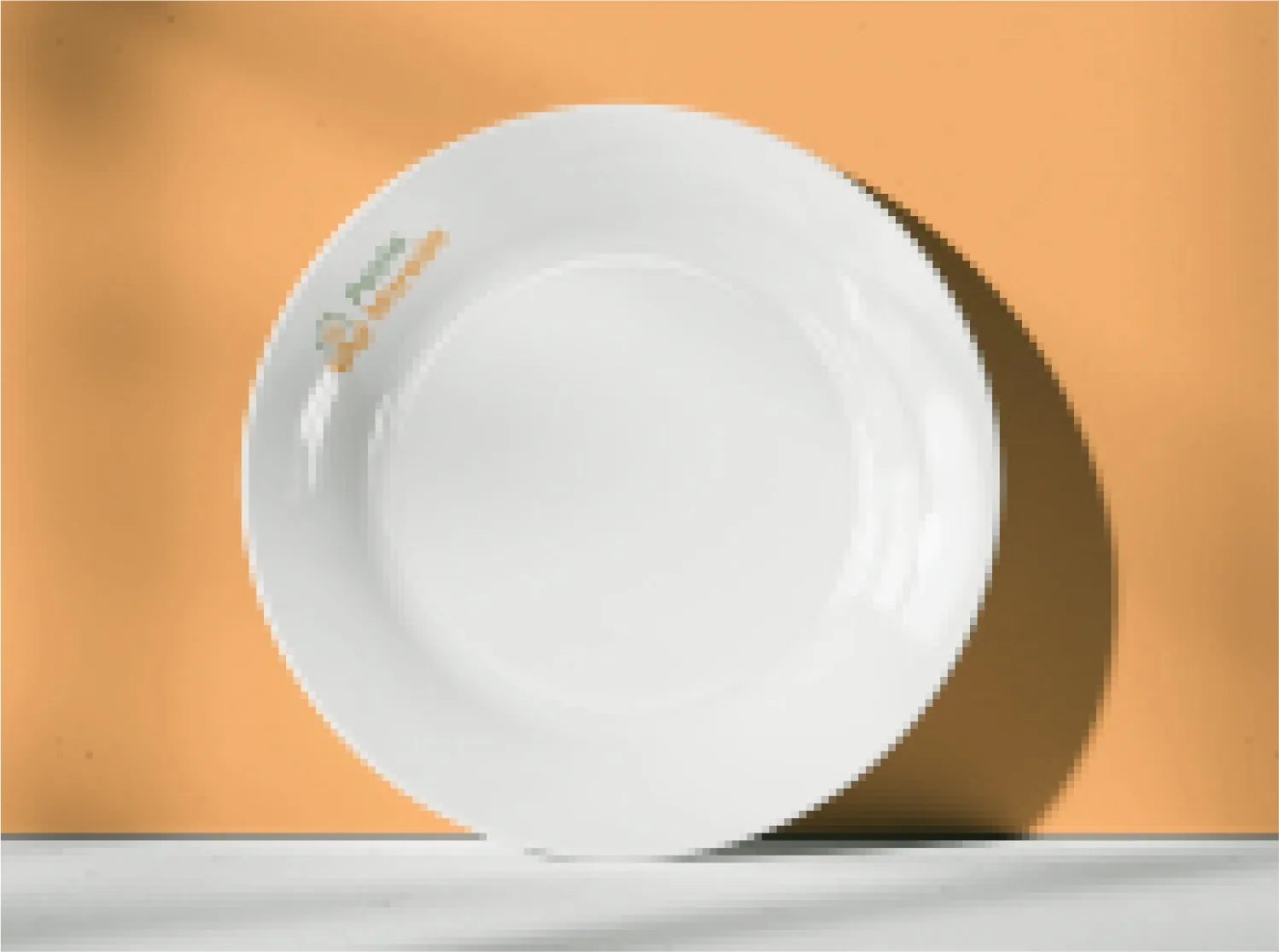
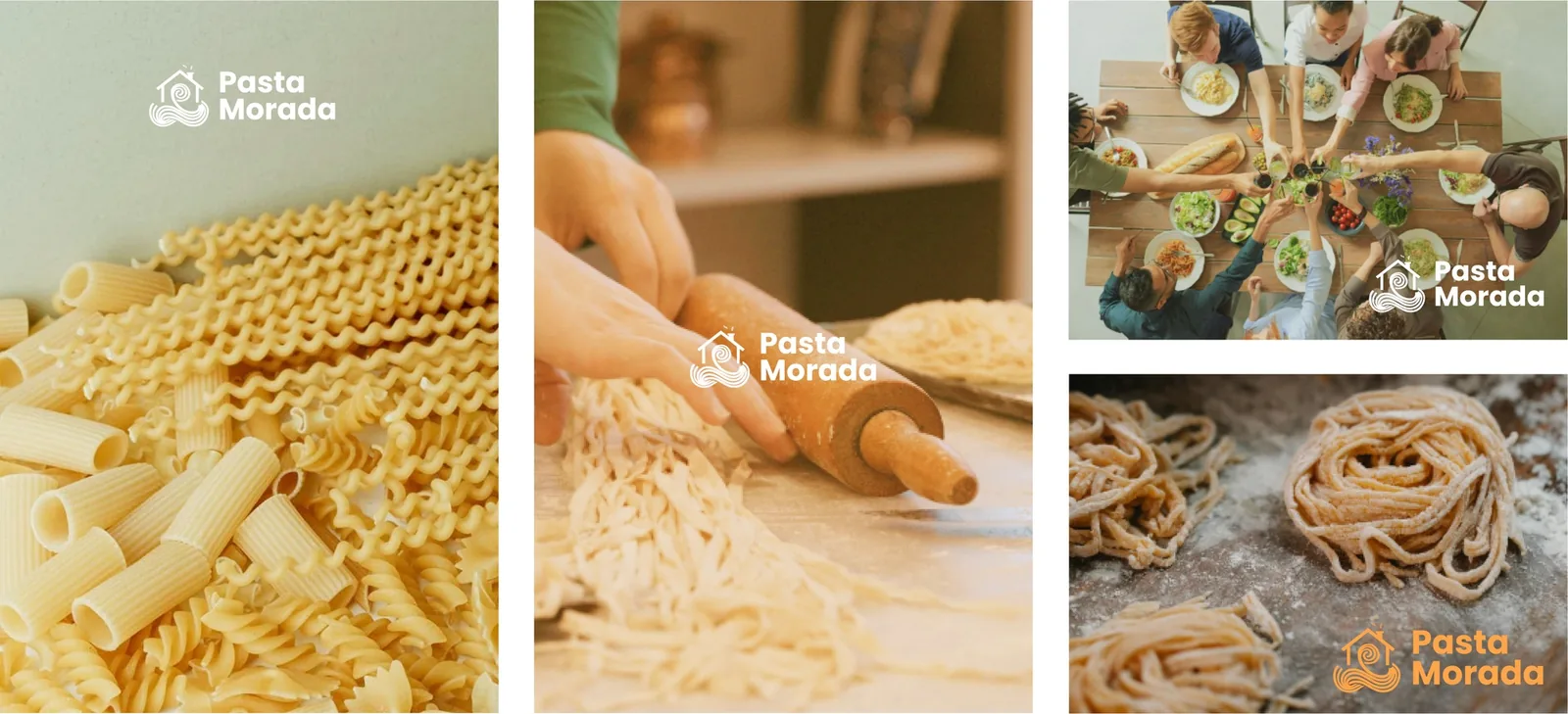
Closer to the meal the mark gets smaller. The menu keeps the large wordmark, while the staff polo and the plates use only a small logo, and the photography direction leaves the pasta as the subject.
The same line on screen
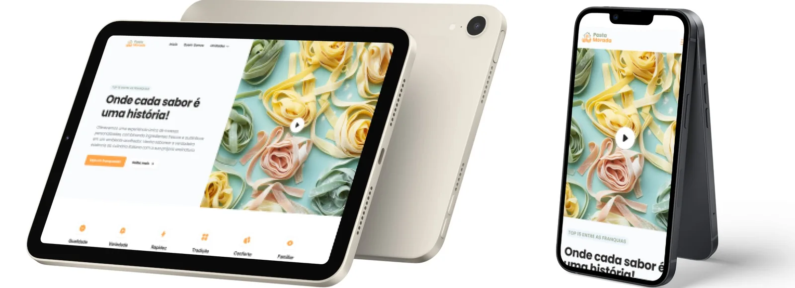
The manual closes the applications with the site in tablet and phone, under the line “Onde cada sabor é uma história”.