 YAN
Mobile app design
Grand Plaza. Everything in the mall, one tab away
A mobile app for the Grand Plaza mall that brings events, services, prize campaigns and offers into one place. Amounts and codes on screen are sample content.
- Contribution
- Product flows and interface design
- Project status
- Interface design · Figma archive
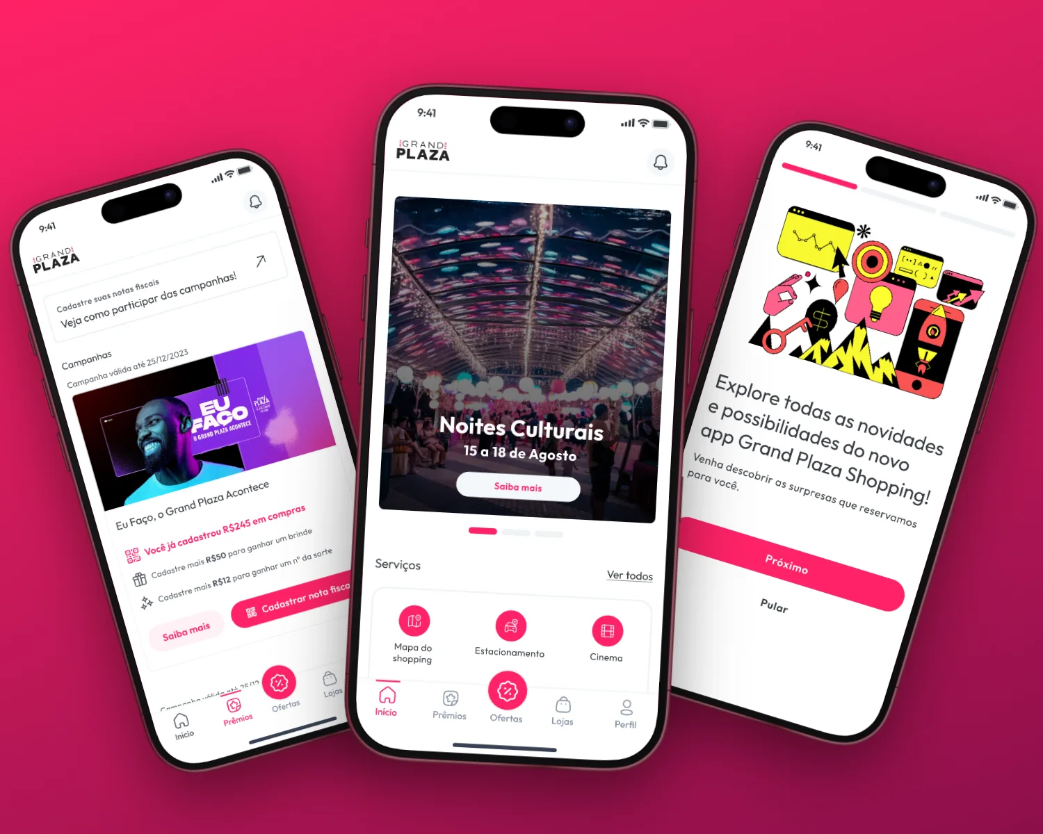
Screens from the original design in Figma and Dribbble, with sample data.
My contribution
Grand Plaza is a Portuguese-language app for a shopping mall. A bottom bar divides it into Início, Prêmios, Ofertas, Lojas and Perfil, with Ofertas raised in the centre as the one tab that breaks the line.
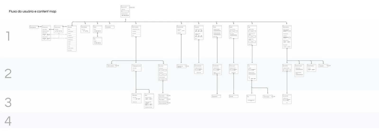
The Figma archive keeps the process beside the screens: wireframes from v0 to v4, a mind map, a sitemap and a user flow with a content map. Here I show the designed screens next to the map that organised them.
One event at a time
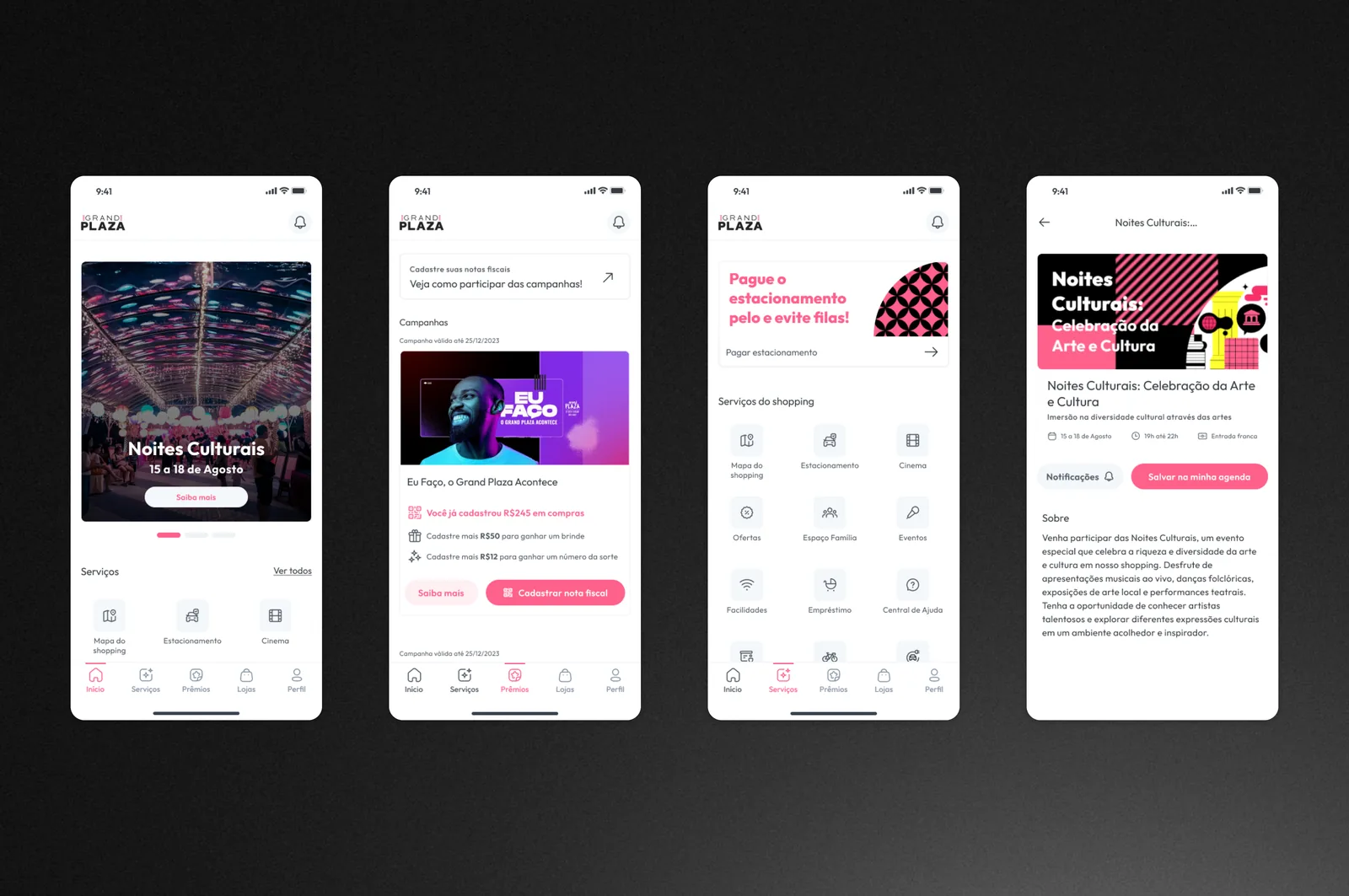
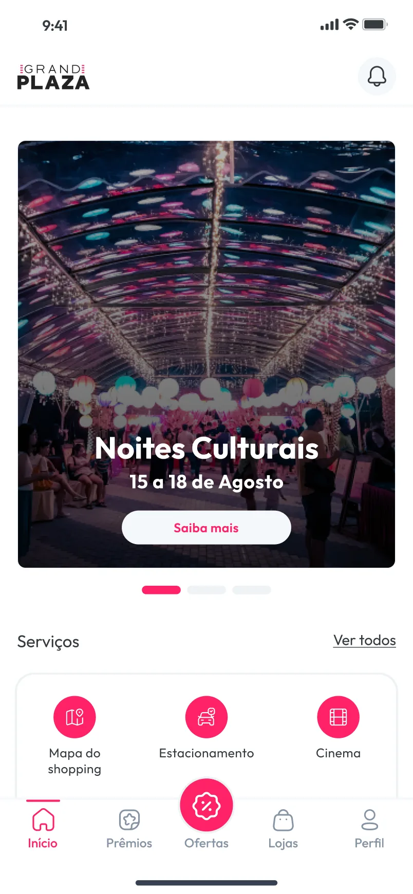
Home gives most of the screen to a single event: a large photo card with the name, the dates and one Saiba mais button, and a carousel indicator showing there are more. Below it sit three service shortcuts, mall map, parking and cinema, with a Ver todos link to the rest.
A campaign that says what is left
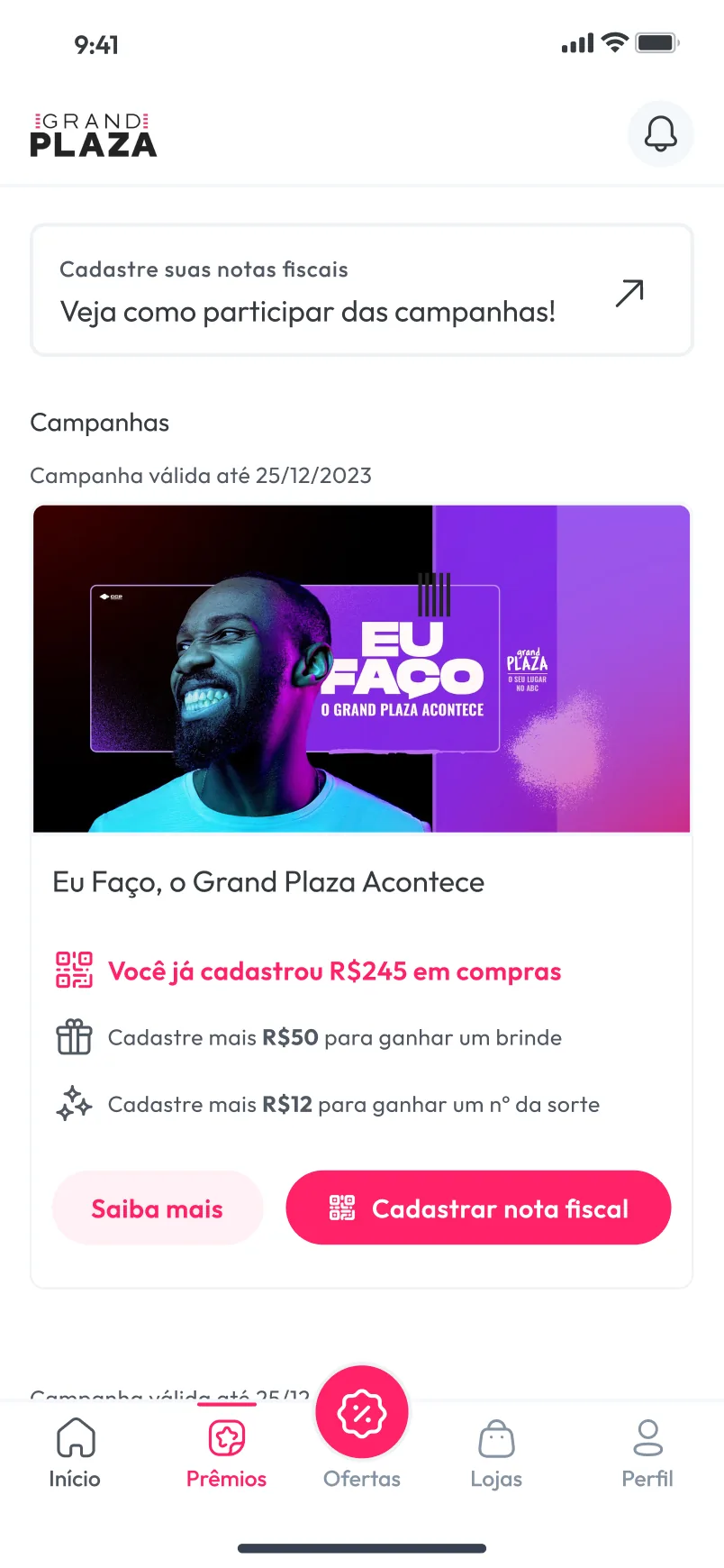
The Prêmios tab runs on receipts. A campaign card states, in three short lines, what the person has already registered, how much more earns a gift and how much more earns a lucky number. Cadastrar nota fiscal is the strong button and Saiba mais the quiet one, so the next step is clear before any explanation is needed.
A long list of services, mapped first
The mall offers more than a tab bar can hold, so Serviços do shopping collects fourteen services in a single grid, from the mall map and parking to coworking, bike racks and EV charging. Offers end on their own screen, with the discount, a code, a QR code and an expiry date to show at the store.
The user flow and content map lays this structure out as a tree of screens branching from the home. The file also keeps two versions of the prototype, one with flat icons and one with 3D icons.