 YAN
Mobile app design
DossApp. Two requests and one red button
A Portuguese-language residential security app where residents request a verification or cover, and guards receive those requests on their own side. Names, dates and prices on screen are sample content.
- Contribution
- Product flows and interface design
- Project status
- Interface design · Figma archive

Screens from the original design in Figma and Dribbble, with sample data.
My contribution
DossApp is a Portuguese-language app for on-demand security around the home, with one side for residents and another for service providers. A verification asks a guard to check something, such as whether a gate was locked. Cover sends a guard to accompany the resident’s arrival.
The Figma work covers both sides, with wireframes, a user flow and prototype pages, and a separate file holds captioned screenshots prepared for a store listing.
What each colour asks for
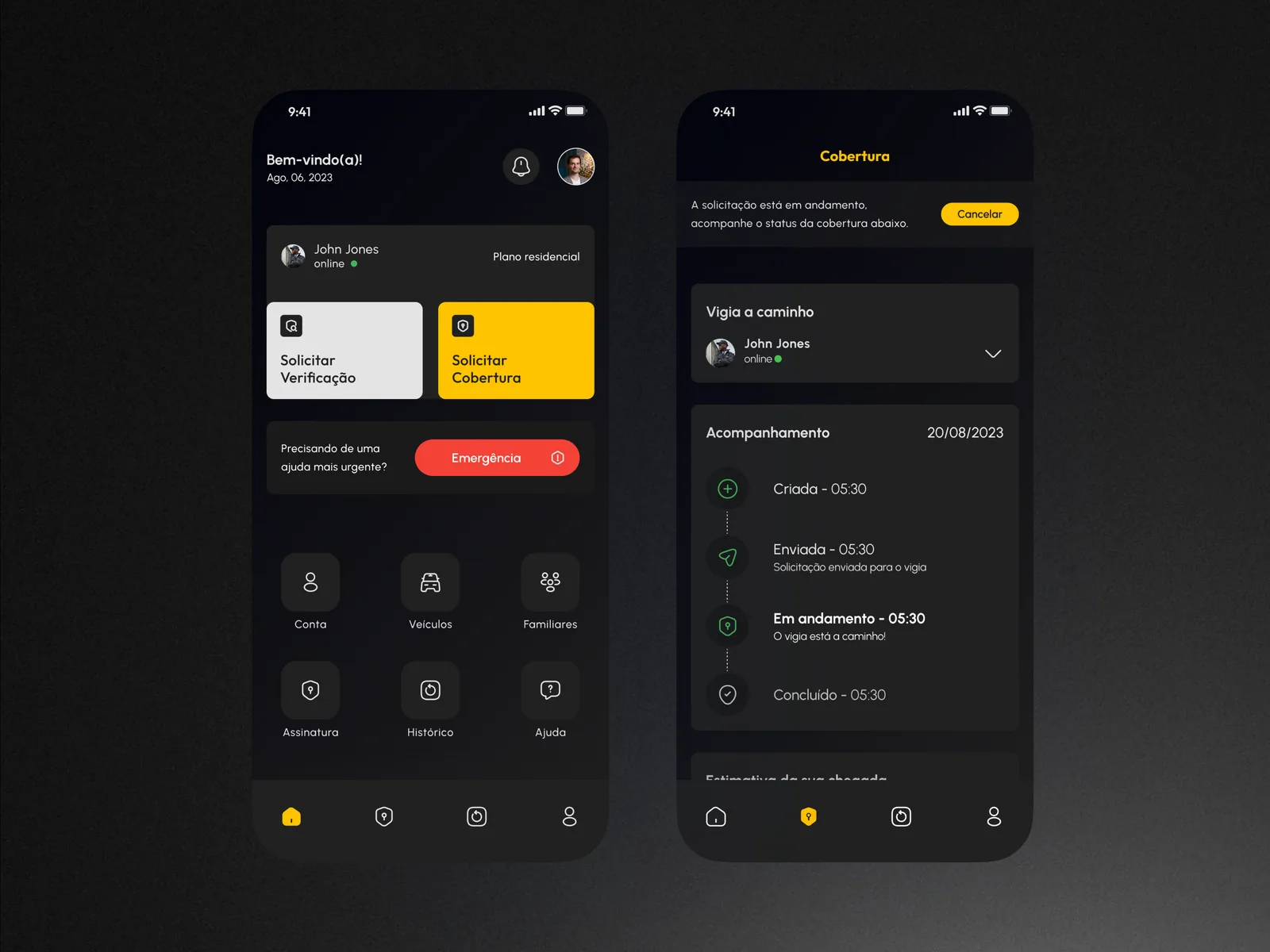
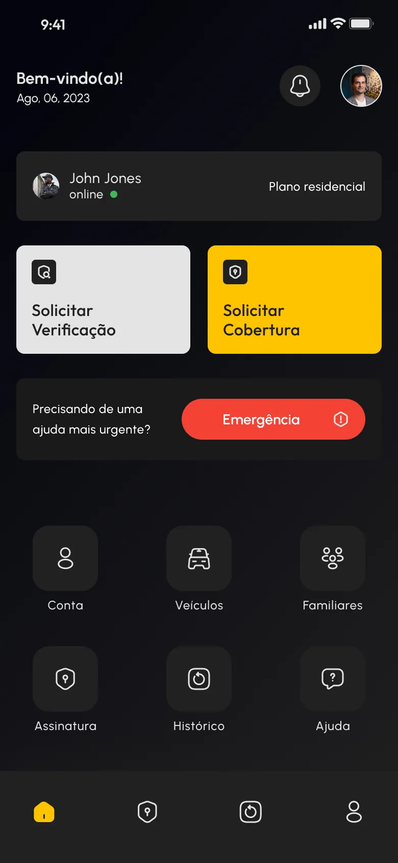
On a dark screen, colour does most of the sorting. The two everyday requests are the largest blocks, Solicitar Verificação in light grey and Solicitar Cobertura in the brand yellow. Emergência stands apart as the only red element, beside the question “Precisando de uma ajuda mais urgente?”, so the urgent path cannot be confused with a routine one. Account, vehicles, family members and the rest stay lower down in a quiet grid of icons.
After the request, what is happening now
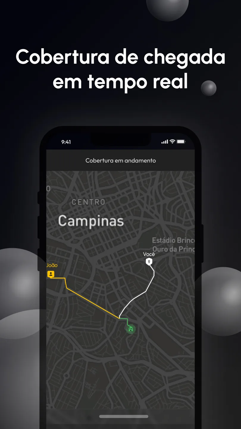
A request does not end at the button. The cover screen names the guard on the way and shows four steps, Criada, Enviada, Em andamento and Concluído, with the current one in bold and Cancelar at the top. A map screen then draws the guard’s route and the resident’s in different colours as they converge on the home.
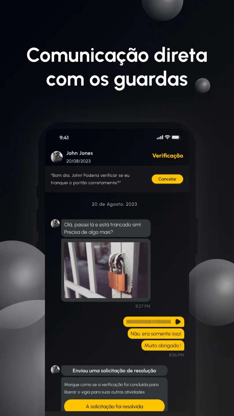
A verification runs as a chat tied to the original question. In the sample, the guard replies with a photo of the padlock, then sends a resolution request that the resident marks as resolved, which releases the guard for other work.
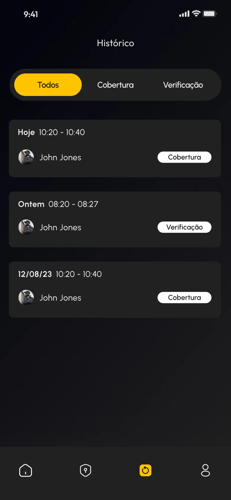
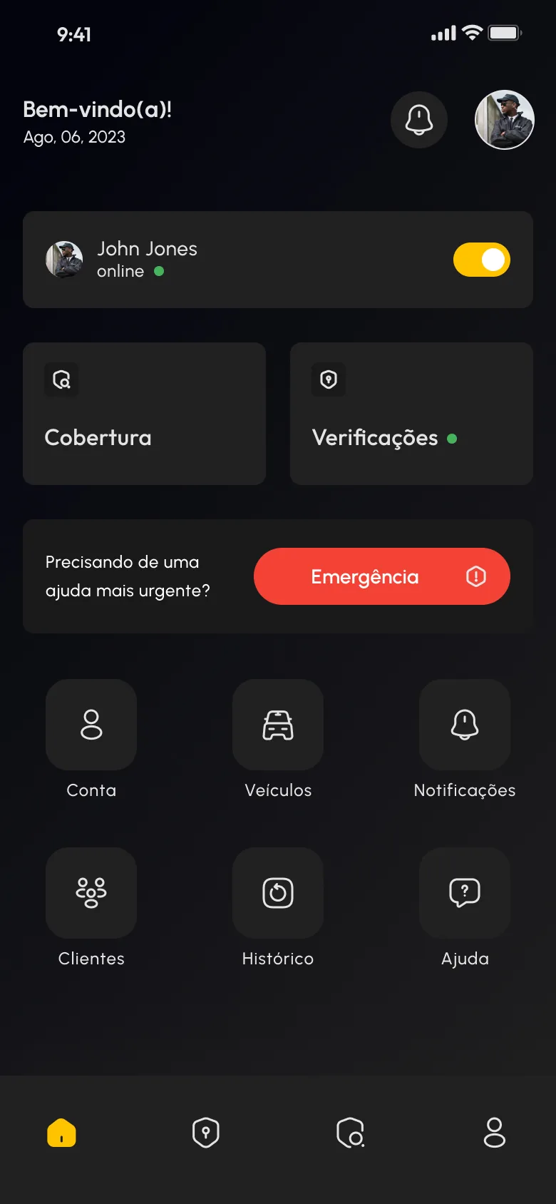
The same screen from the guard’s side
The service provider’s home keeps the layout of the resident’s, so both sides of the app read alike. What changes is the content: a toggle replaces the plan label, the two large blocks become Cobertura and Verificações, and the grid adds Clientes and Notificações. On the resident’s side, Histórico stays a simple record, filtered by type, with one card for each date, guard and request.