 YAN
Mobile app design
Boater. From choosing a boat to boarding it
A Portuguese-language app for boat rentals and tours, connecting people who want to rent with advertisers. Bookings, people and prices on screen are sample content.
- Contribution
- Product flows and interface design
- Project status
- Interface design · Figma archive
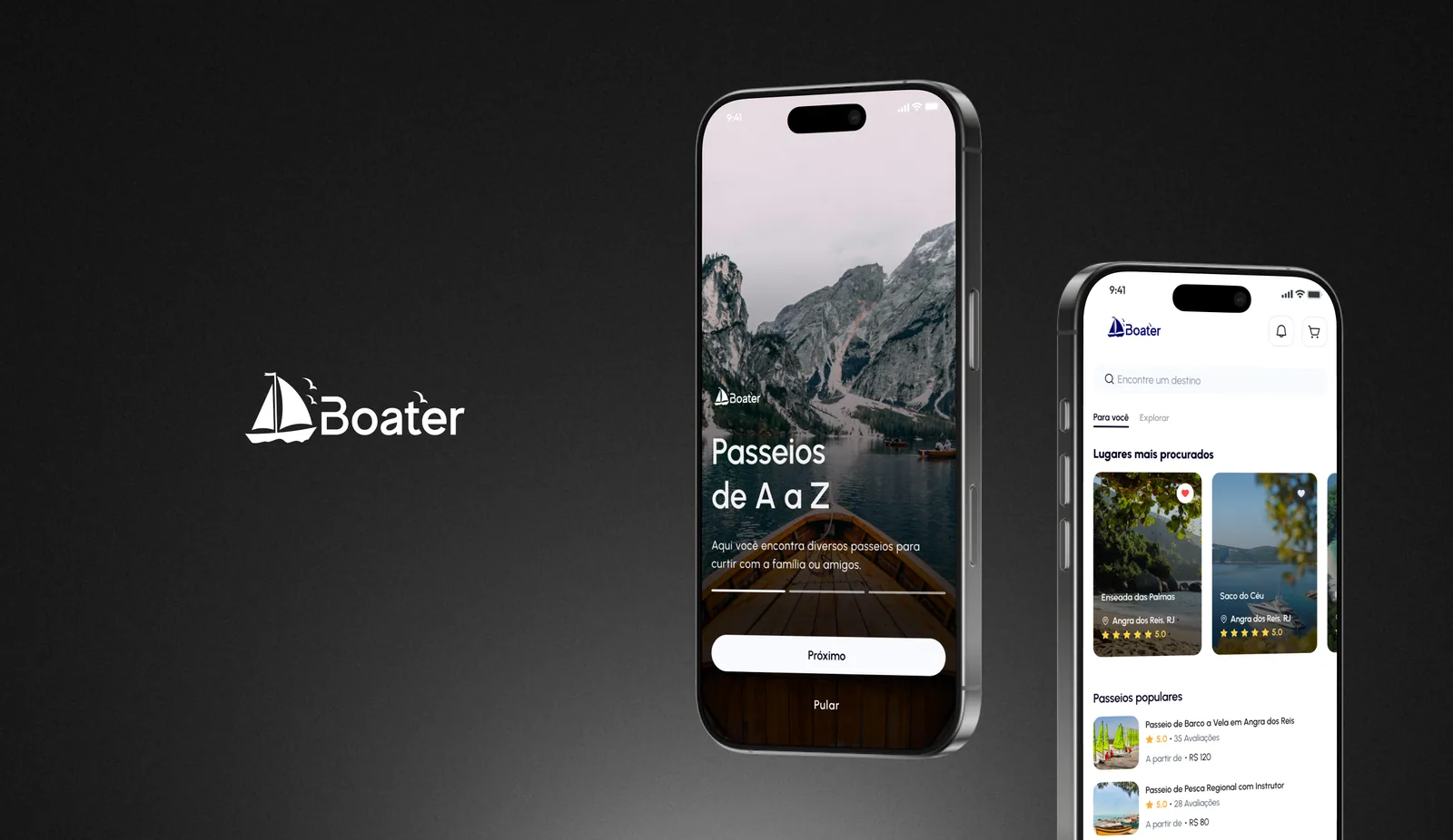
Screens from the original design in Figma and Dribbble, with sample data.
My contribution
Boater is a Portuguese-language platform that, in its own welcome text, connects people interested in renting boats with advertisers. The Figma file has 52 phone frames plus variants, divided between the renter’s flow, from search and booking to check-in and chat, and an advertiser area with its own profile and reservations. Here I follow the renter.
The next trip takes the top of the screen
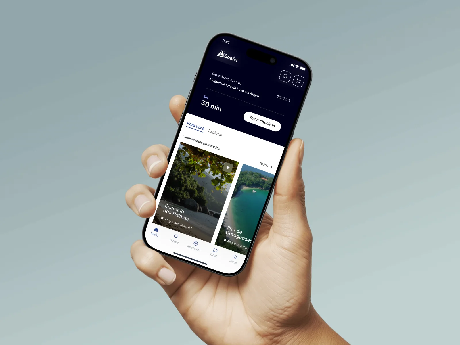
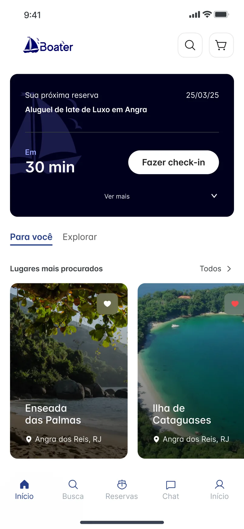
When a booking is close, a dark card sits at the top of the home with what was booked, the date, the time left and one button, Fazer check-in. Discovery starts below it, with Para você and Explorar tabs and large photo cards of the most searched places. The same screen serves someone about to board and someone still choosing.
Who will be at the helm
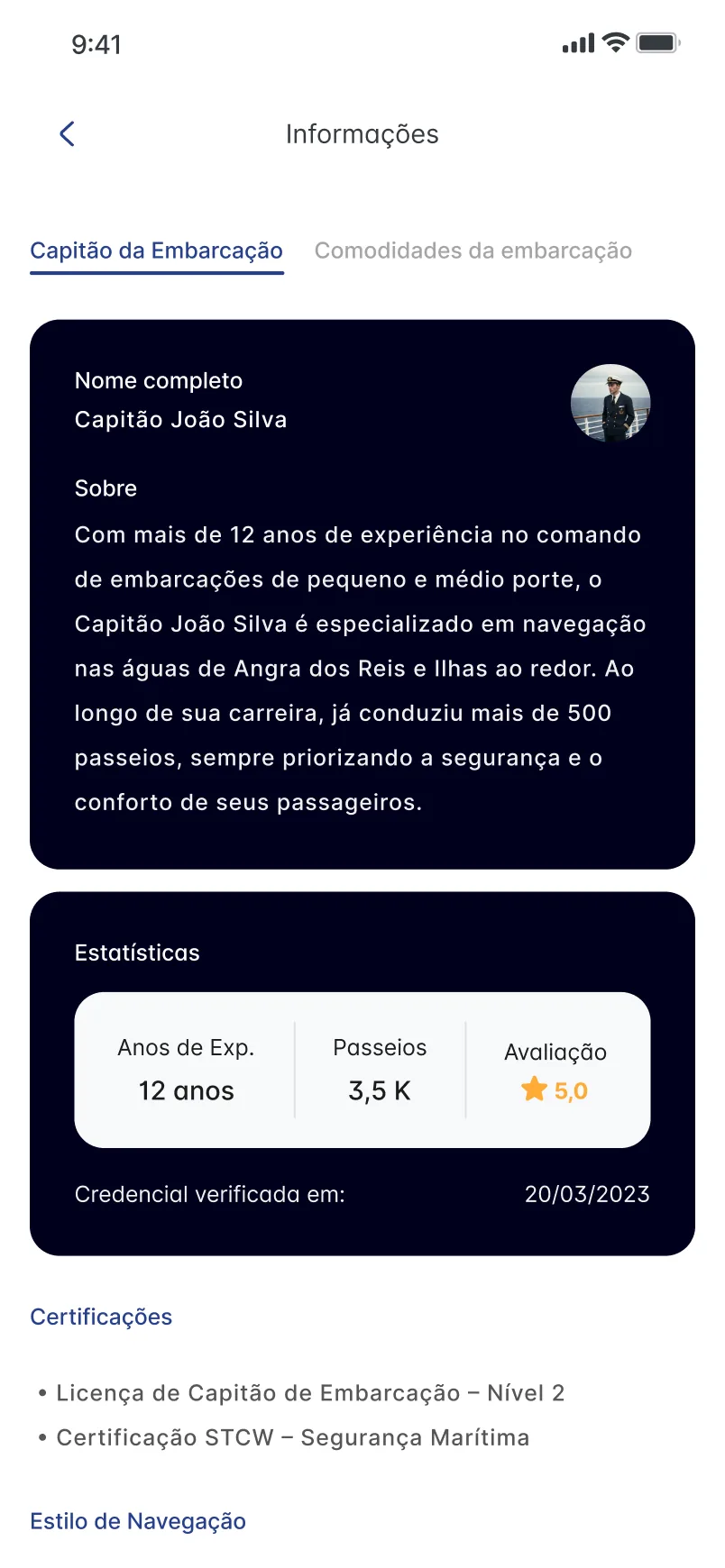
The information screen gives the captain a tab of their own, separate from the boat’s amenities. It holds a name and a short bio, three figures for experience, tours and rating, the date a credential was verified and a list of certifications. The person and the numbers are sample content. The structure shows the intent: people can check who runs the boat as well as what it offers.
At the end, the interface makes way for the sea
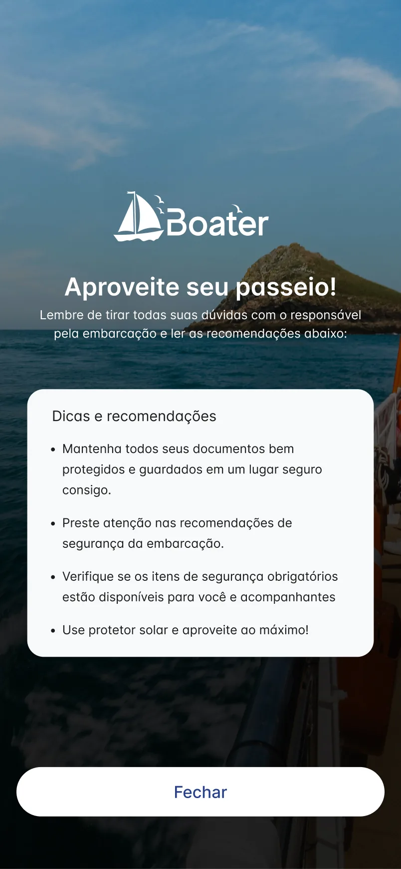
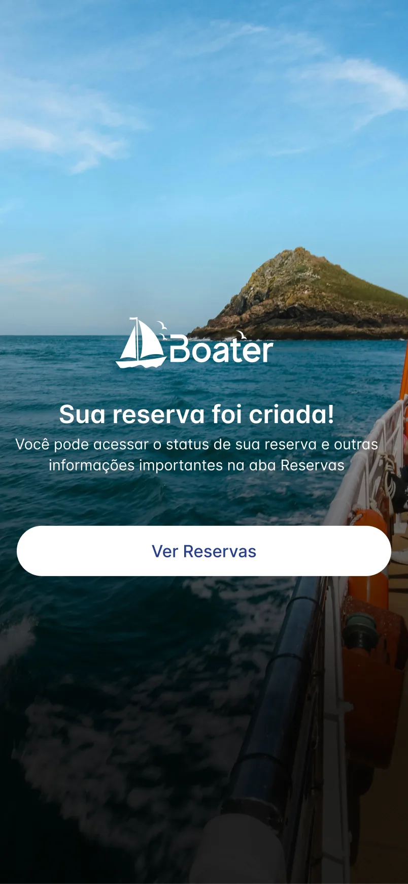
Most of the app is white with dark cards. When a booking is created, the screen changes to a full-bleed sea photograph with the logo, a short confirmation and one button, Ver Reservas, which leads to where the booking’s status lives. Another screen reuses the photograph with a card of tips for the trip and a single Fechar button.