 YAN
 Web app and dashboard design
Rei do Pitaco. A waitlist with short steps
The sign-up flow of a waitlist for a betting product: choosing how to enter, giving details over short steps and confirming the email.
In short
- The problem
- A fantasy-sports company was launching a betting product. Its waitlist had to take people through sign-up, an identity check and referrals, and give them a reason to wait.
- My part
- As a Product Designer on the team from March to October 2022, I worked on UX and UI, interaction design, usability testing, heuristic evaluation and research for the fantasy game and the launch of the betting product.
- The key decision
- Map the launch as four stages, sign-up, identity check, referral and score, before drawing a screen. Then ask for one thing per screen, with errors and the reason for each requirement shown in place.
- Contribution
- Product flows and interface design
- Project status
- Interface design · Figma archive

Screens from the original Figma design files, with sample data.
My contribution
I worked at Rei do Pitaco as a Product Designer from March to October 2022, on its fantasy game and on the launch of a new betting product. That meant UX and UI design, interaction design, usability testing, heuristic evaluation, UX research and product discovery.
This case follows the waitlist of the betting product, from the plan to the logged area. The user research behind it is a separate case, under code.

Mapping the launch before drawing it
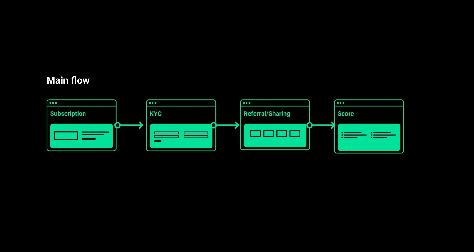
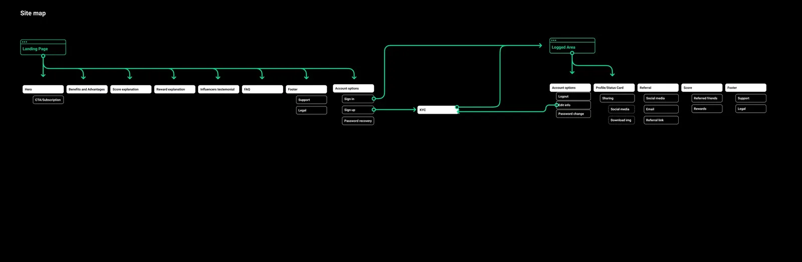
The work started as structure: a sitemap for the waitlist and a main flow in four stages. Subscription brings the person in, KYC confirms who they are, referral and sharing bring others along, and the score shows where they stand. Every screen that followed had to serve one of those stages.
Two ways in, one step at a time
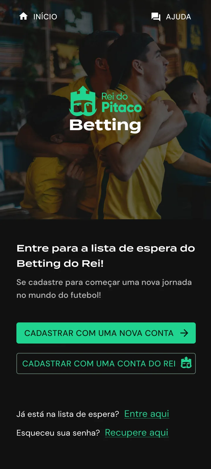
The first screen separates two situations: creating a new account or using an existing Rei do Pitaco account. People coming back get their own links below those buttons, one to log in and another to recover a password.
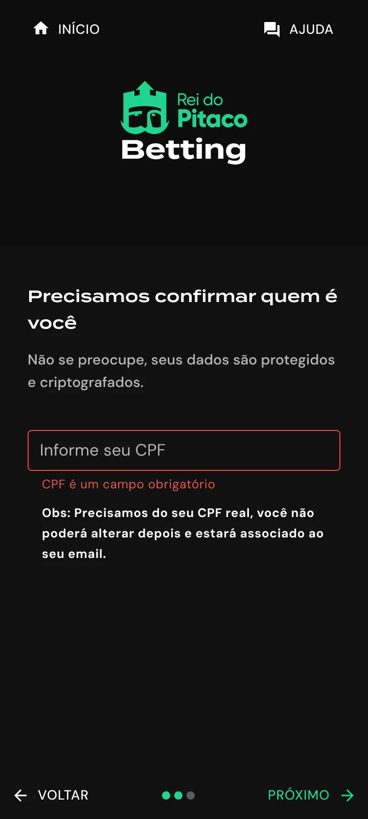
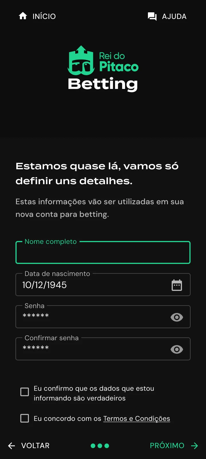
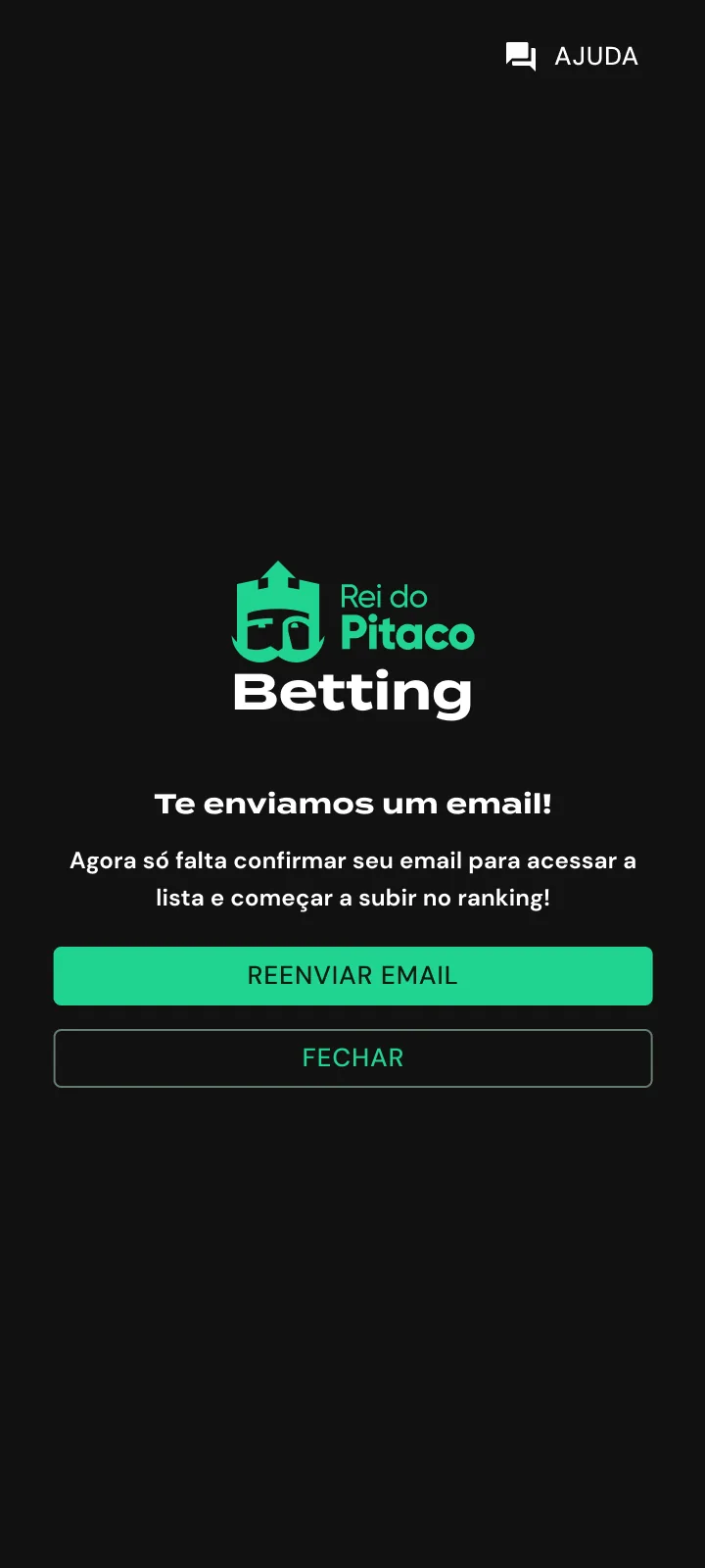
Each later step keeps the same structure: logo at the top, one heading, the fields for that step, and Back and Next at the bottom around three progress dots. The CPF step shows the required-field error in place, with a note below it explaining that the number cannot be changed later. After the last step, the flow reduces to one message and two actions: resend the email or close.
A waitlist that explains the prize
The landing page announces the new betting product with one line, “O betting do Rei vem aí!”, and one action: leave an email and join the list. Everything below it answers why that is worth doing, starting with more than R$ 1 million in prizes.
Prize tiers, how points work and a short FAQ come in that order, so the page settles the money question before it asks for anything else.
After signing up, a countdown
Once inside, the logged area keeps the launch present: days left, a prize ladder and the state of the account’s verification. The file holds both verified and unverified versions, so someone who stopped halfway can see what is missing.
The sign-up itself asks one thing per screen, from email to name and birth date, then CPF, with a plain note explaining why that number is needed.