 YAN
Mobile app and landing page
Hidratasport. Training and nutrition on the same timeline
A training and nutrition tracking app, shown on screen as Hidrata, with macros, workouts, supplementation and AI analysis, plus the landing page that presents it. All figures are sample data.
- Contribution
- Product flows and interface design
- Project status
- Interface design · Figma archive
Screens from the original Figma design file, with sample data.
My contribution
Hidratasport appears on screen as Hidrata, a Portuguese-language app made to support training and nutrition. The app file is organised by flow, from first use and paywall through home, workouts, logging, ranking and profile, and a second file holds the landing page. Here I show the app’s daily screens and the page that presents them.
Two versions of the same morning
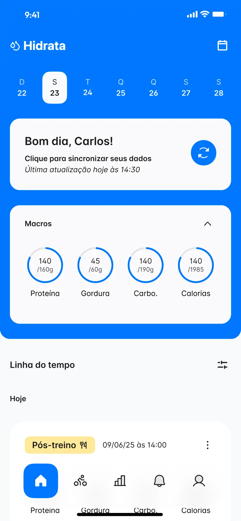
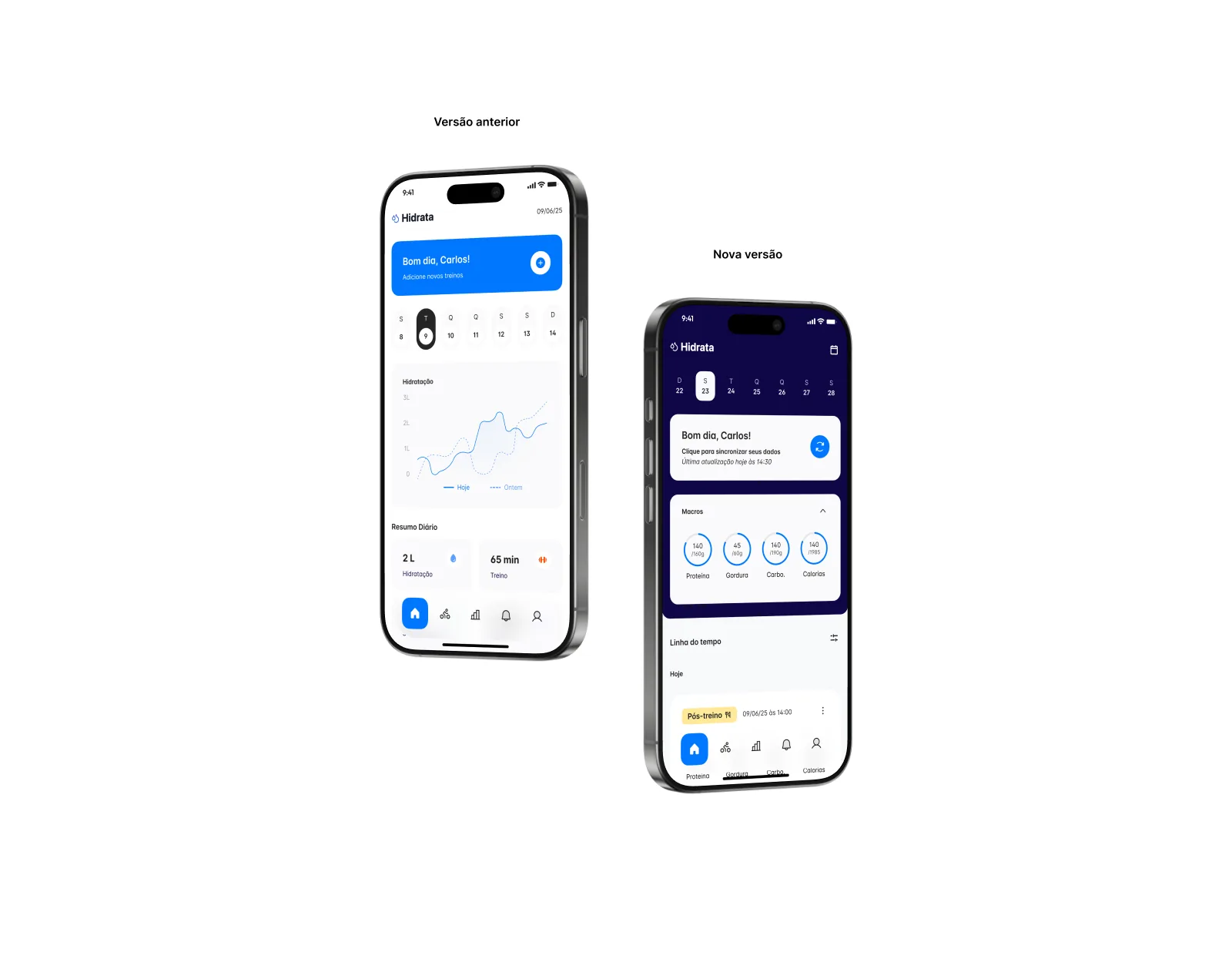
The file keeps an earlier home beside a newer one, and the difference is a change of priority. The earlier version led with a hydration chart and daily totals. The newer one puts data sync first, then macro rings for protein, fat, carbs and calories against their daily targets, and turns the rest of the page into a timeline of the day with tags such as Pós-treino.
One run, read in layers
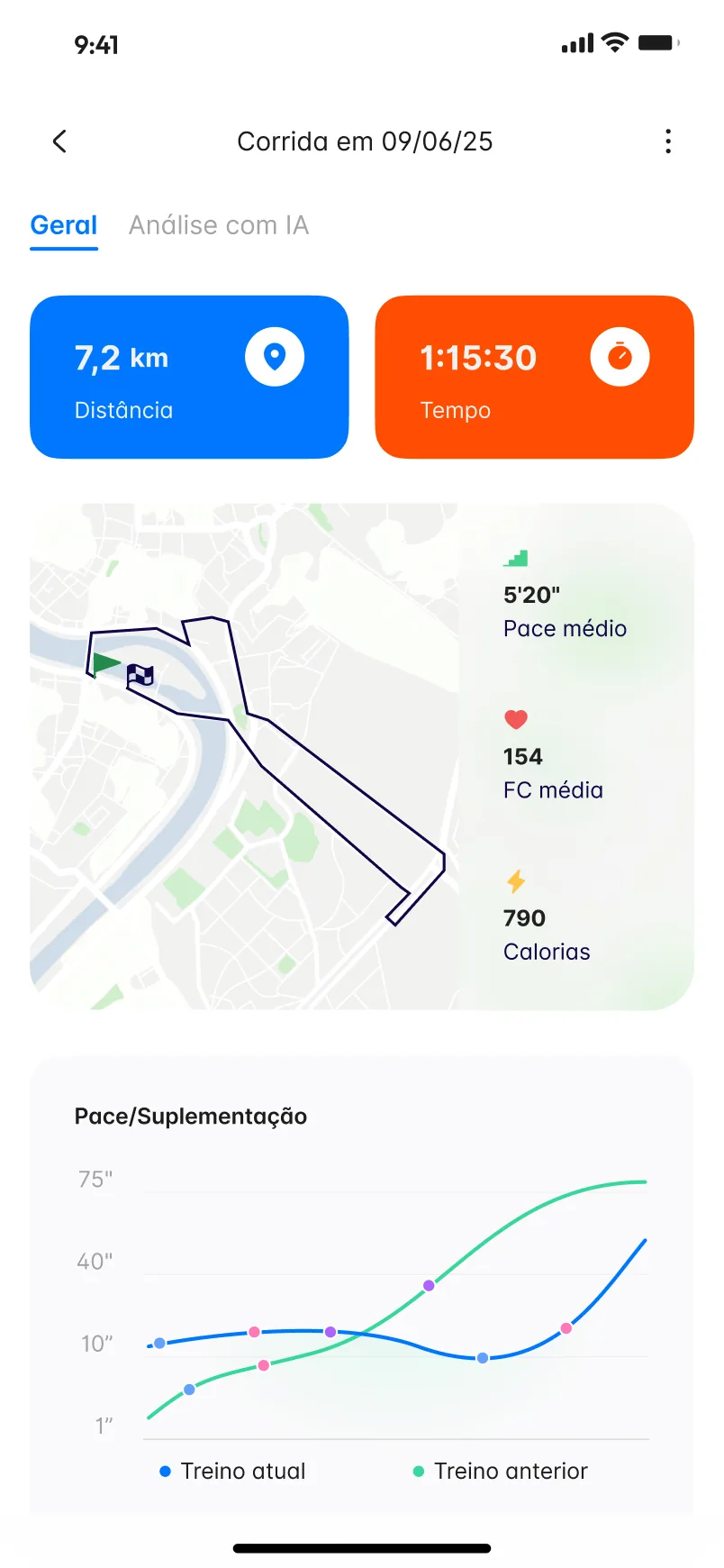
A workout page starts with distance and time in two large tiles, then the route on a map with pace, heart rate and calories beside it. Lower down, a chart lays the current workout over the previous one, with markers along the lines. The AI analysis has its own tab, so the plain numbers stay uncluttered.
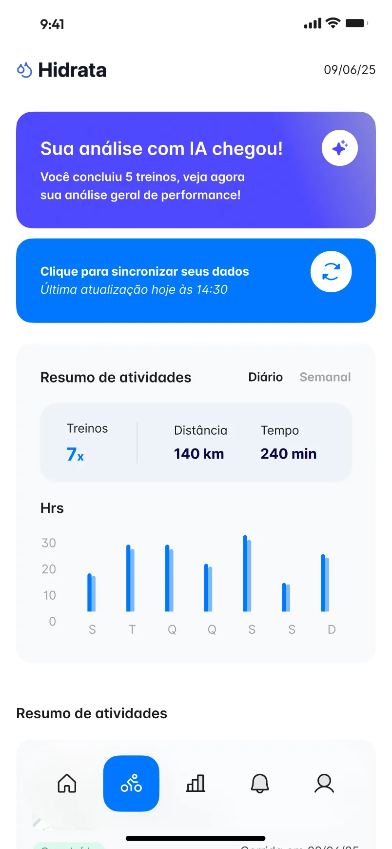
The activity screen works at a wider scale: a daily or weekly summary of workouts, distance and time above a bar chart, with a banner when a new AI analysis is ready.
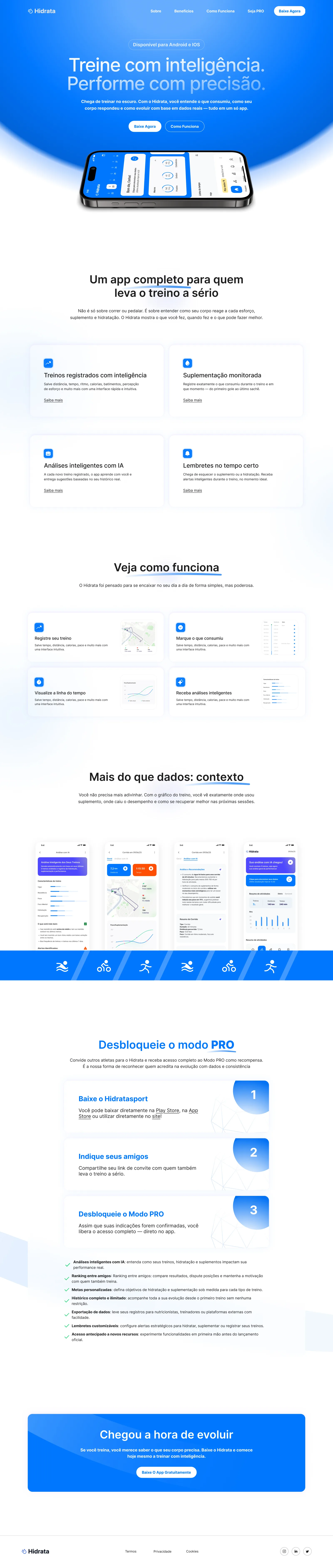
A landing page that explains by showing
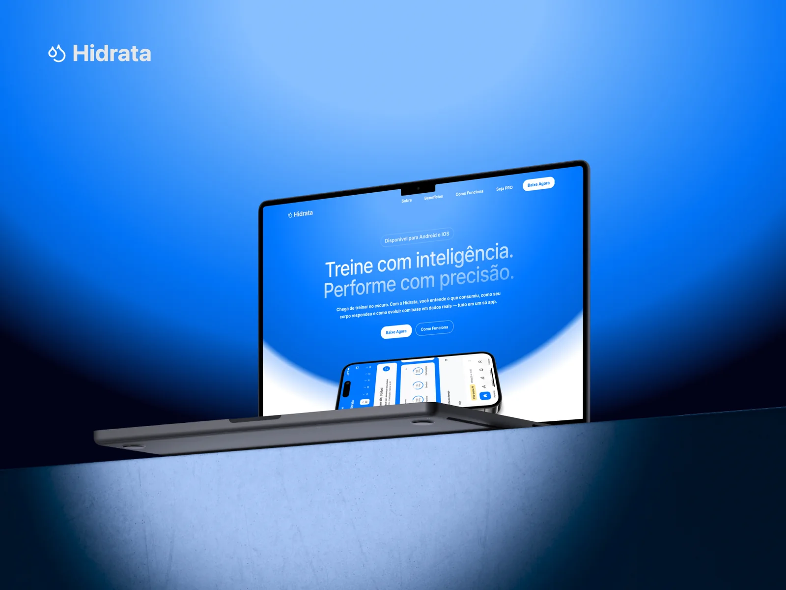
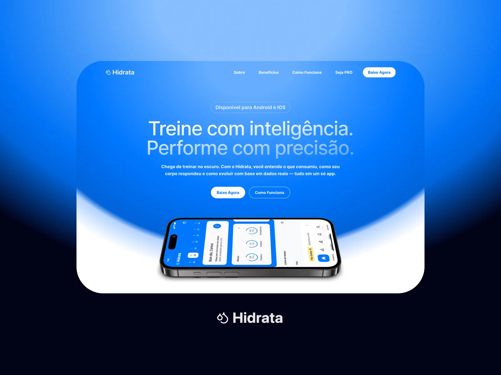
The landing page opens on “Treine com inteligência. Performe com precisão.” over the blue of the app, with the home screen on a phone below the headline. From there it moves through the main features, how the app fits into a routine, real screens under “Mais do que dados: contexto”, and three steps to unlock the PRO mode by inviting friends.