 YAN
 Brand identity
Divine’s Bake Shop. A handwritten name inside an ornate ring of leaves
A brand identity manual for Divine’s Bake Shop, a gourmet sweets shop: a script logo in an ornate ring, a wine, gold and black palette, and stickers and delivery seals that put them to use.
- Contribution
- Brand identity
- Project status
- Brand identity · Figma archive
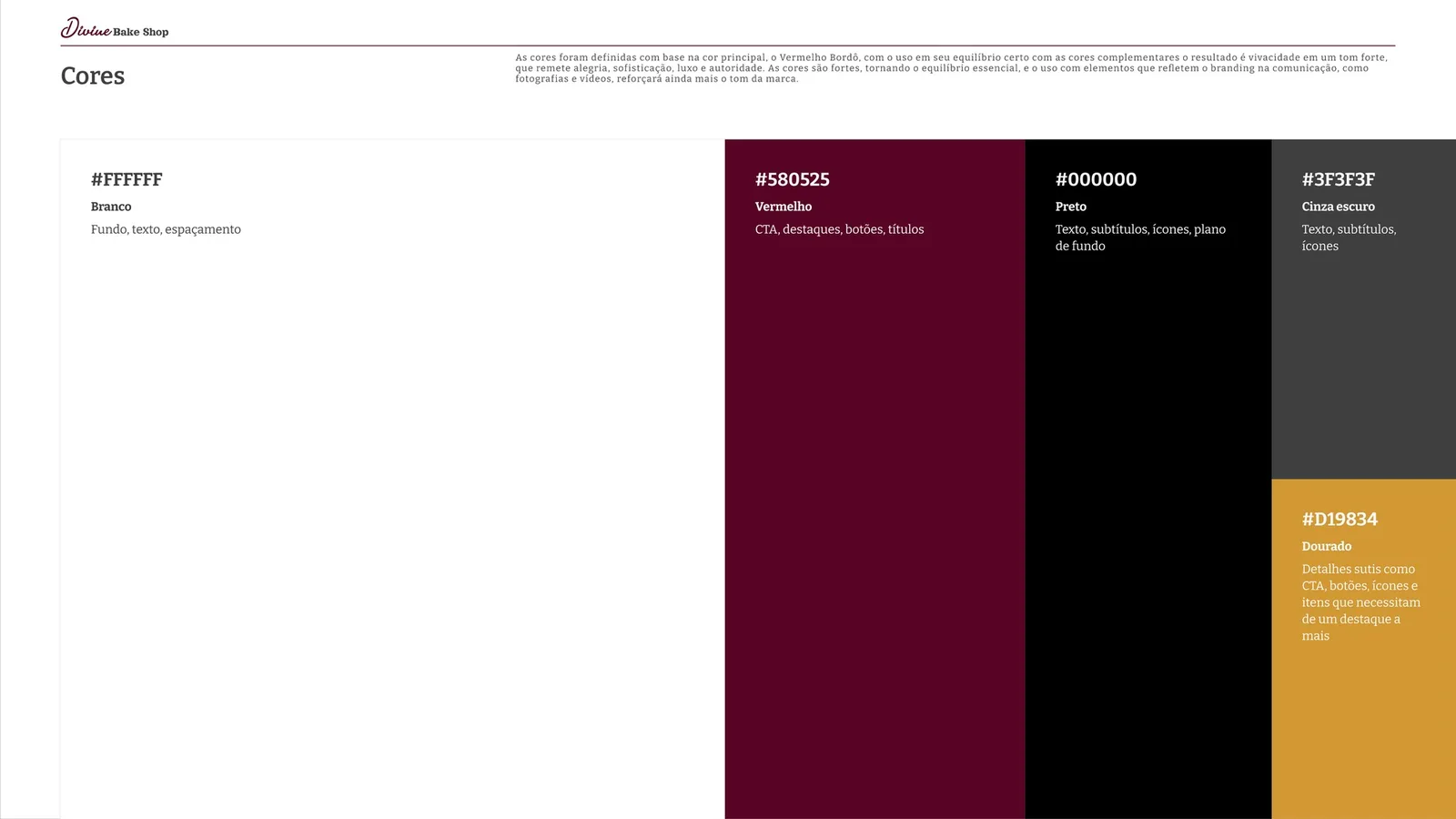
Pages from the original identity manual in Figma, marked V. 0.1.
My contribution
Divine’s Bake Shop sells gourmet sweets, and its manual describes the brand as a warm hug, full of care. I organized the identity as a slide manual, marked V. 0.1 on the cover, with sections for logo, typography, color, voice and tone, photography and applications.
The pages here follow three of those parts: the mark, the color and the applications.
A name inside an ornament
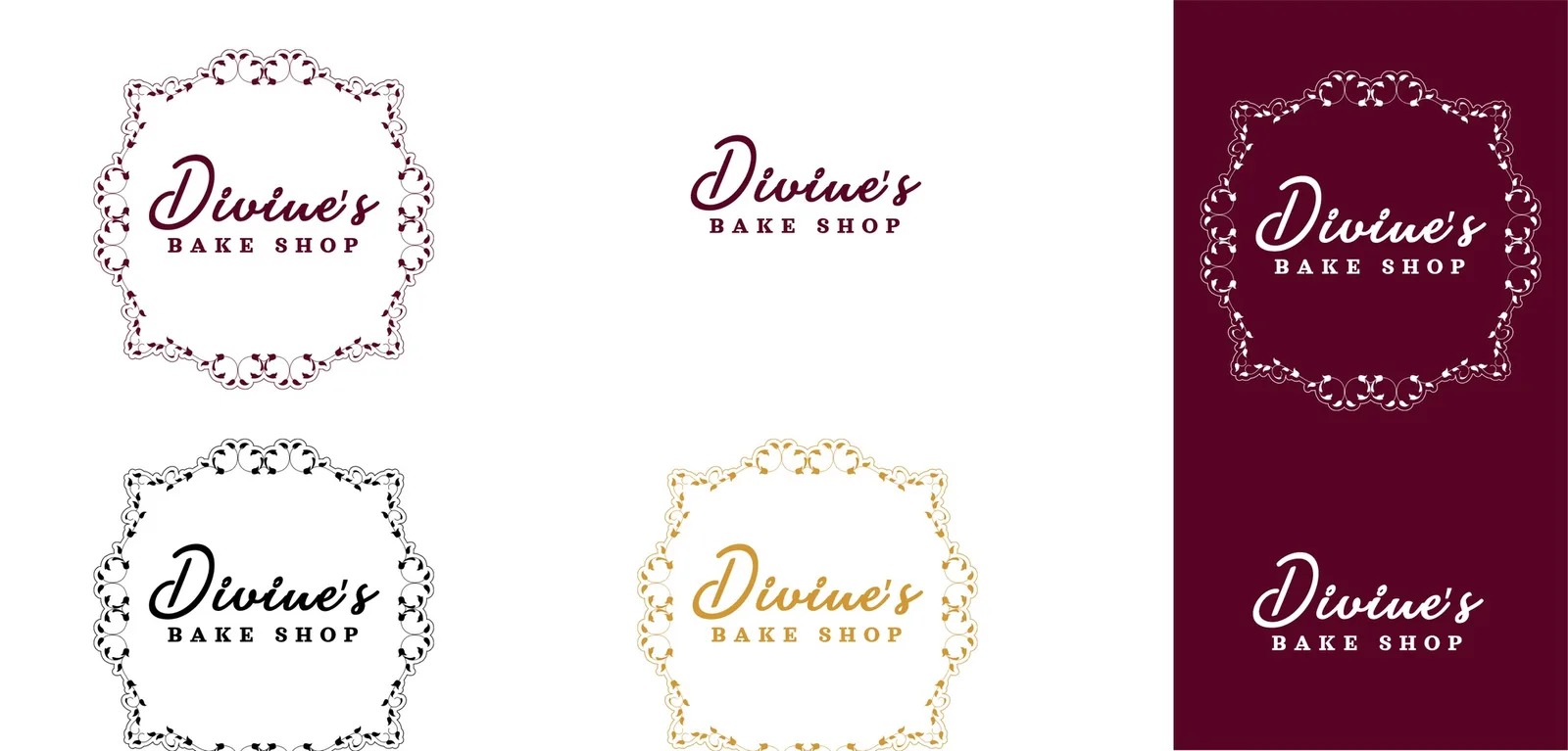
The mark sets the name in a heavy script above BAKE SHOP in spaced serif capitals, inside a ring of scrolls and small leaves. The fine outline of the ring and the weight of the script pull in opposite directions, so the whitespace rule matters: the manual asks for a clear margin of a third of the logo’s height around it.
Wine does the talking, gold stays rare
The palette starts from one color, a deep wine red, #580525, which the manual assigns to calls to action, highlights, buttons and titles. White carries backgrounds and spacing, black and a dark gray carry text, and gold, #D19834, is kept for small details. The color page gives the reason itself: these colors are strong, which makes balance essential.
Stickers and seals for the order
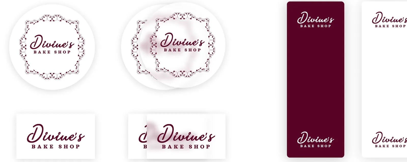
The application preview tries the mark on round and rectangular stickers, with white and transparent backgrounds, and on two long delivery seals, one wine and one white. On the seals the ring drops away and only the script and BAKE SHOP remain, repeated at both ends, which keeps the name readable on a narrow strip.
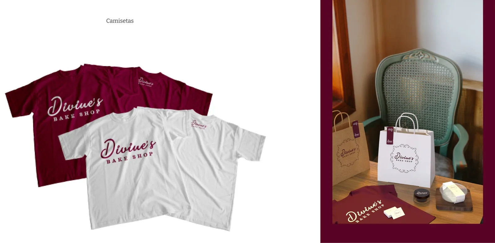
The same preview carries the mark onto t-shirts in wine and white, a shopping bag and a card, and the closing page sets it in white on the wine red.