 YAN
 Landing page design
Lex by Alexandria. A landing page that opens with one question
A Portuguese landing page and logo for an electricity-bill offer, with three mobile hero treatments around the same opening question.
- Contribution
- Interface design
- Project status
- Interface design · Figma archive
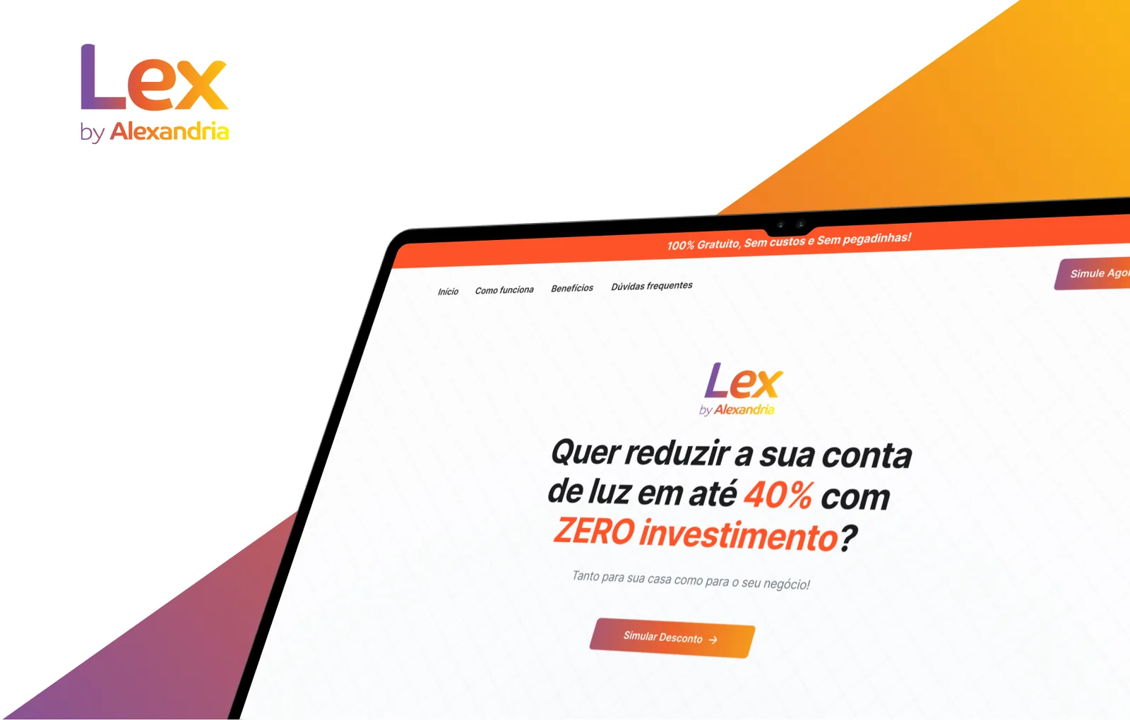
Screens from the original Figma design file. Headlines are the page’s own marketing copy.
My contribution
Lex by Alexandria is a Portuguese landing page for an electricity-bill offer, aimed at homes and businesses. The file holds desktop and mobile versions of the page, along with logo variants.
The headline and tags on these screens are the page’s own marketing copy, not results I can verify. This case looks at how the page is built.
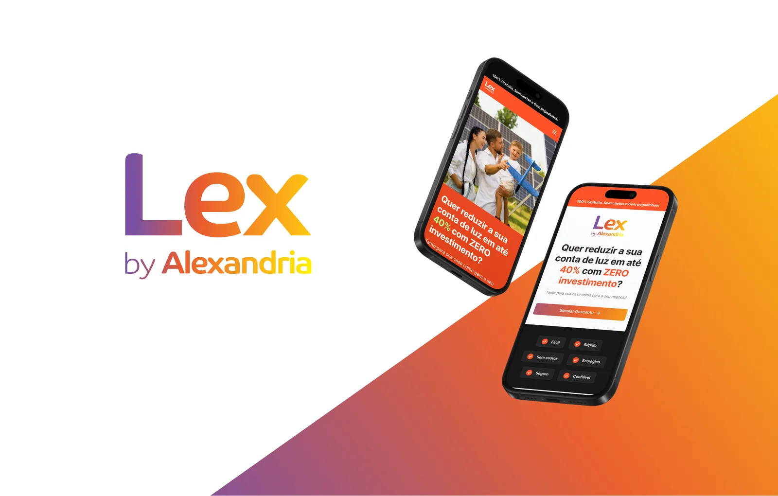
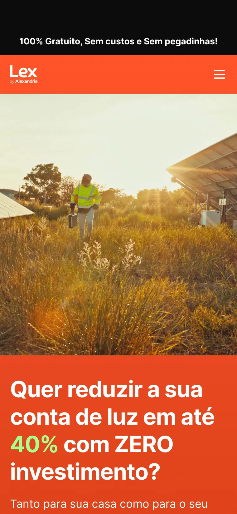
Three ways to open on a phone
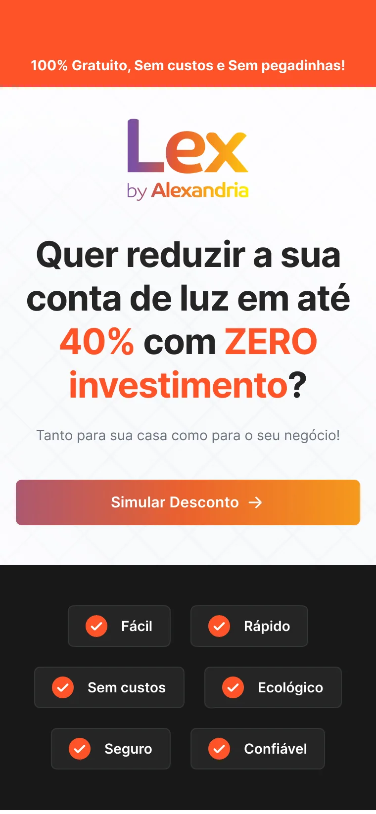
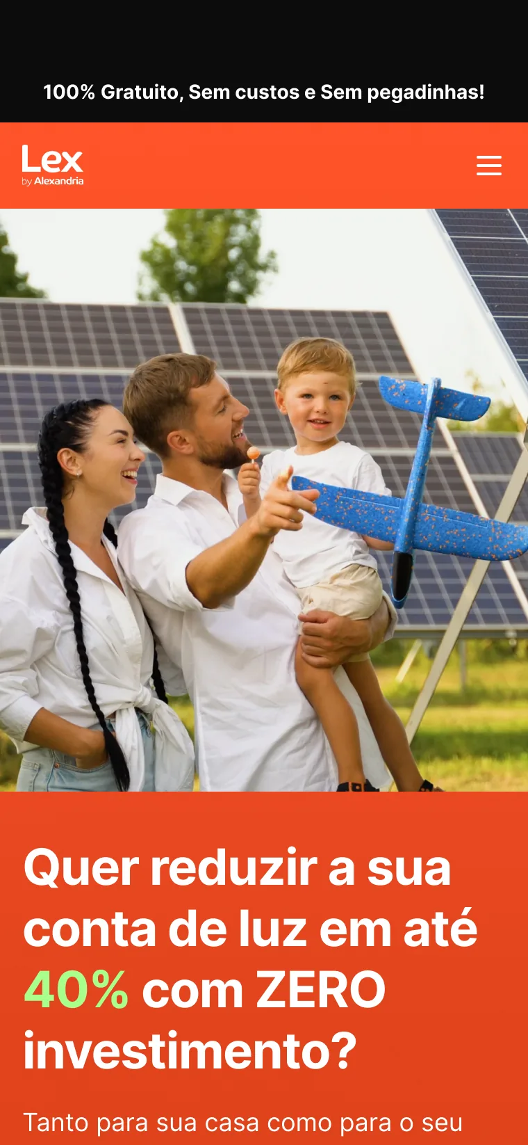
The mobile frames explore three treatments of the same first screen. Two lead with a photograph, a family beside solar panels or a technician walking through a solar field, and set the question on an orange panel. The third drops the photo, puts the gradient logo on white and brings the Simular Desconto button into the first view.
That version also ends the first view with six short tags on a dark band, a small summary before the page continues.
A gradient that holds the page together
The logo runs from purple through orange to yellow, and the same gradient fills the main button and the diagonal shapes of the presentation frames. On the orange bar of the photo versions the mark switches to white, so it stays legible without changing shape.