 YAN
Mobile app design
AglomeraNão. See how full a place is before you go
A mobile app interface in Portuguese for booking a trip to the shops away from crowds, with a heat map of Manaus, stores labeled by how busy they are and a time to book.
- Contribution
- Interface design
- Project status
- Mobile app · Figma archive
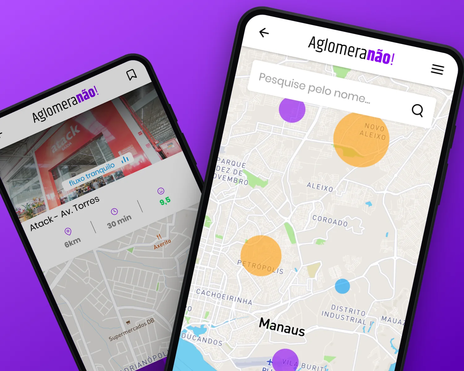
Screens from the original Figma file. Store names and numbers are sample content.
My contribution
The home screen asks a direct question: have you imagined doing your shopping without the crush of people and without the risk of catching corona? AglomeraNão answers with three options, Check-in, Agenda and Mapa, and three kinds of place: markets, pharmacies and pet shops.

Crowding you can read at a glance
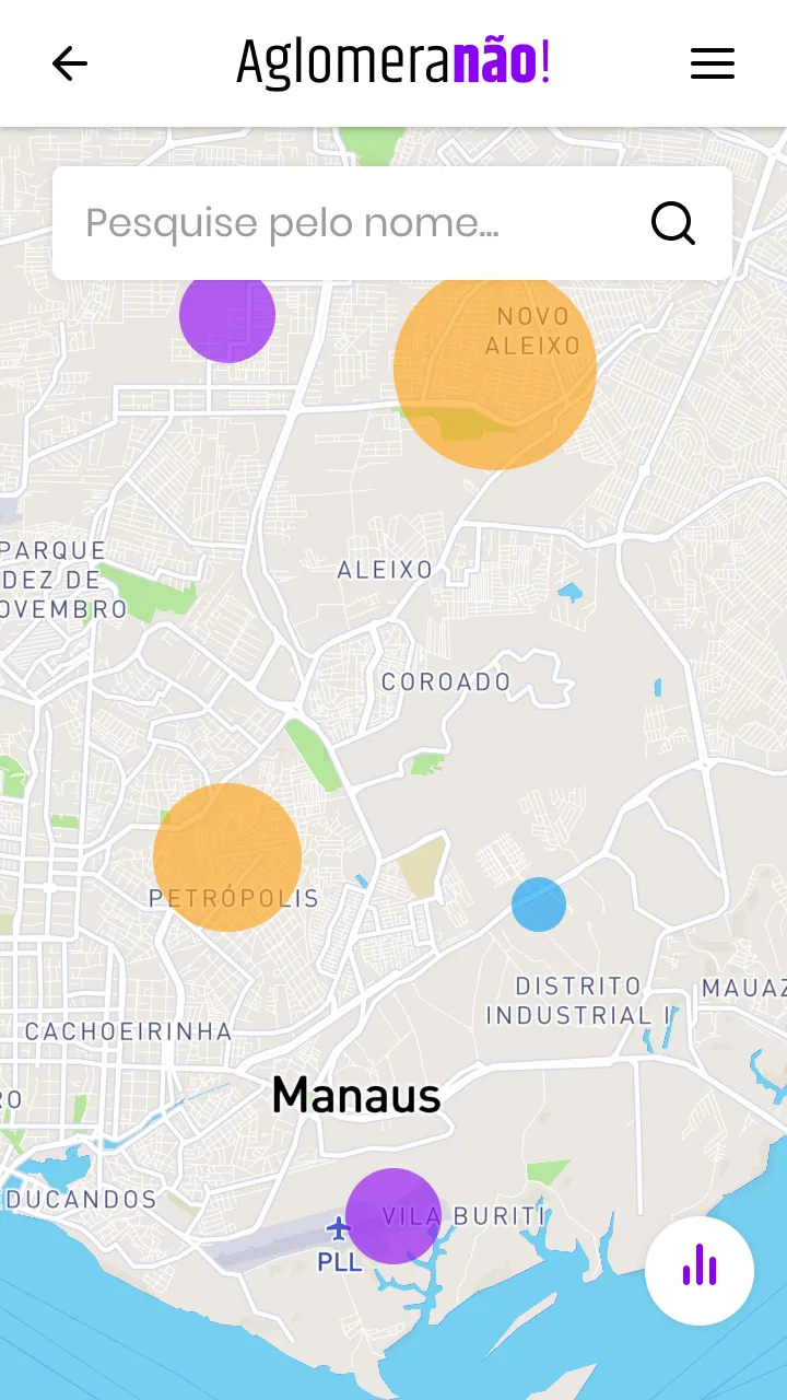
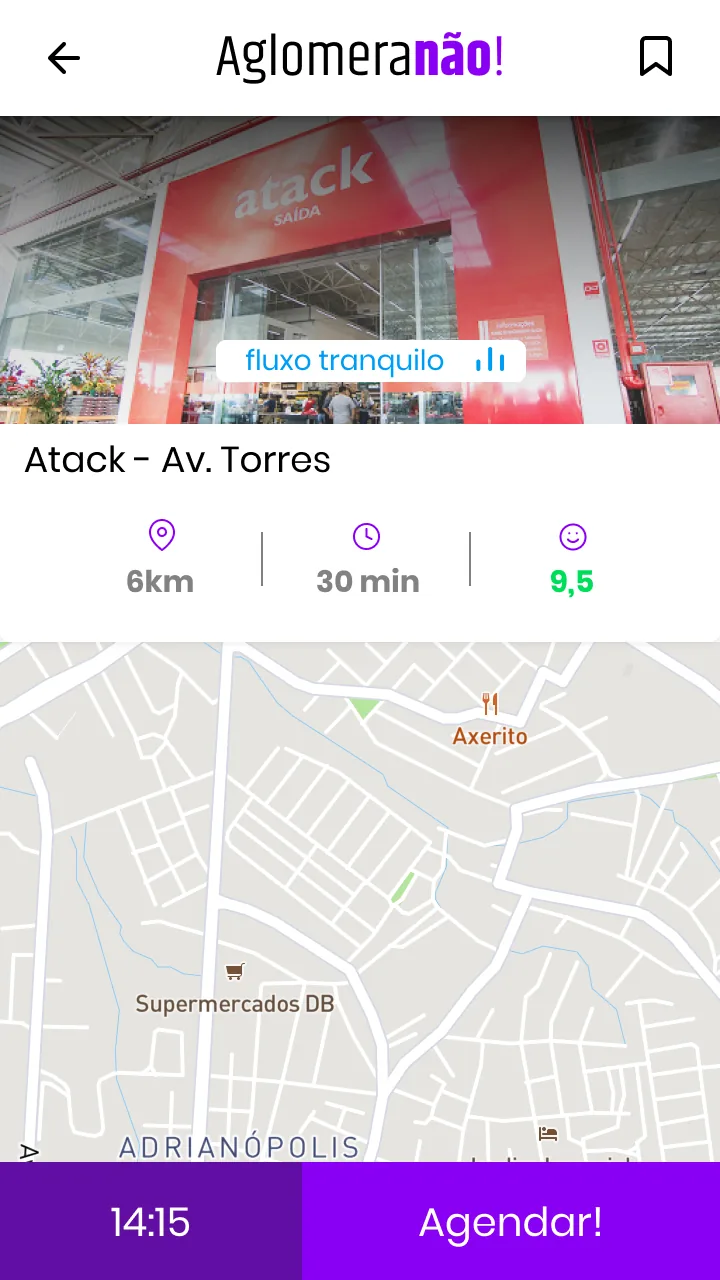
The heat map places circles of different sizes and colors over Manaus neighborhoods, under a search field. The store page carries the same idea into a small label on the photo, such as fluxo tranquilo, next to distance, time and a score. Store names are sample content.
A store page that ends in a time
The store page repeats the label and the three numbers, adds a street map and closes with a bar at the bottom: a time, 14:15, next to the Agendar! button. Everything above it leads to that one action.
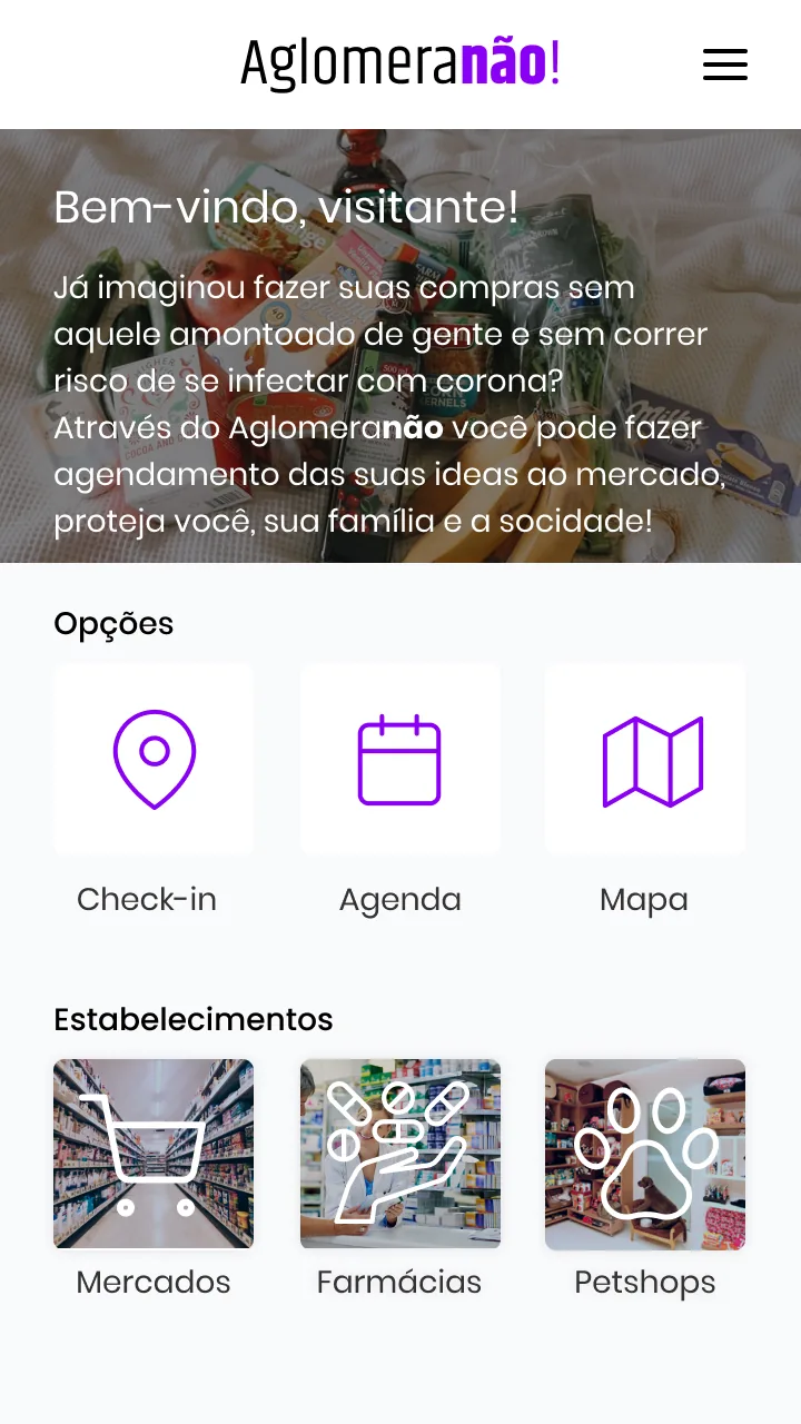
All the weight on the no
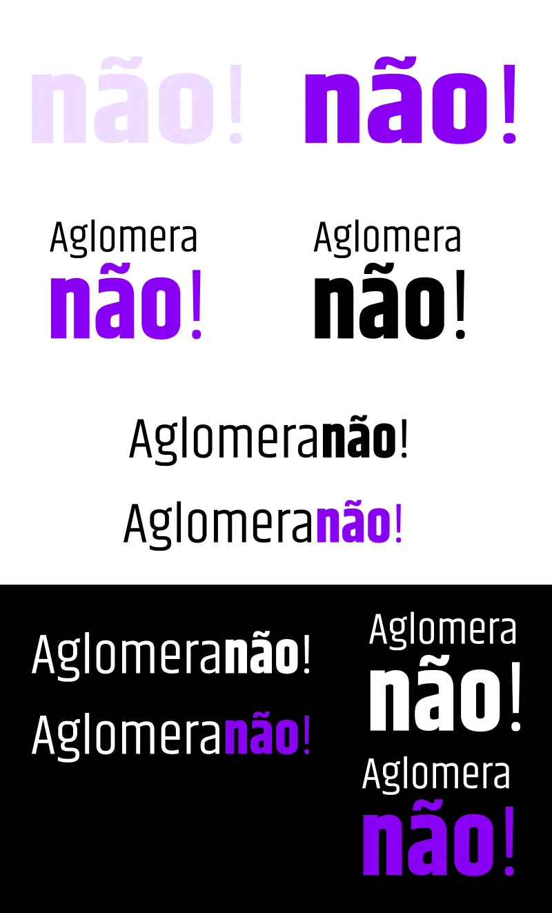
The wordmark sets Aglomera in a light condensed type and não! in a heavy one, in violet, so the name makes its point out loud. The same violet carries the icons and the main button across the screens.